IDA 2026 IS NOW OPEN - SUBMIT BY APRIL 15 TO GET A 10% EARLY BIRD DISCOUNT.
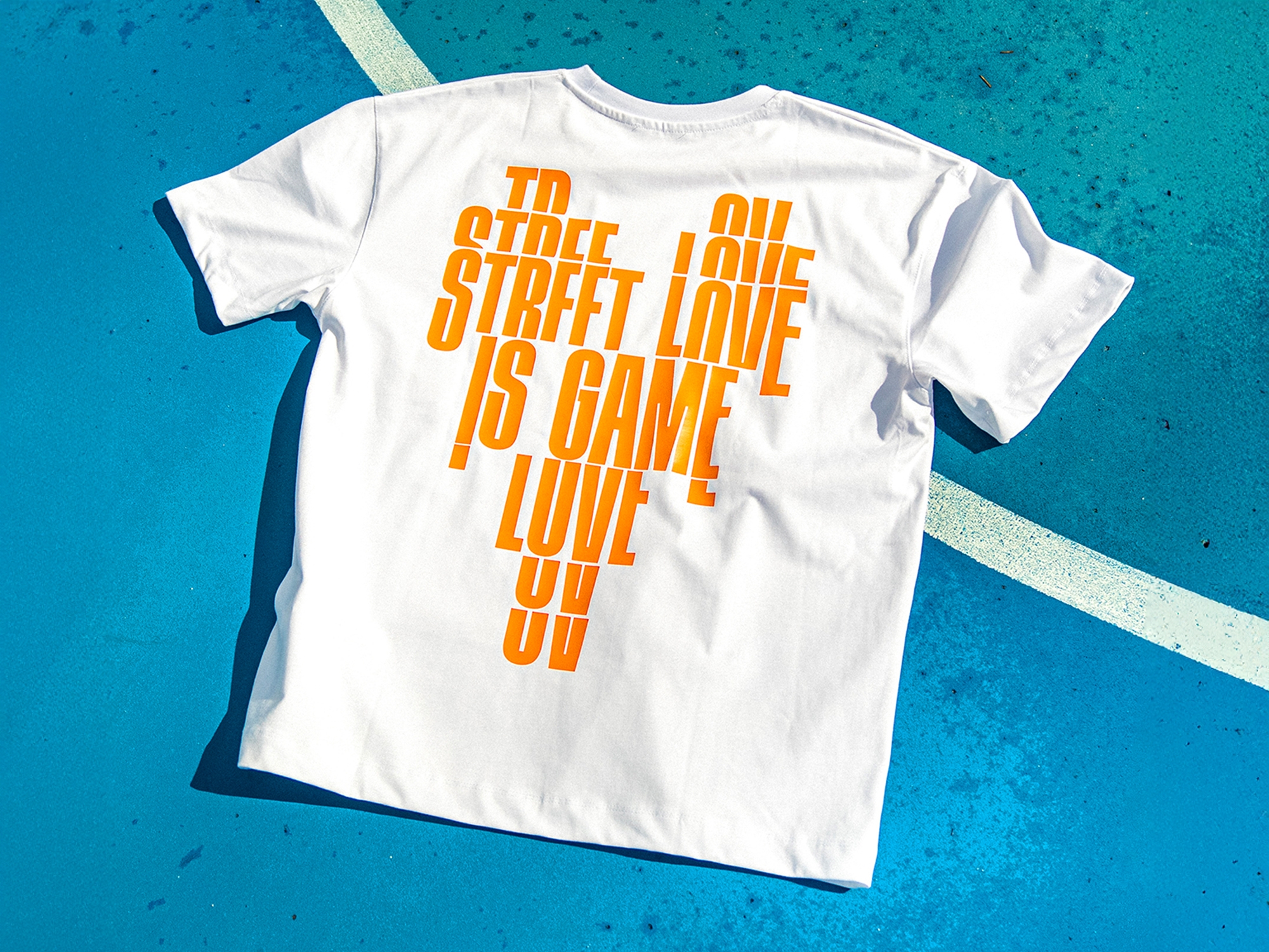
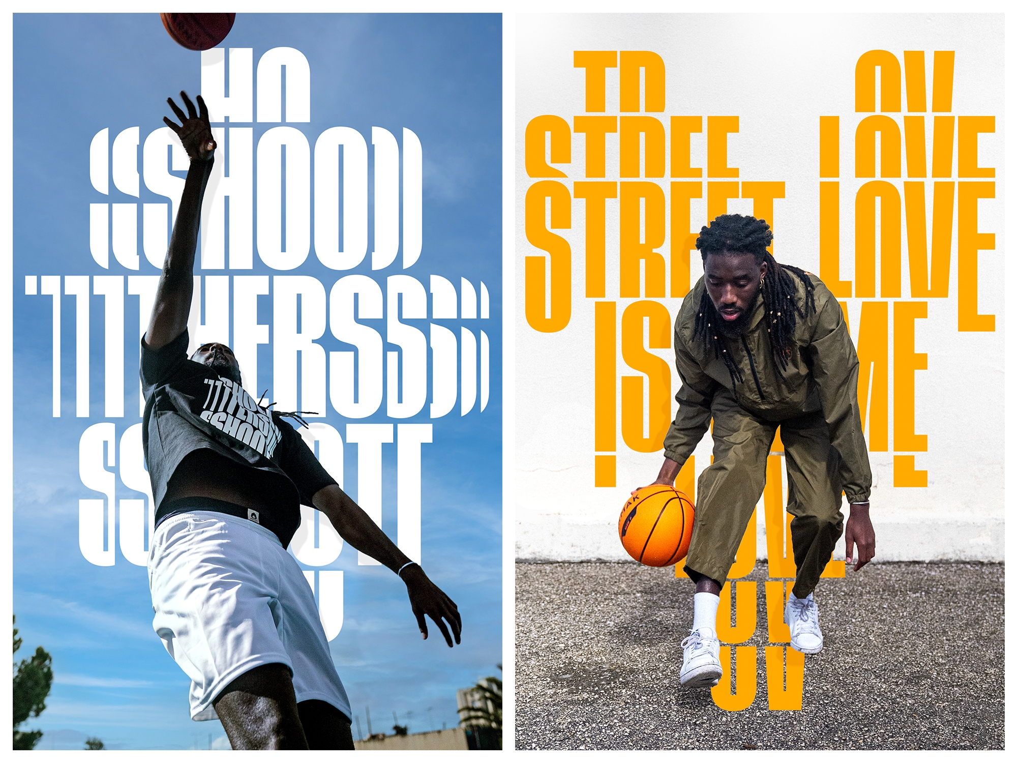
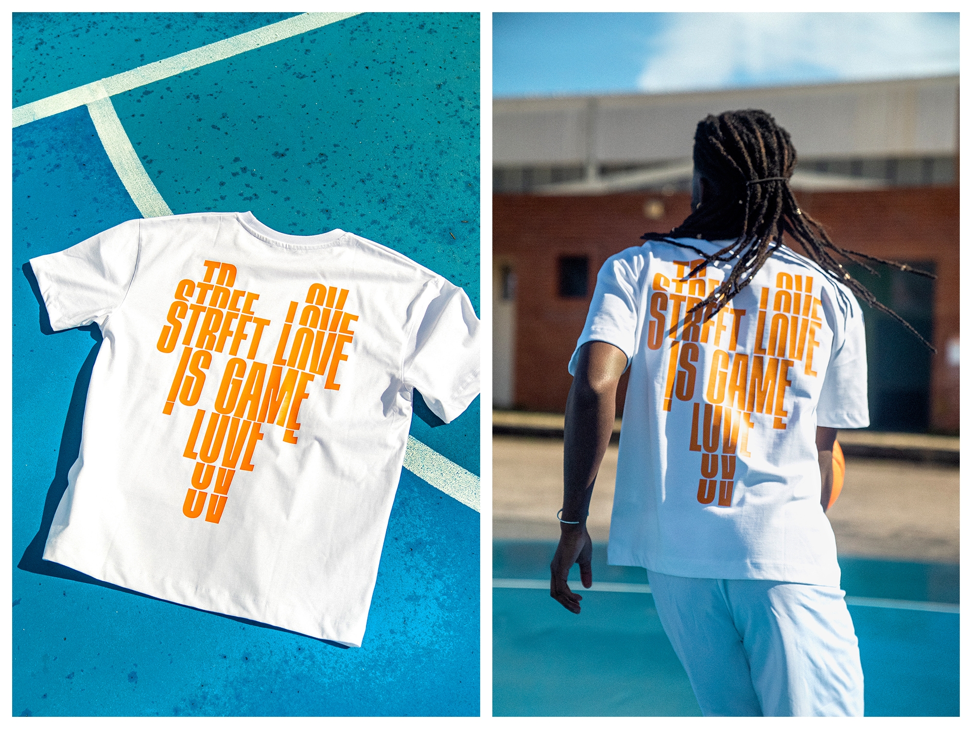
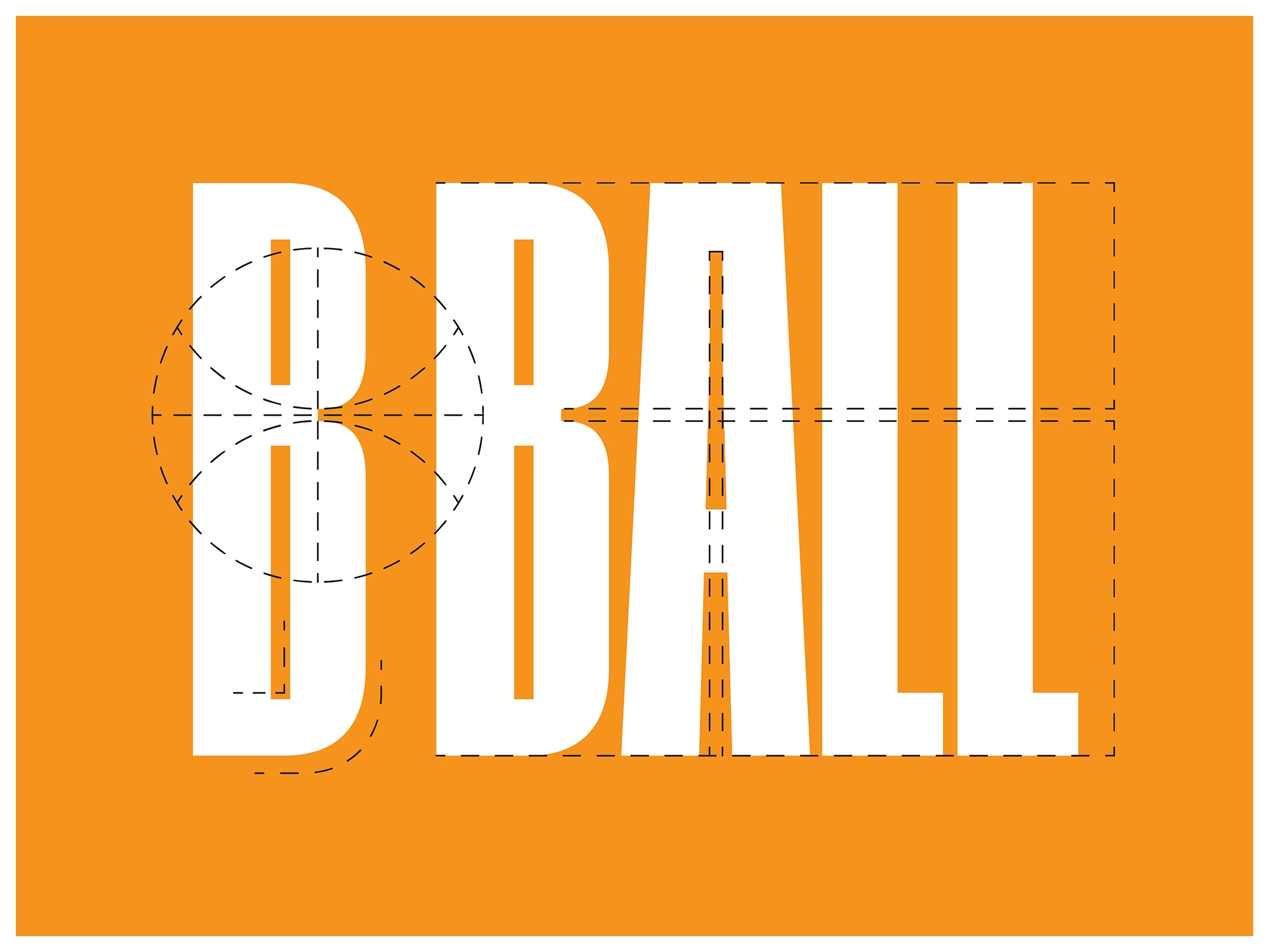
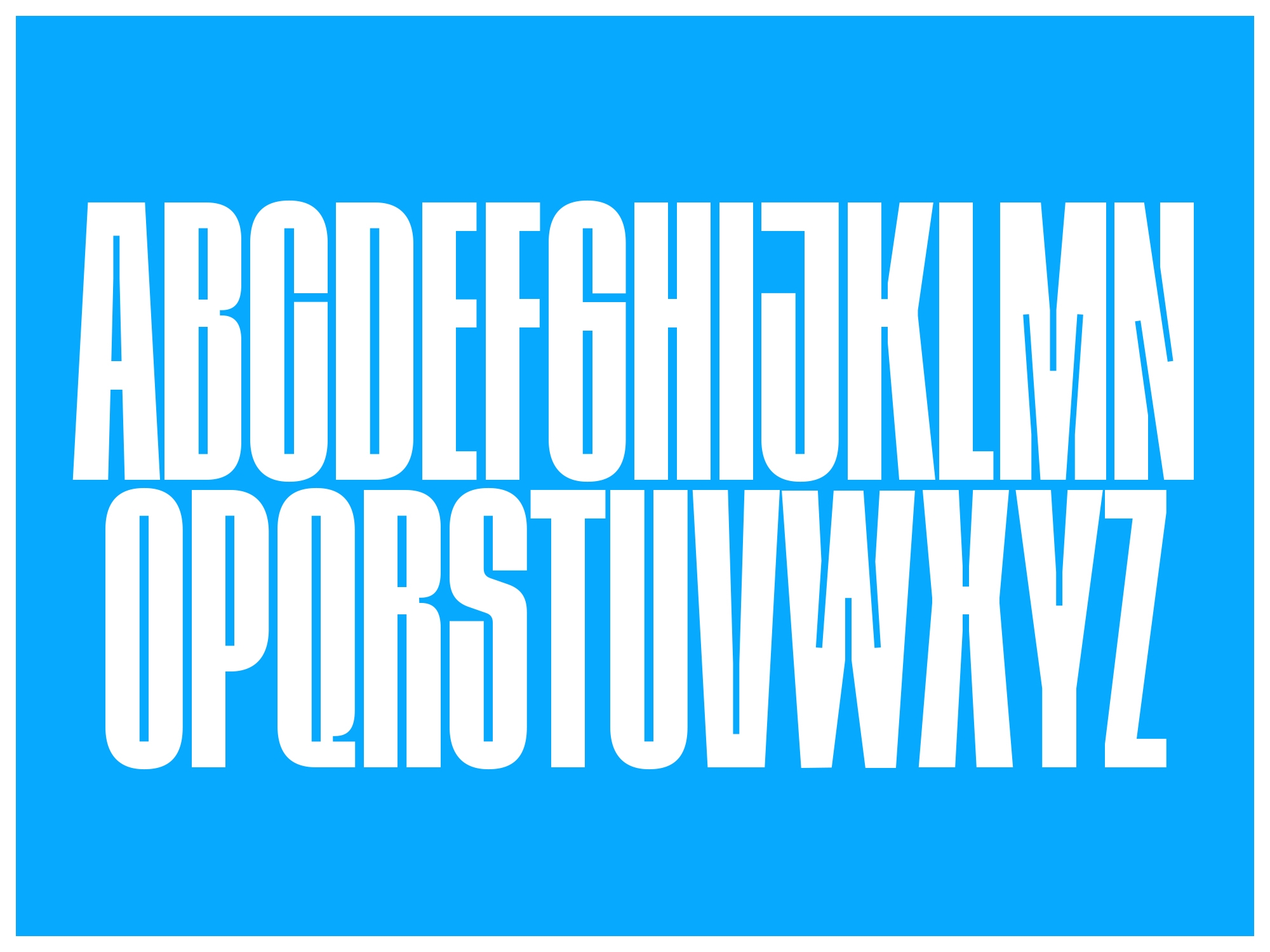
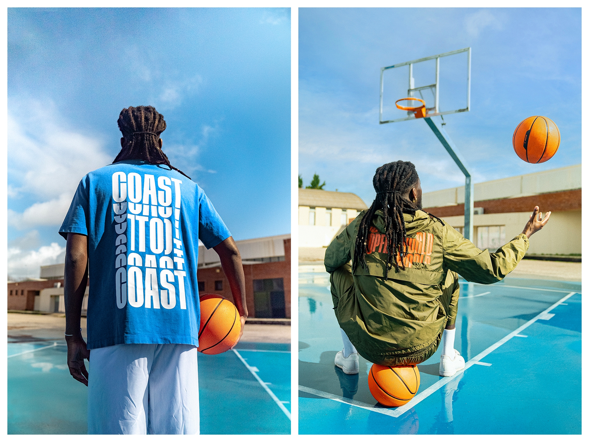
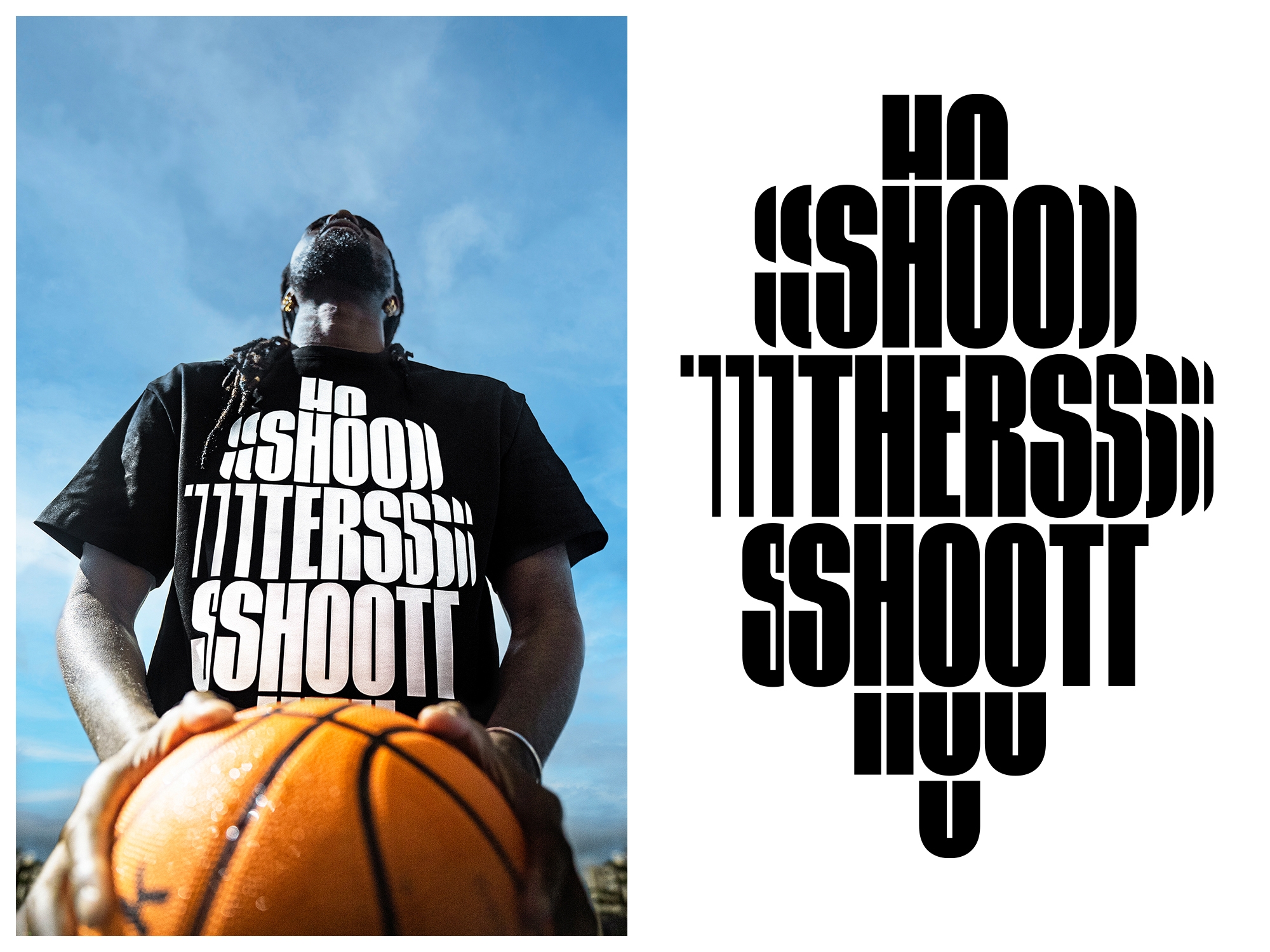
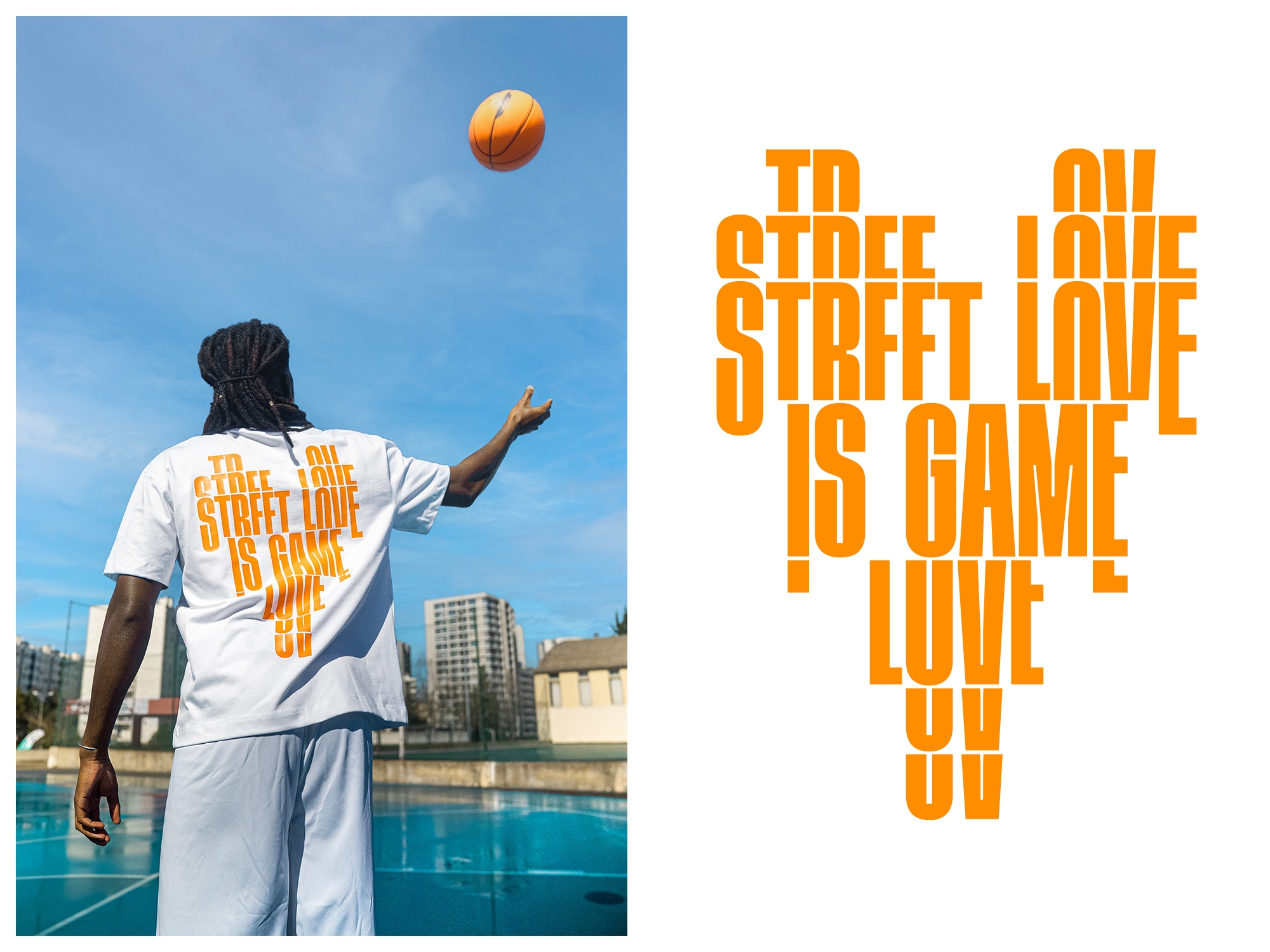
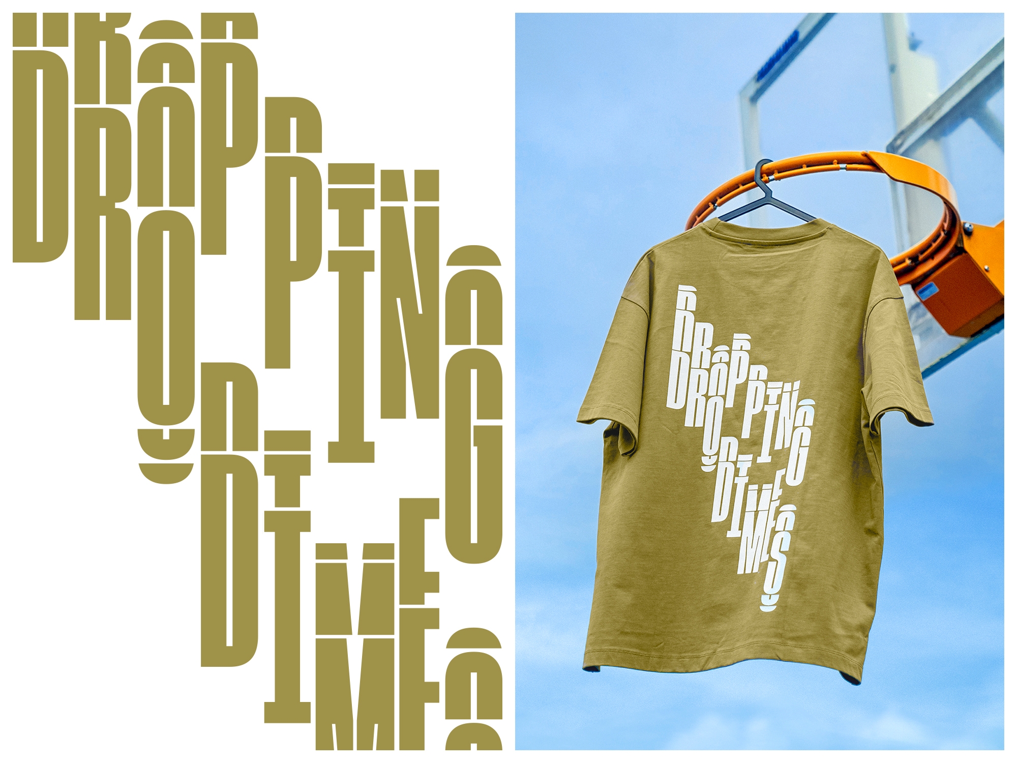
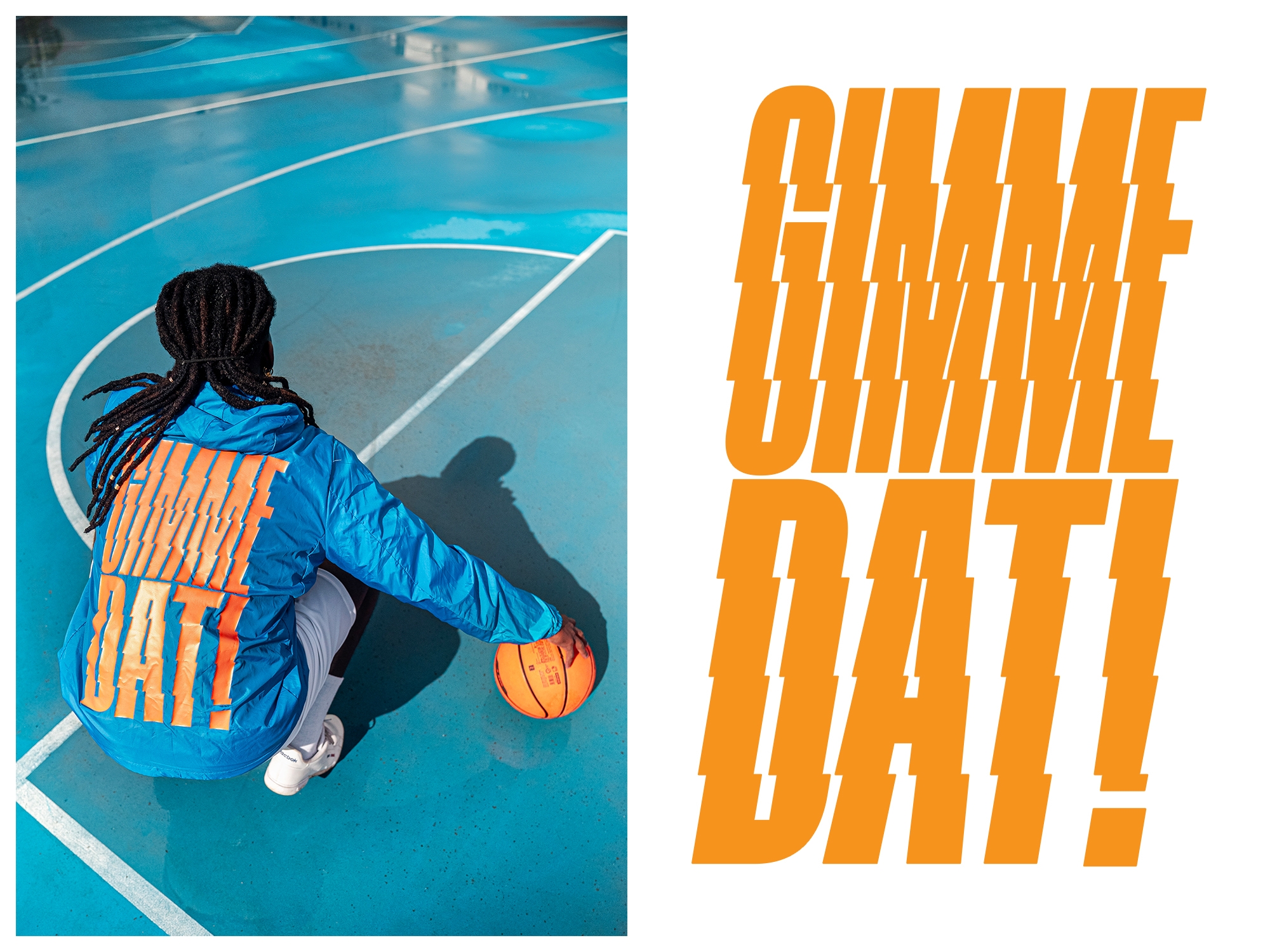
For the summer launch of Hoopers Club, I created bold typographic compositions featuring basketball slang and expressions that reflect the brand’s identity. To stay true to their vision, I designed a custom display typeface inspired by the geometry of a basketball. The typeface embodies a bold, urban spirit with sharp contrast between straight and curved lines, while condensed letterforms emphasise vertical movement. Final pieces were crafted by cropping, rearranging, and manipulating type, merging basketball’s motion with streetwear aesthetics.
Silver Award Clube da Criativade de Portugal