IDA 2026 IS NOW OPEN - REGULAR DEADLINE: AUGUST 15
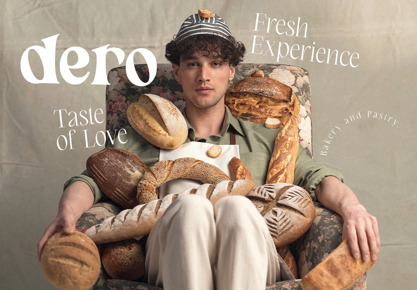
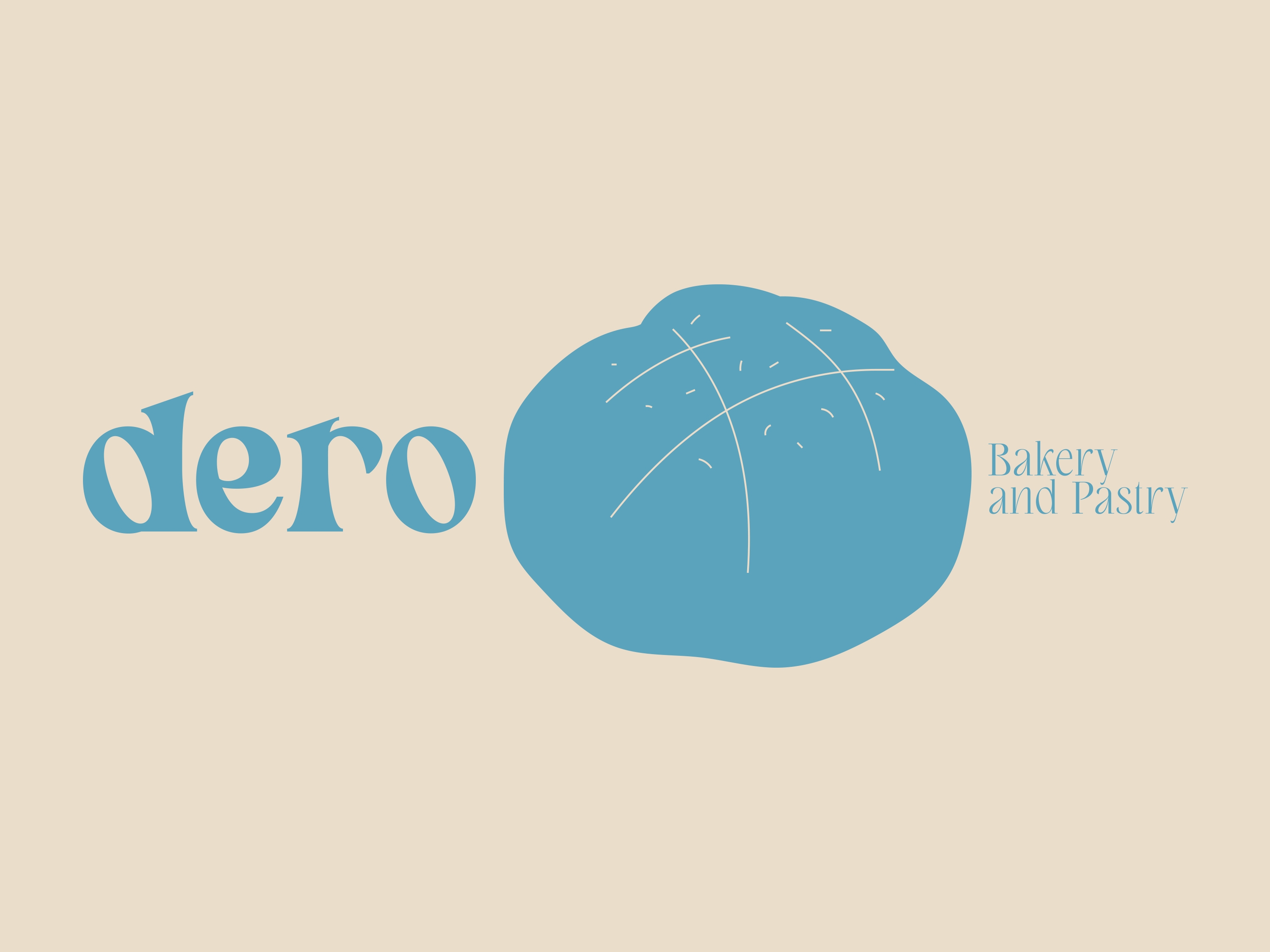
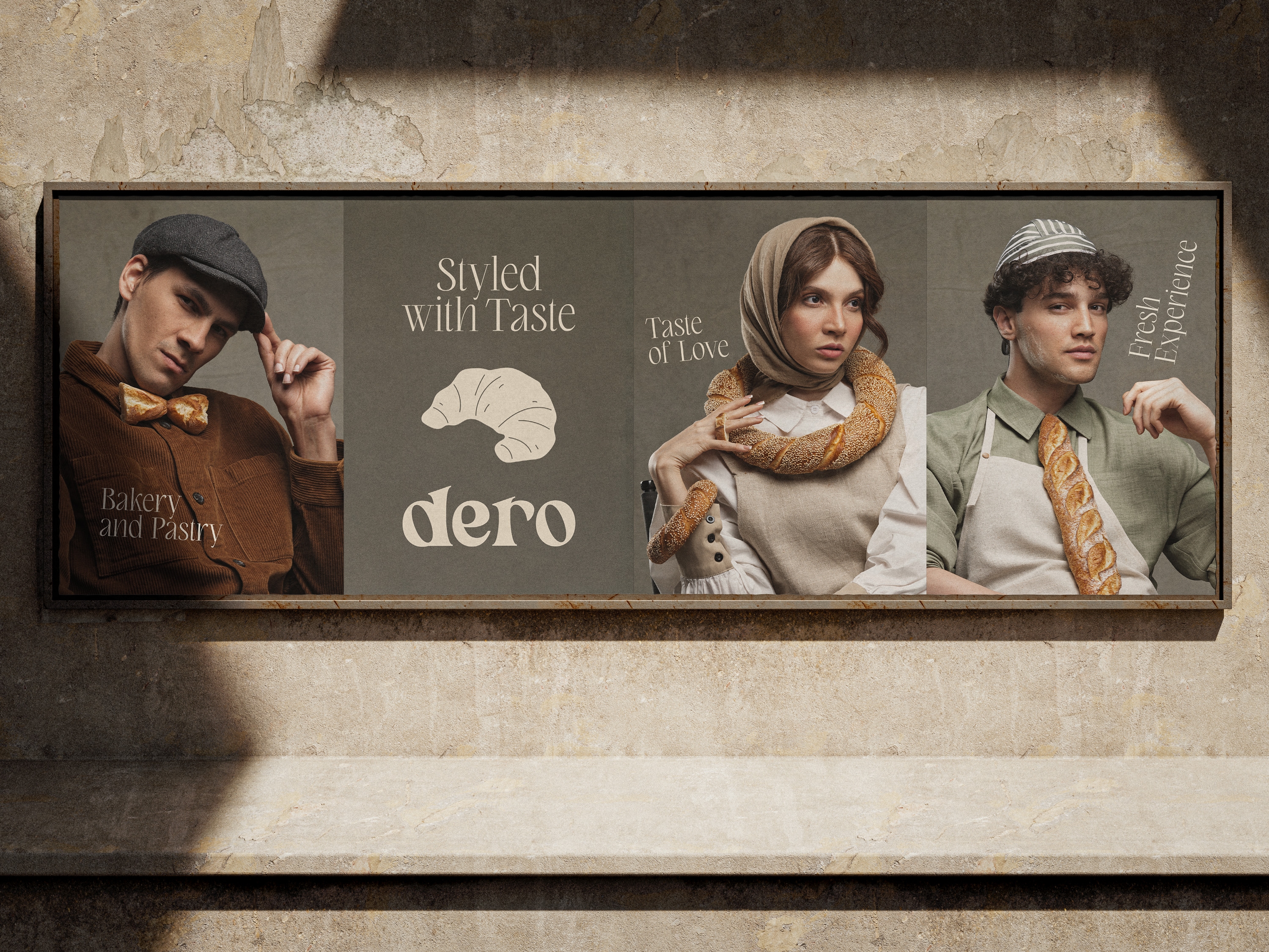
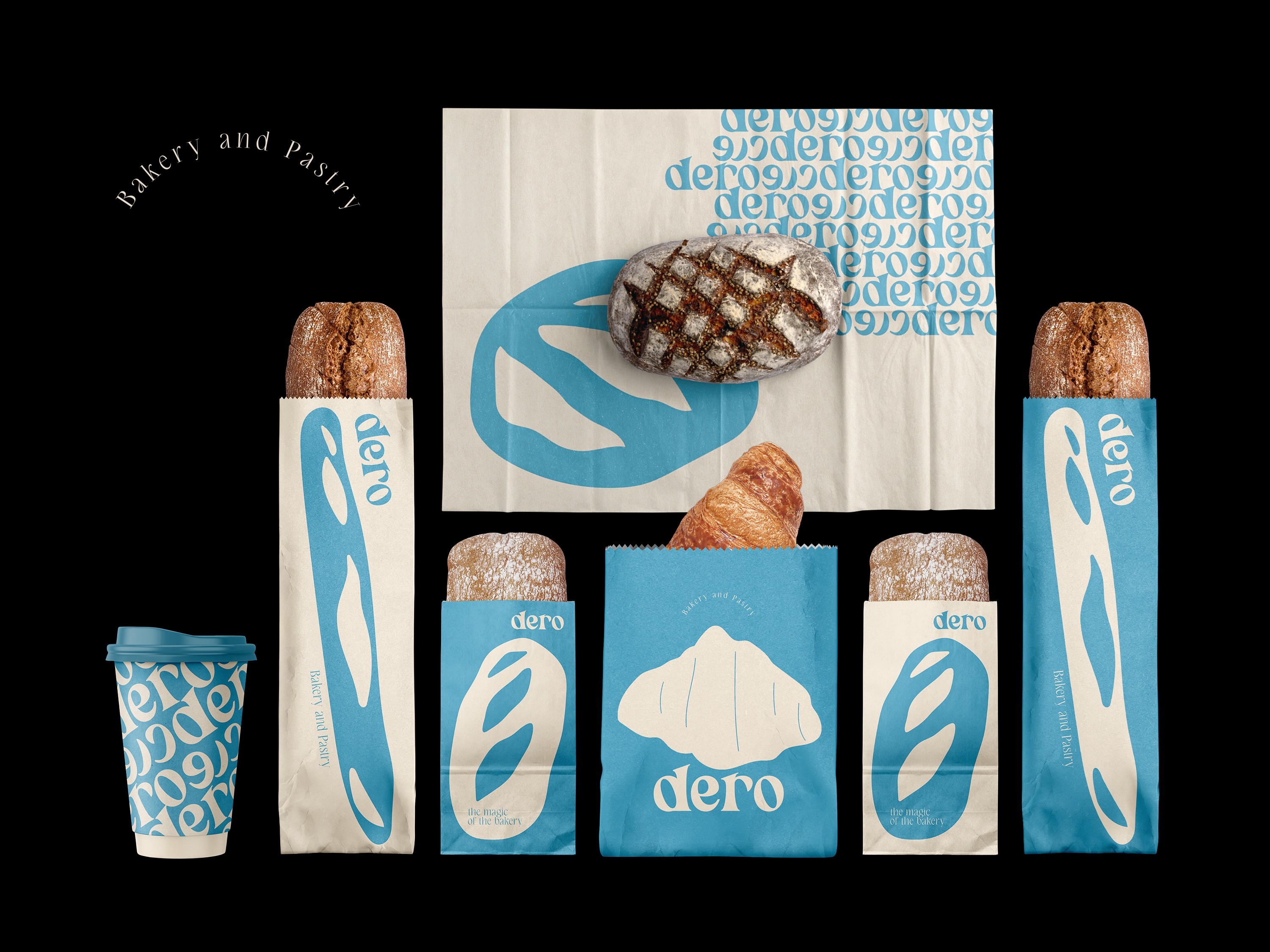
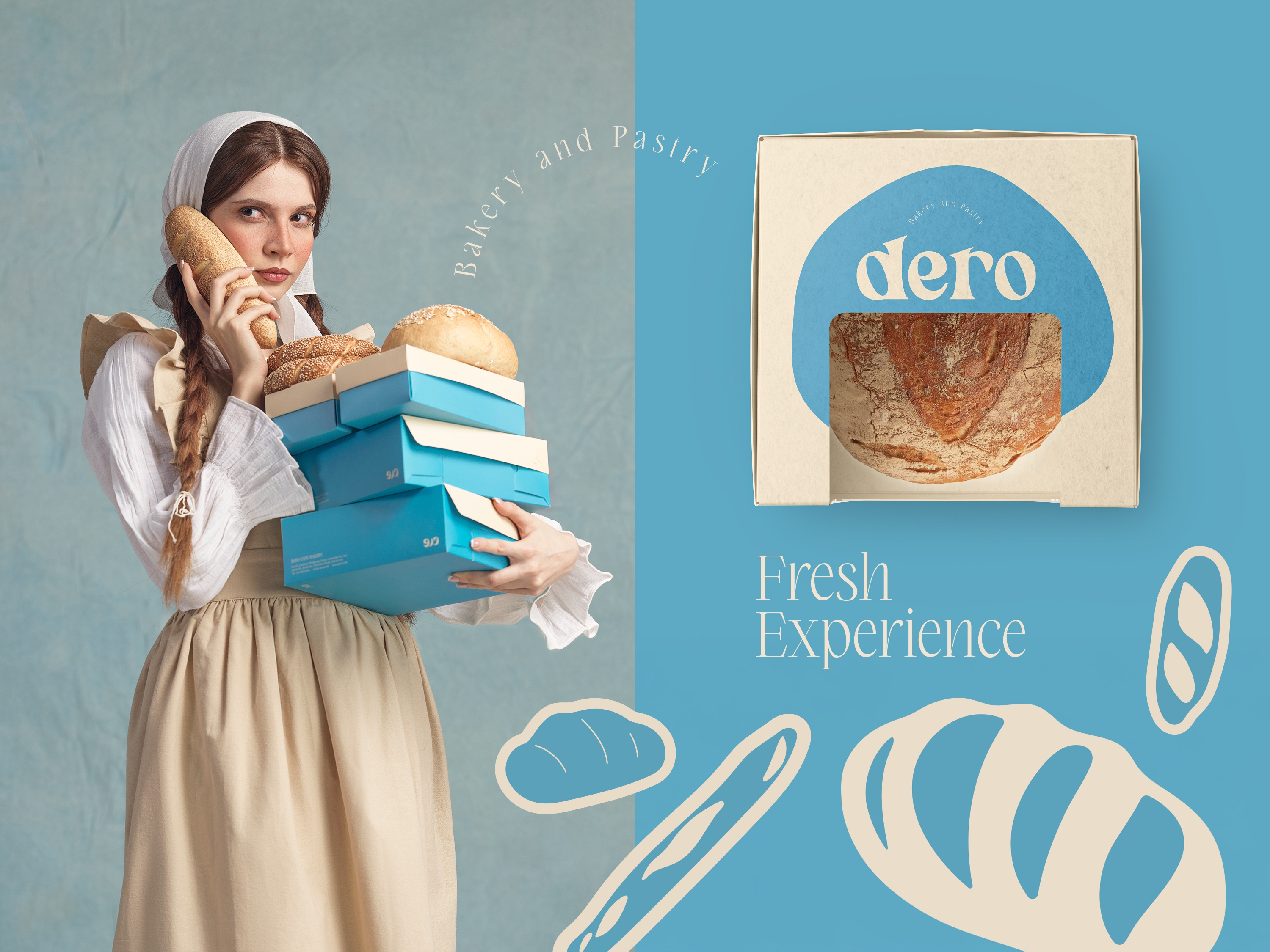
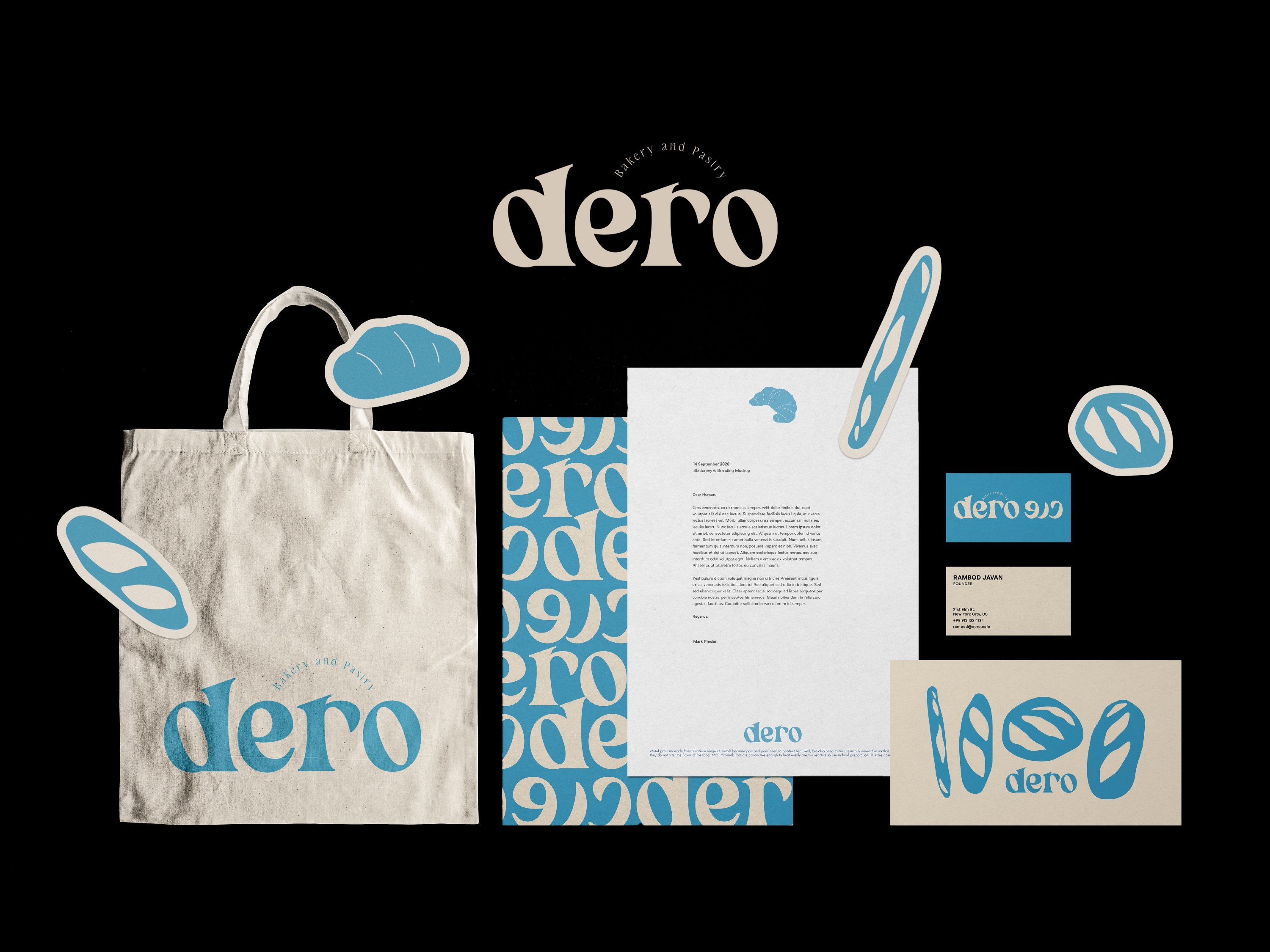
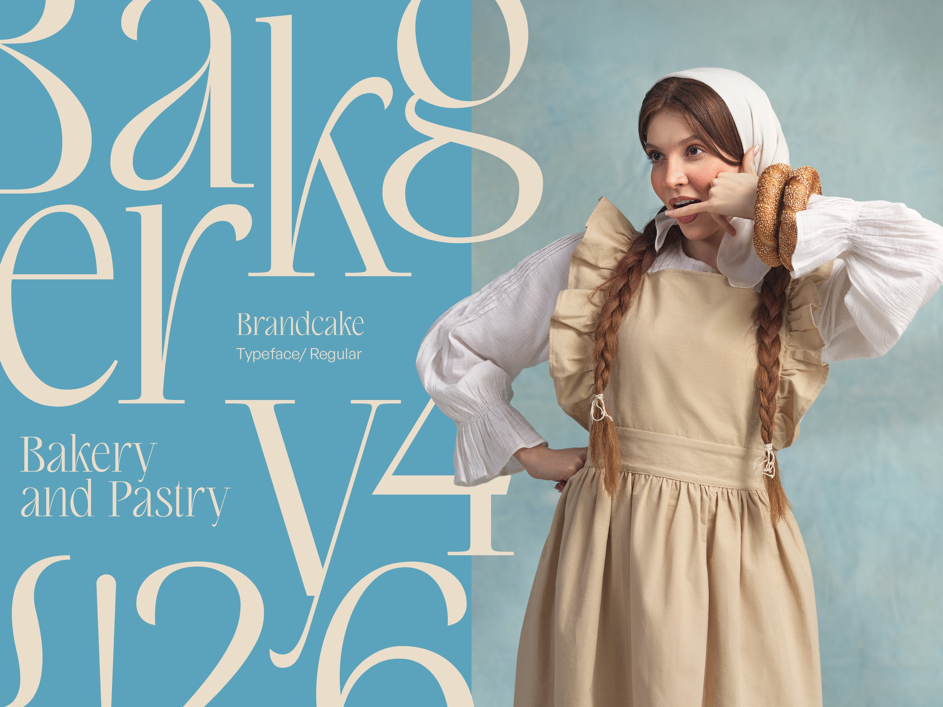
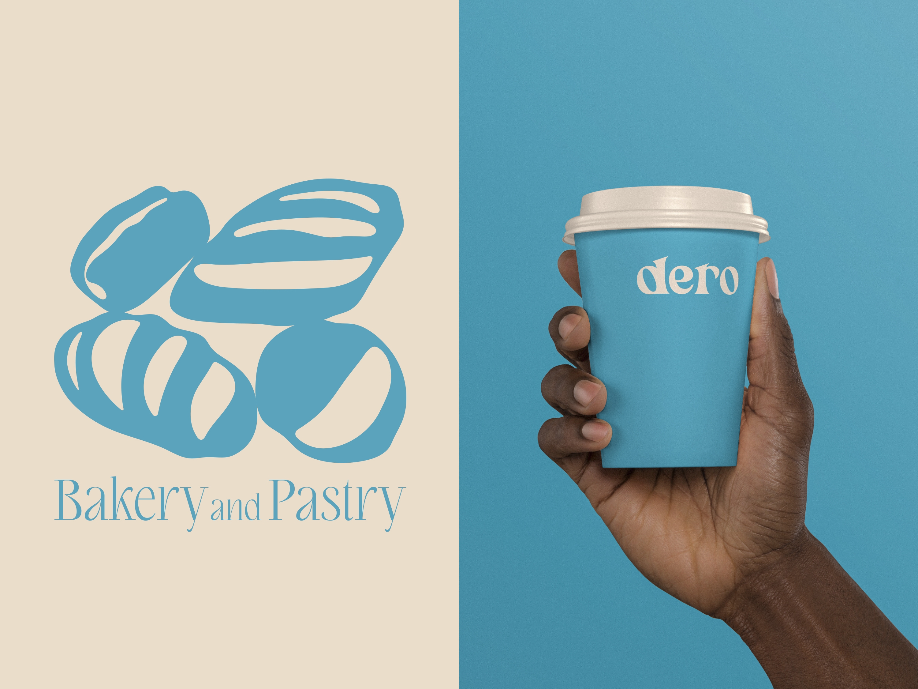
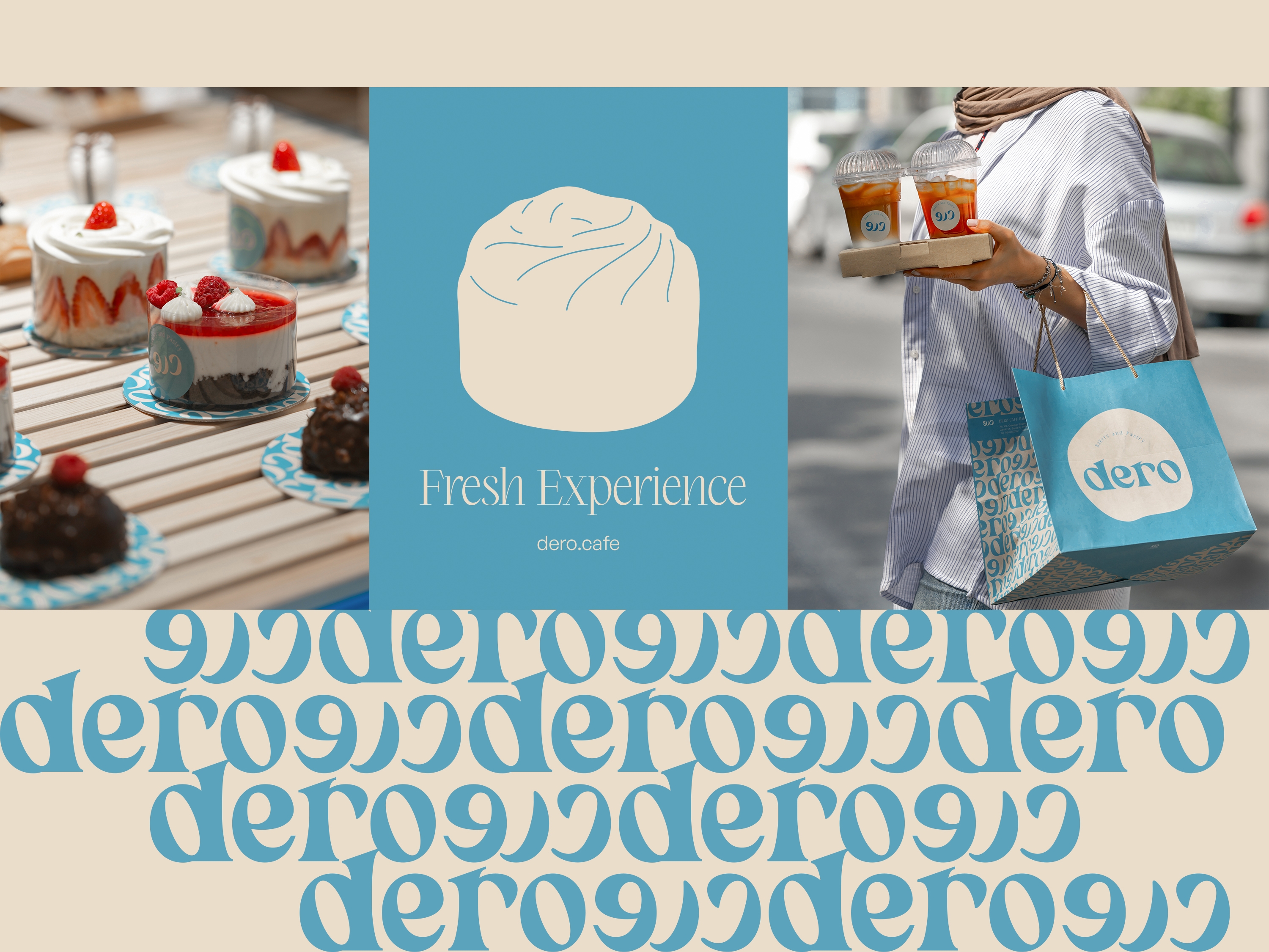
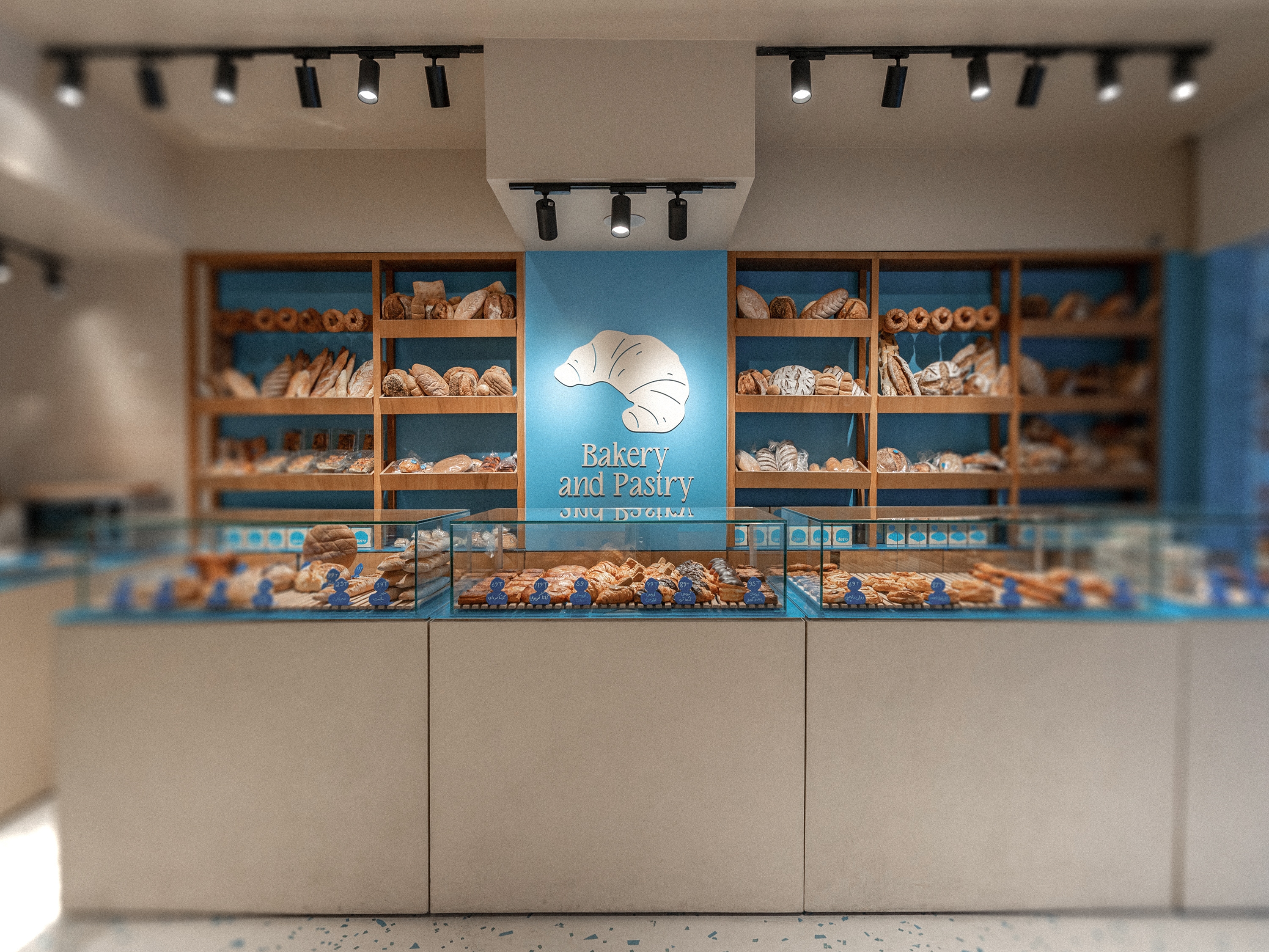
Dero means “to harvest” in Persian. Seeking to tap into Iran’s growing bakery trend and appeal to younger audiences, the brand was built around artisanal bread with a modern, playful identity. we gave each branch a distinct color. The main store adopted blue to break away from conventional warm bakery tones. A simple bold logotype was paired with a Latin typeface, which became a key element in packaging design and served as the foundation for adaptable patterns. Playful illustrations and photography added charm and a subtle touch of humor, keeping the identity fresh and engaging.
Since 2013, we’ve been building unique brand identity and visual language for a wide range of high-profile brands and enterprises, helping them stand out with identities that turn brand vision into lasting impact. Our projects reach across continents, and our experience is equally broad. We work with clients across the U.S., Europe, and the Middle East, serving a wide range of industries; from banking and energy to education, entertainment, fashion, and manufacturing. Specializing in comprehensive visual solutions, the agency offers expertise in brand identity, packaging design, and beyond.
2024/25, Silver, World Brand Design Society Award
2024/25, Bronze, World Brand Design Society Award
2025, Silver, Muse Design Award
2025, Gold, Muse Creative Award
2025, Gold, Muse Creative Award
2025, Gold, Muse Creative Award
2025, Gold, Muse Creative Award
2025, Gold, Muse Creative Award
2025, Silver, A'design Award
2025, Bronze, A'design Award
2025, Gold, Pentawards
2025, Gold, IDA Awards
2025, Silver, IDA Awards
2025, Silver, IDA Awards