IDA 2026 IS NOW OPEN - SUBMIT BY APRIL 15 TO GET A 10% EARLY BIRD DISCOUNT.
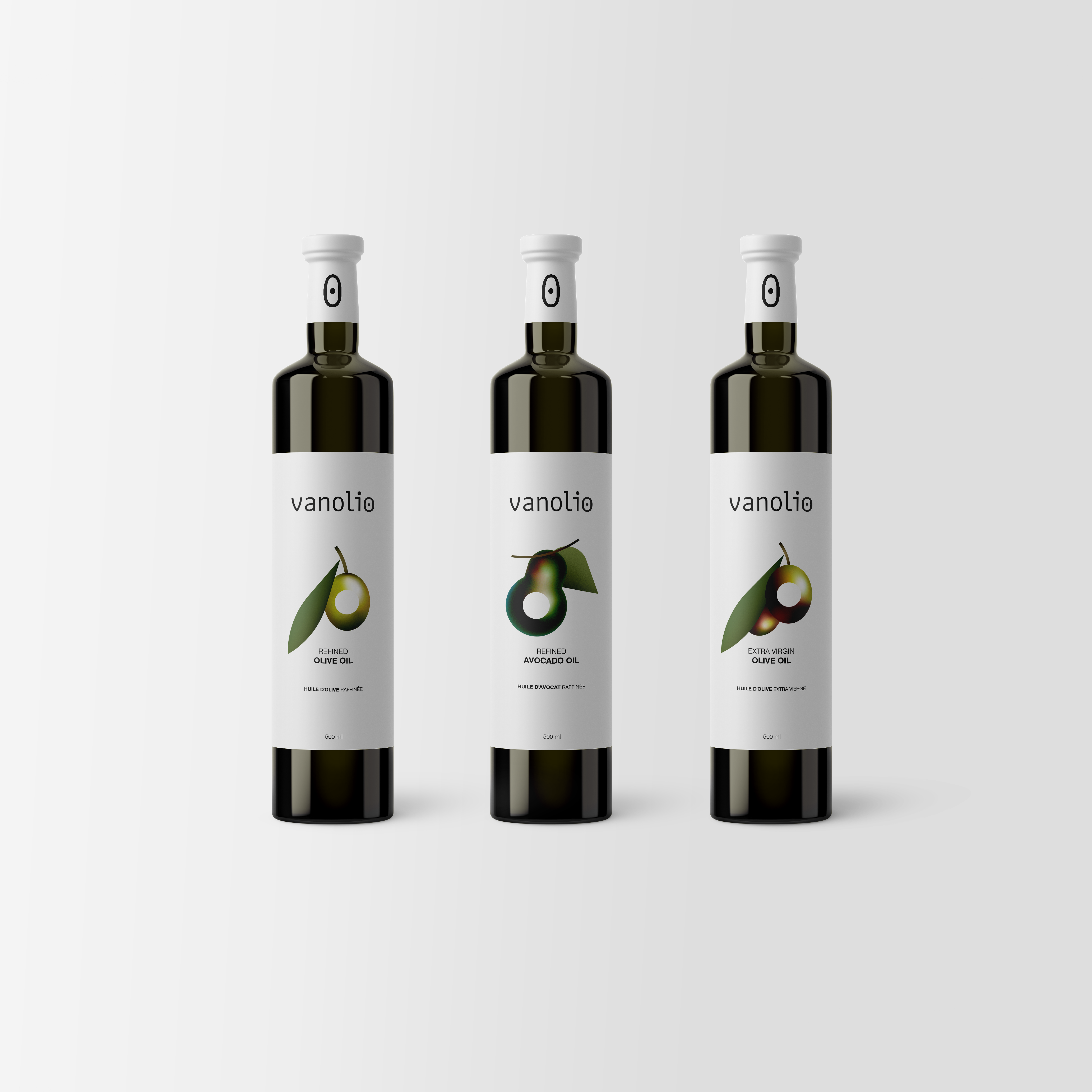
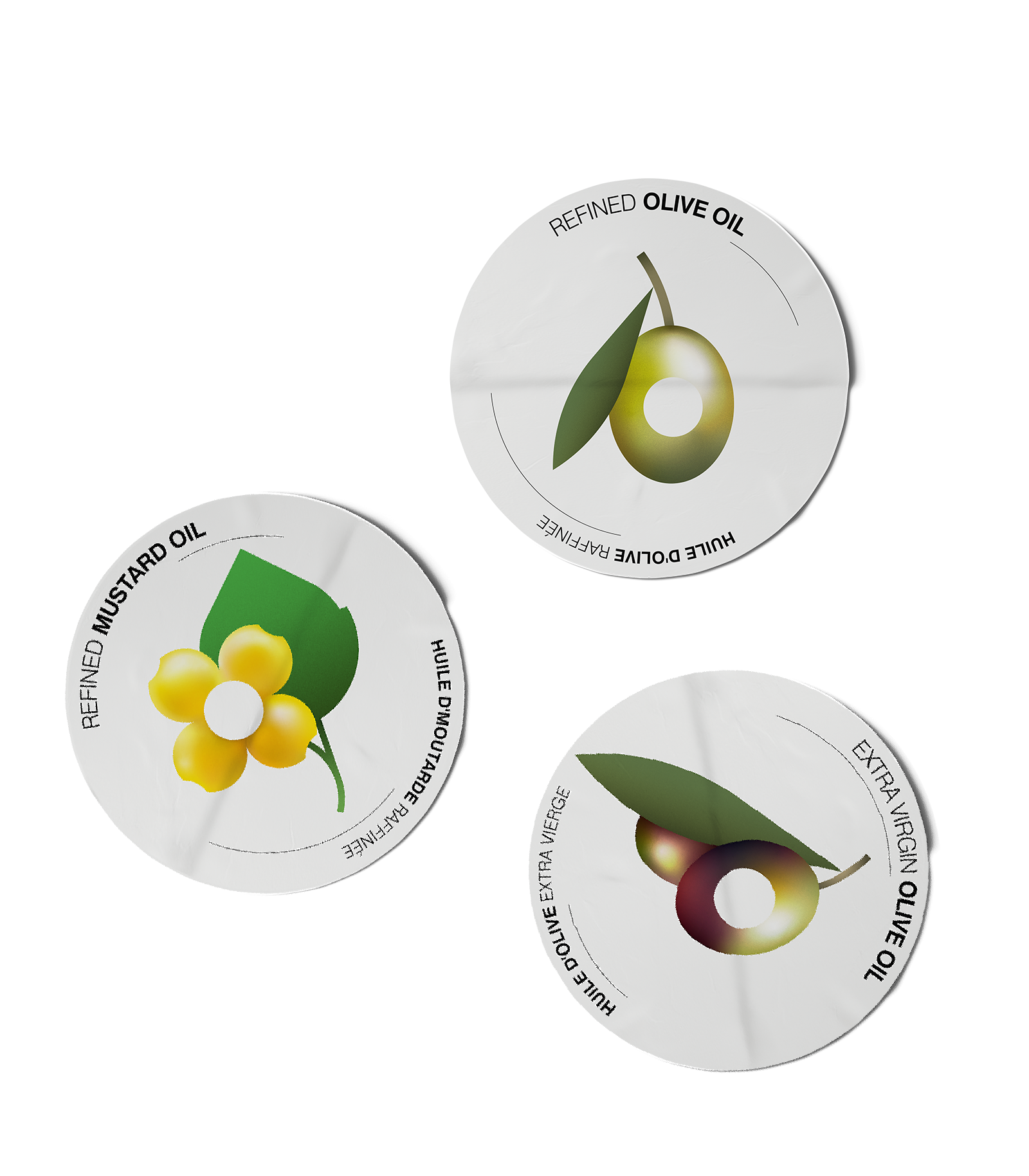
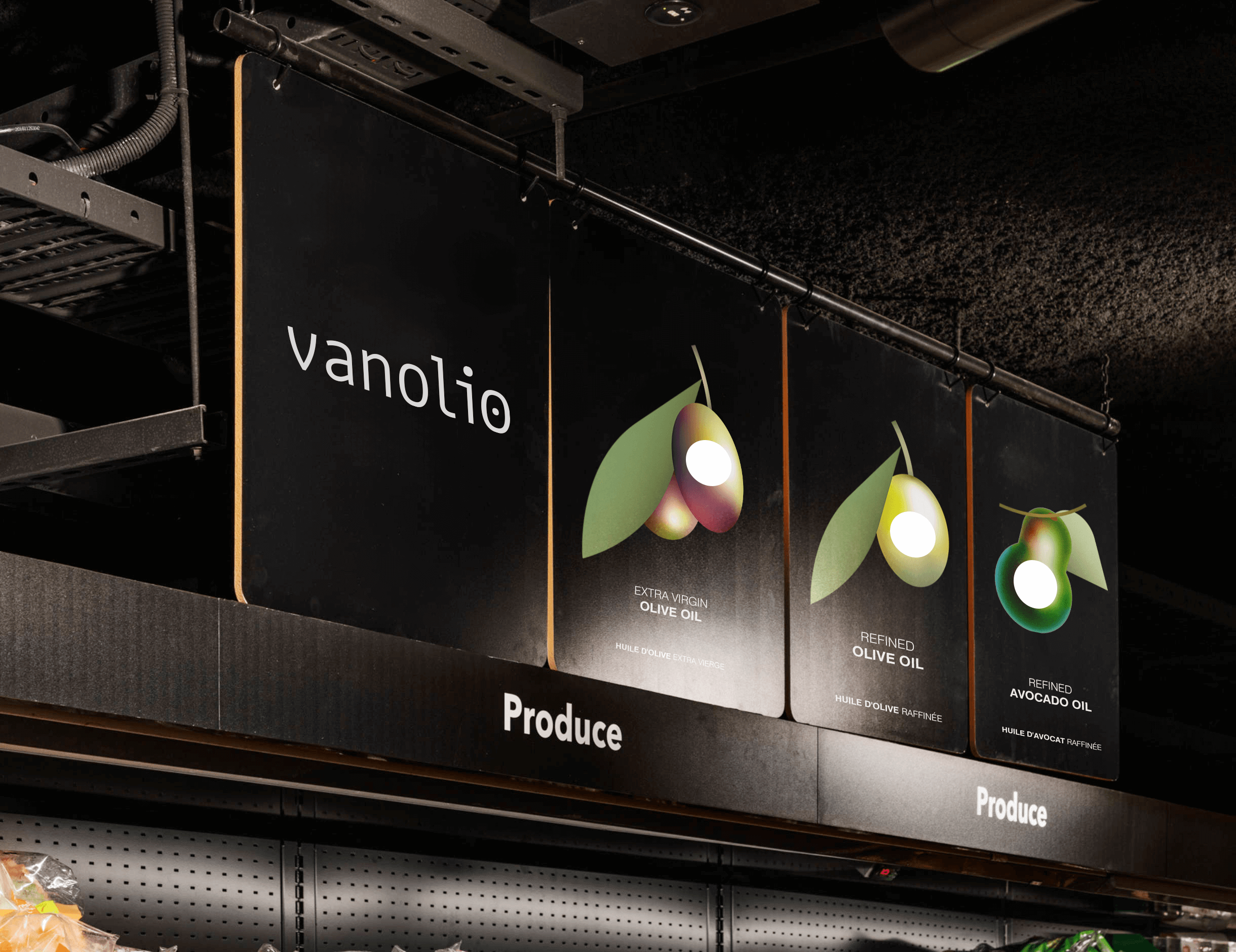
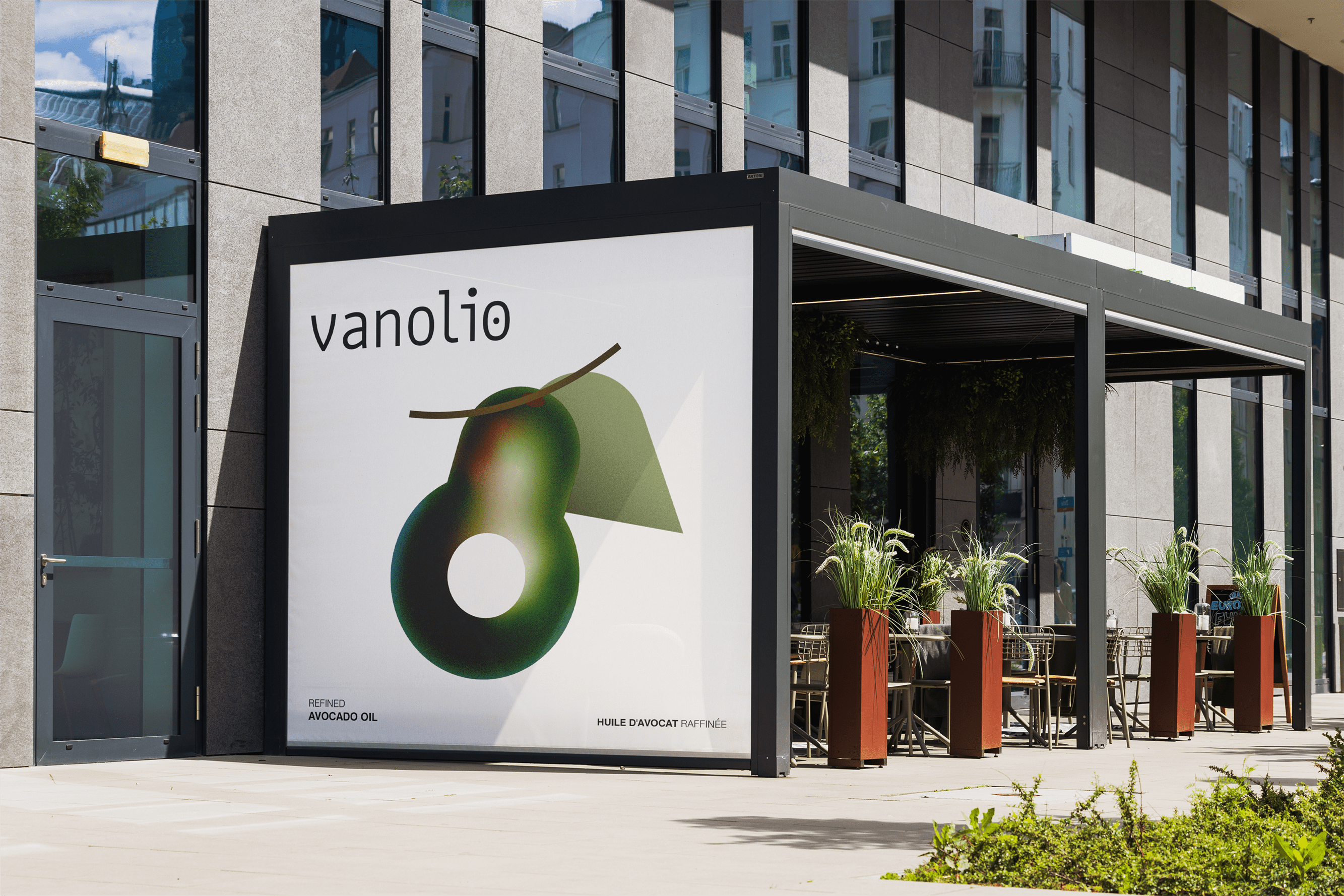
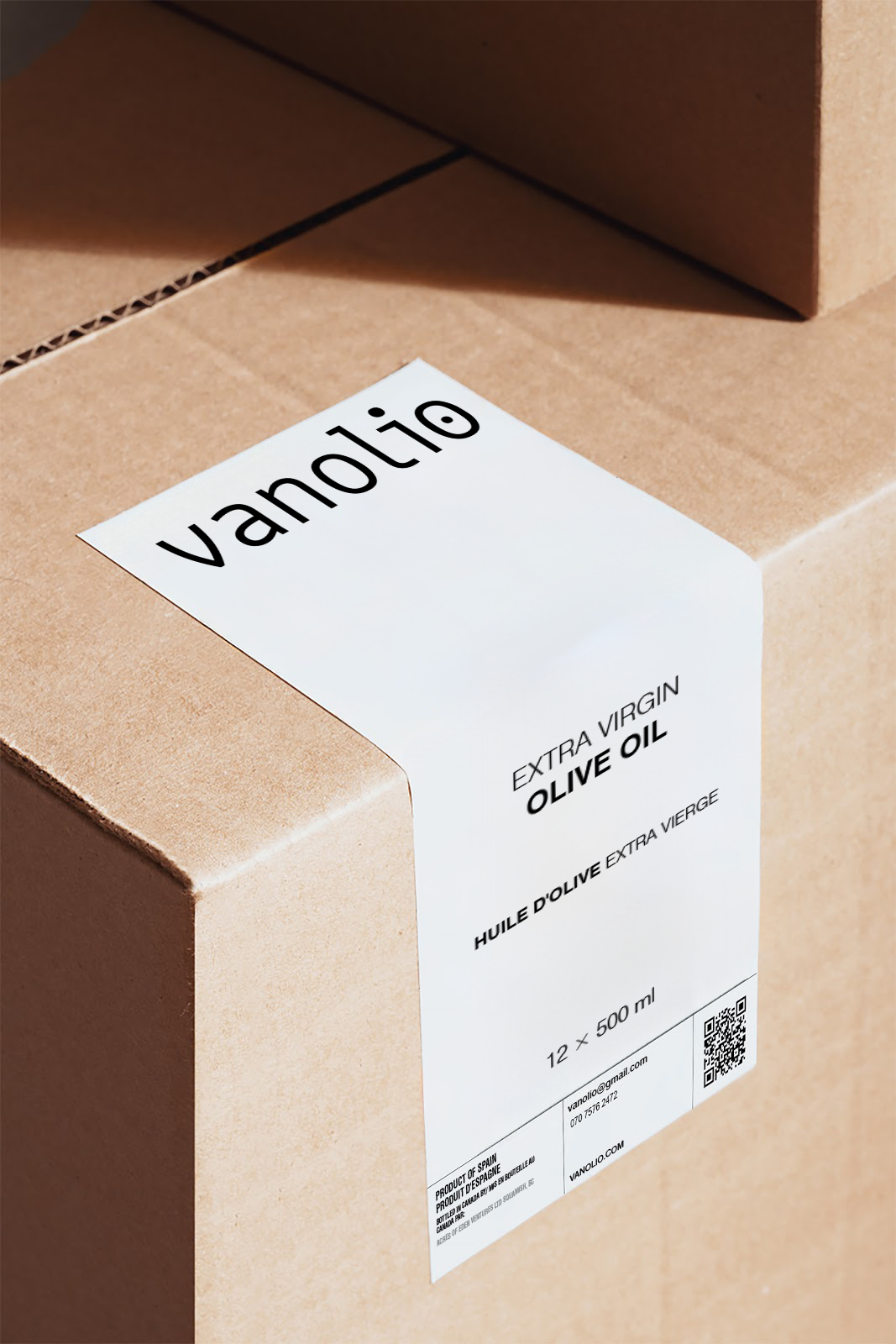
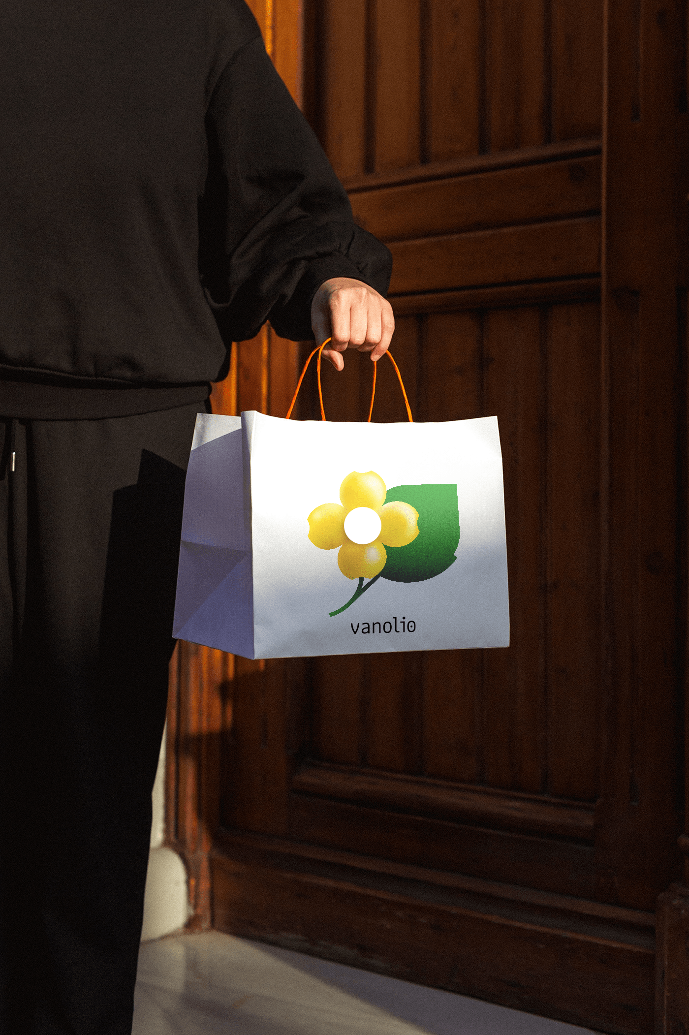
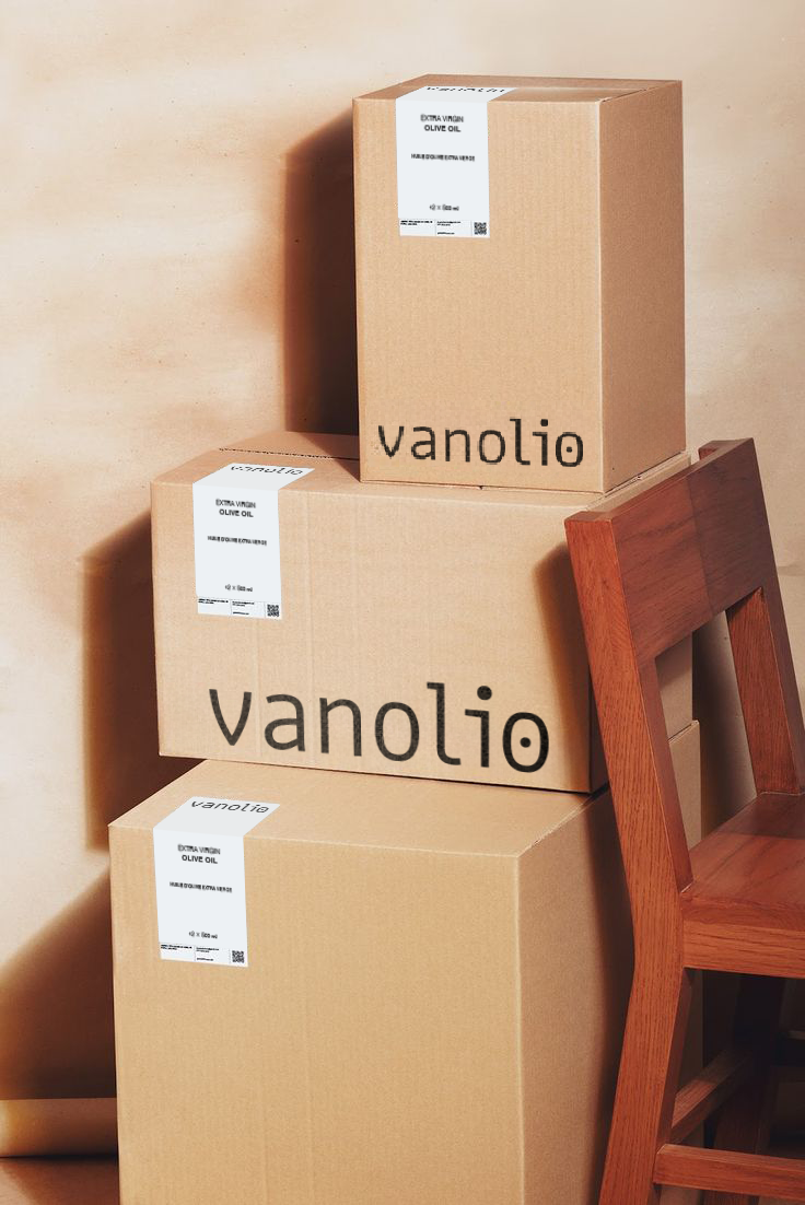
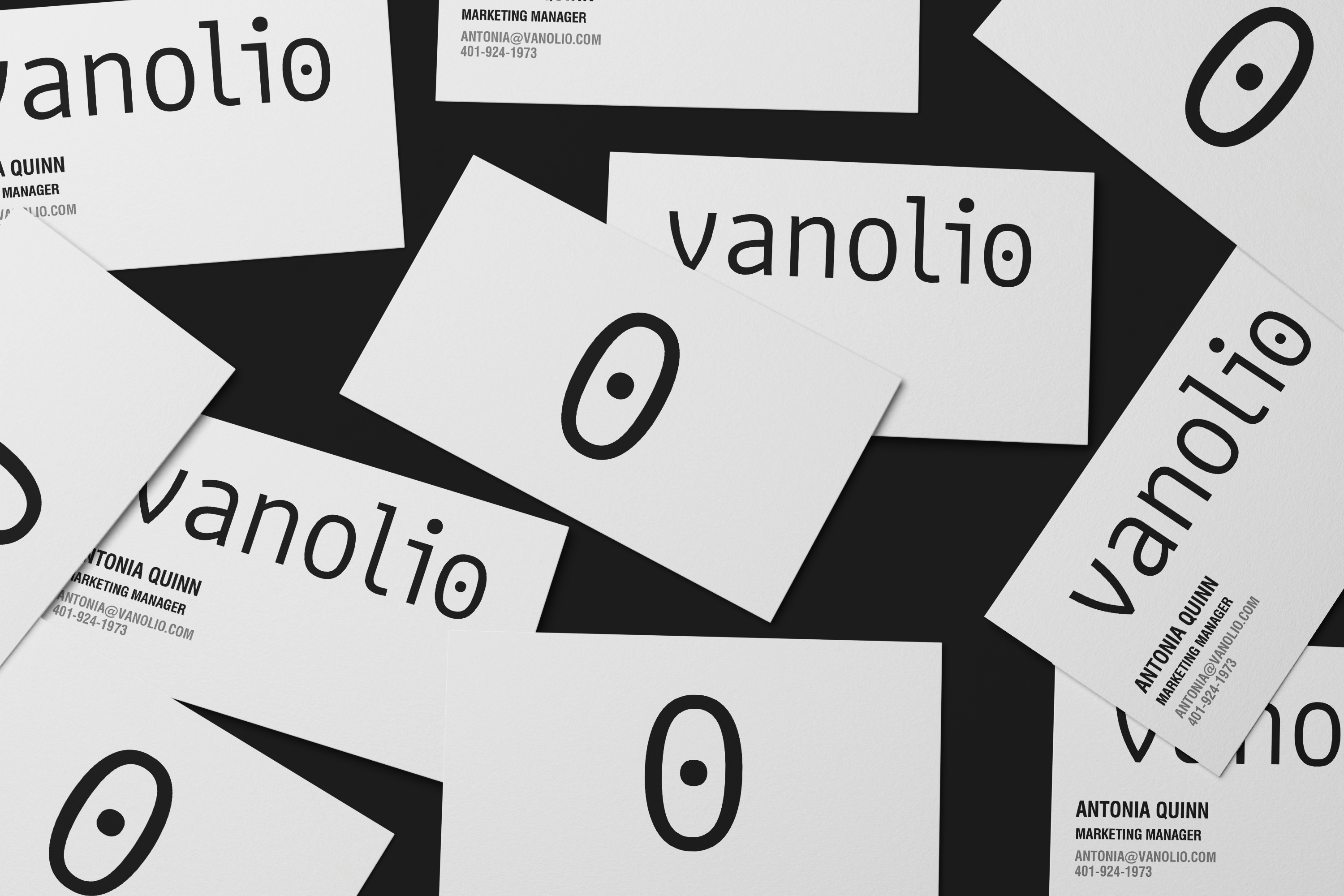
The client is a producer of edible oil, primarily made from plant seeds. In the branding process, we considered this characteristic as the core idea, ensuring that the seed symbol plays a central role in both the logo design and the label graphics.
As a designer, creating brings me joy—whether it’s designing a font, a product package, or the branding and visual identity of a brand.
Alongside this, I always enjoy learning new skills, as it helps me offer fresh and practical ideas.