IDA 2026 IS NOW OPEN - SUBMIT BY APRIL 15 TO GET A 10% EARLY BIRD DISCOUNT.
Design Elements
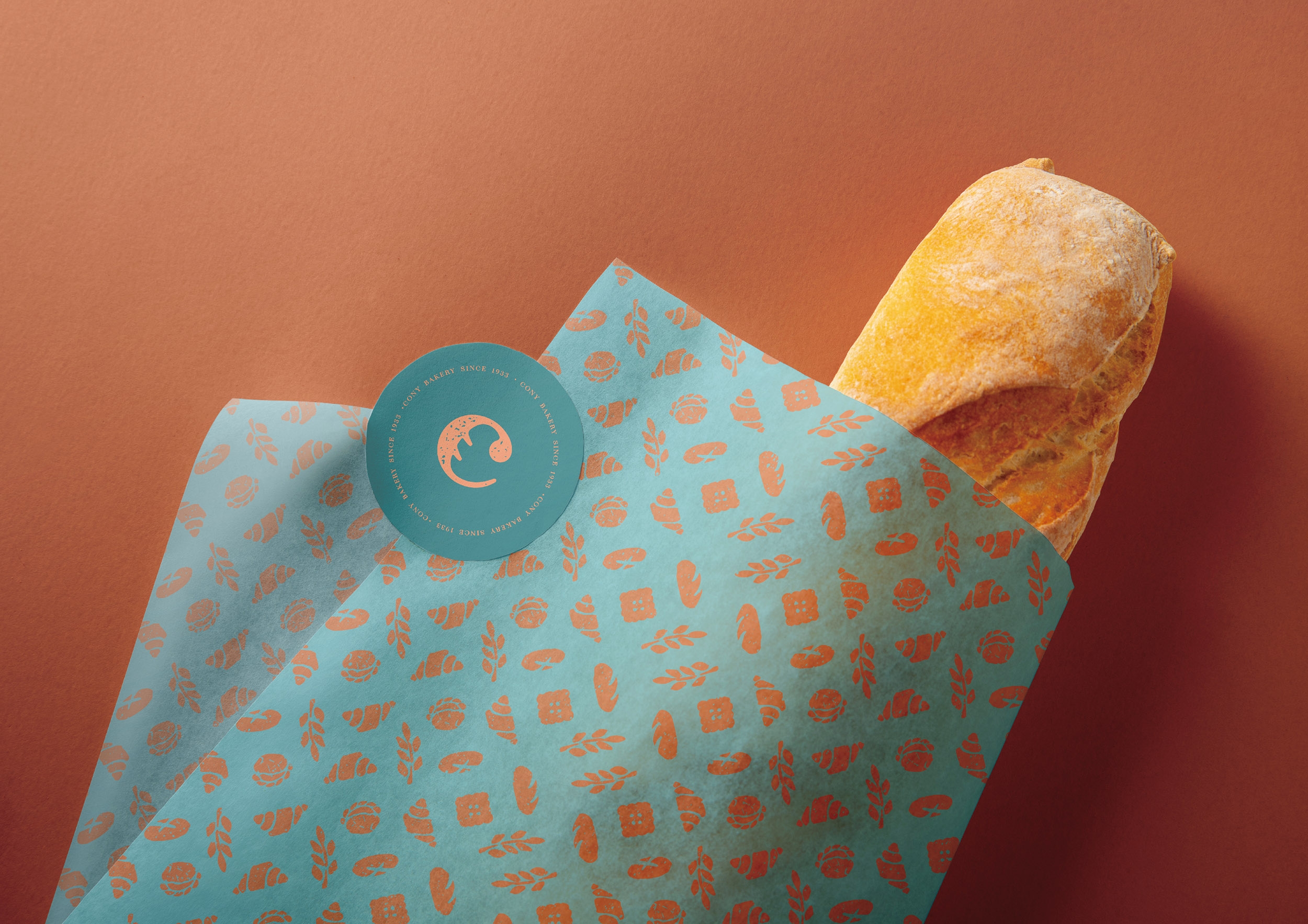
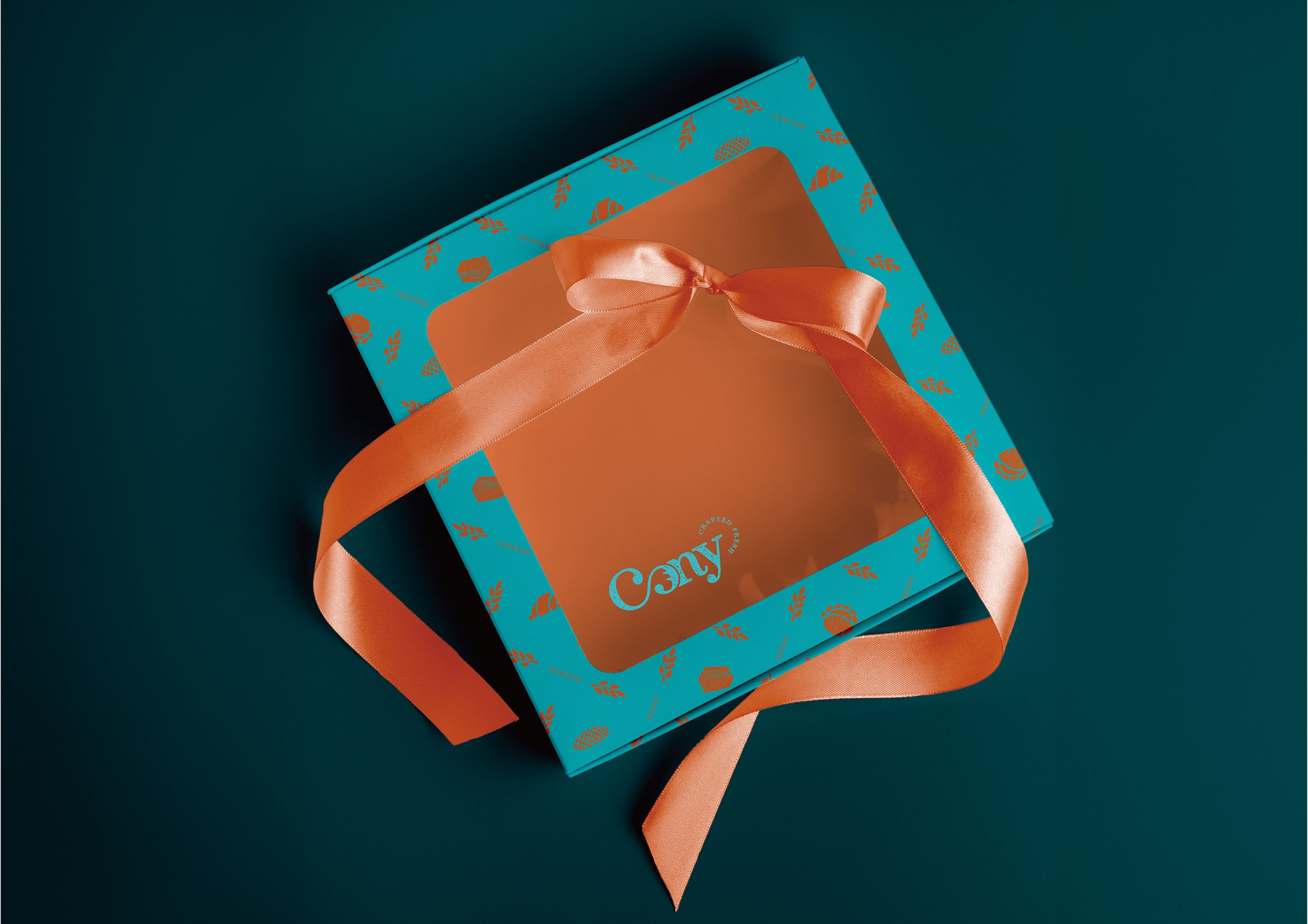
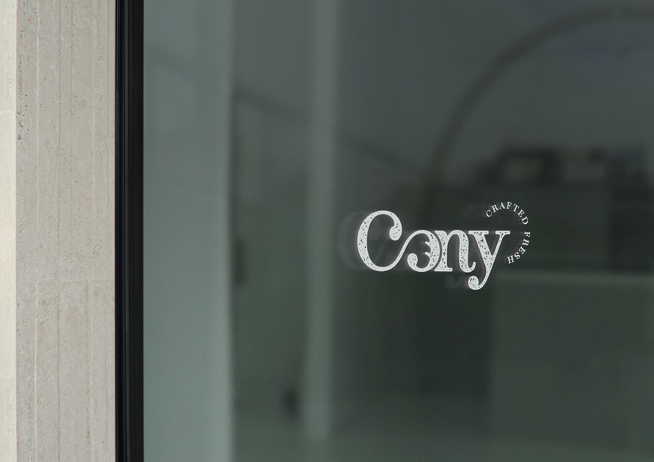
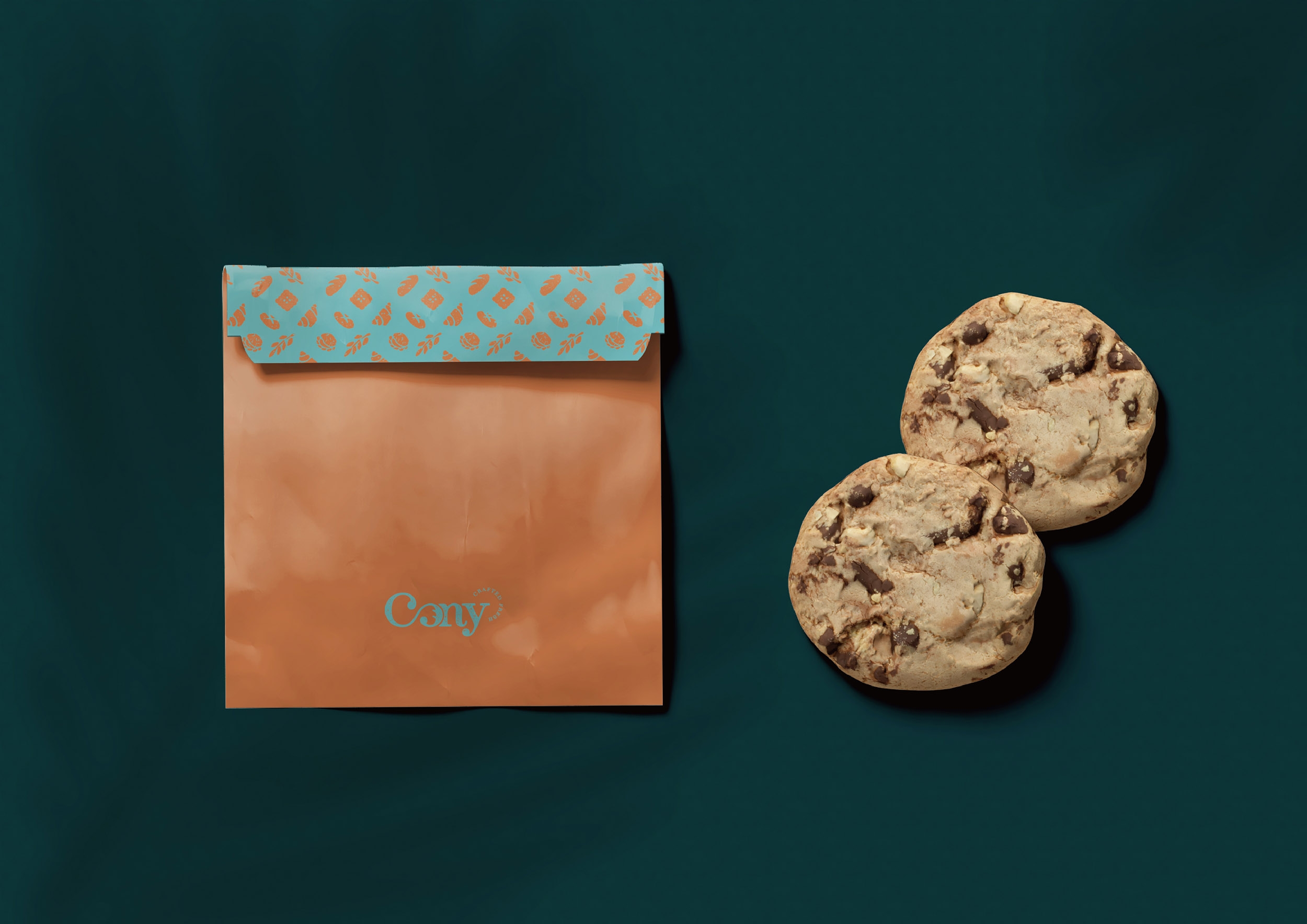
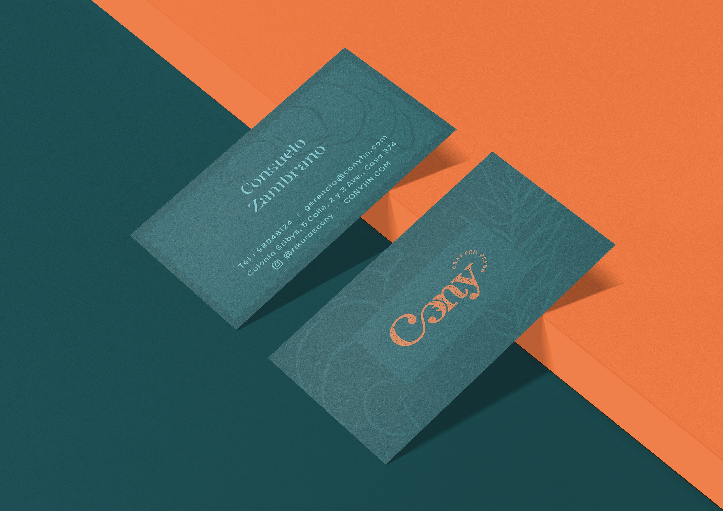
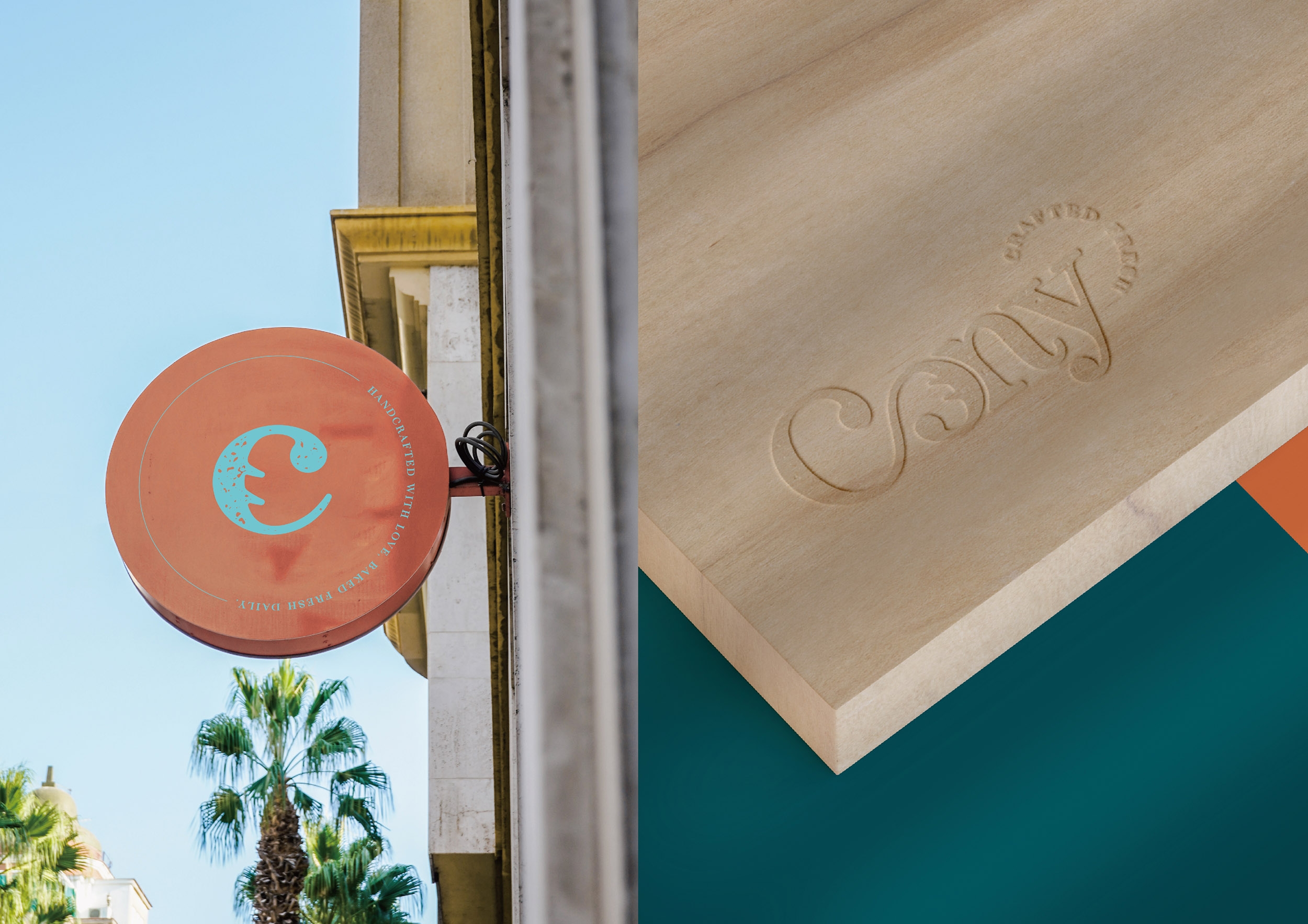
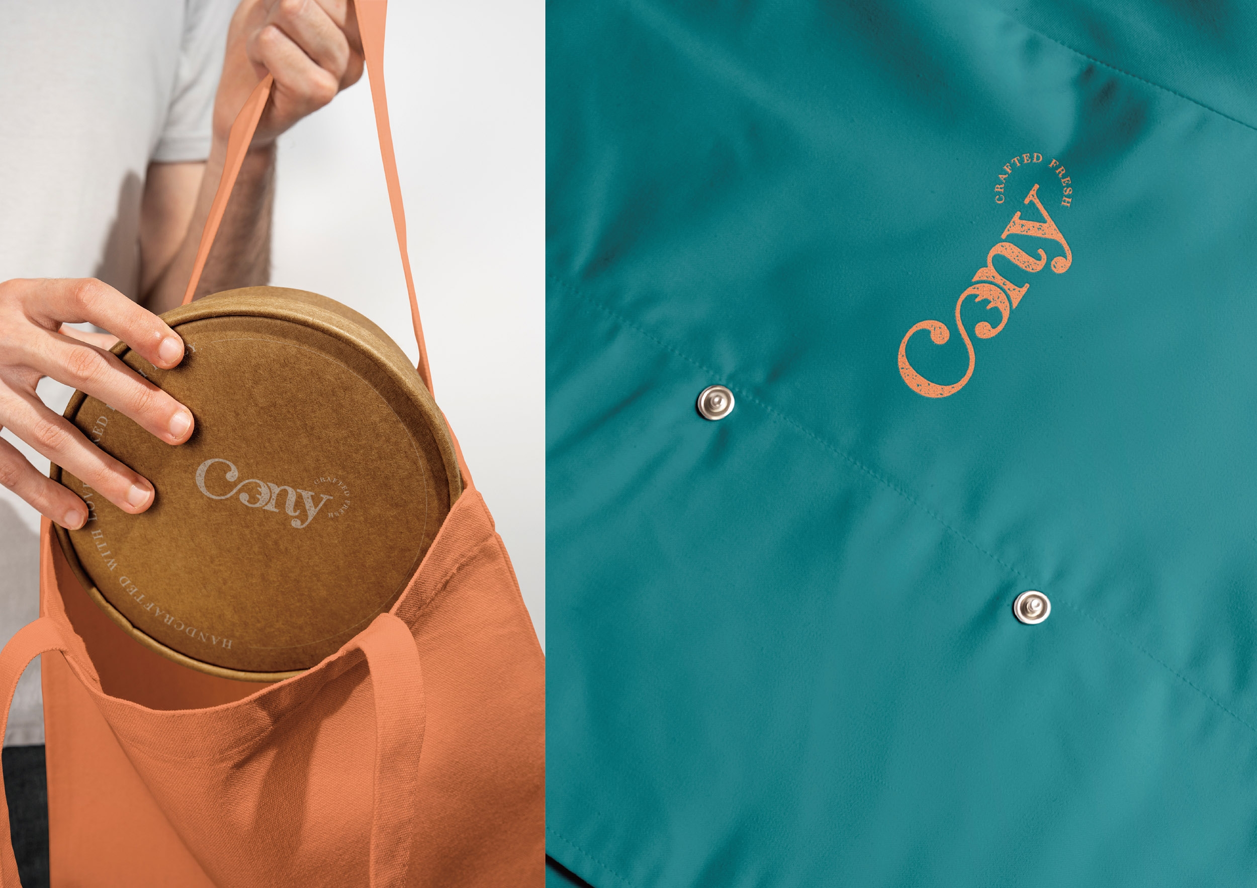
The letters "Co" are linked together, mimicking the folding and kneading of dough. A bread image is embedded in the "O," symbolizing the baking industry and adding a sense of craftsmanship.
Style
The design uses a serif (script) typeface, blending decorative and minimal qualities. Smooth lines soften the simplicity, adding warmth and avoiding a rigid look. The design resembles a stamp, evoking a handcrafted feel.
Color
A high-contrast palette is used, with dark teal as the main color and bright orange accents. Brown and kraft tones add warmth, reflecting the baking industry.