EXPLORE THE IDA 2025 WINNERS - GET INSPIRED BY OUTSTANDING DESIGN!


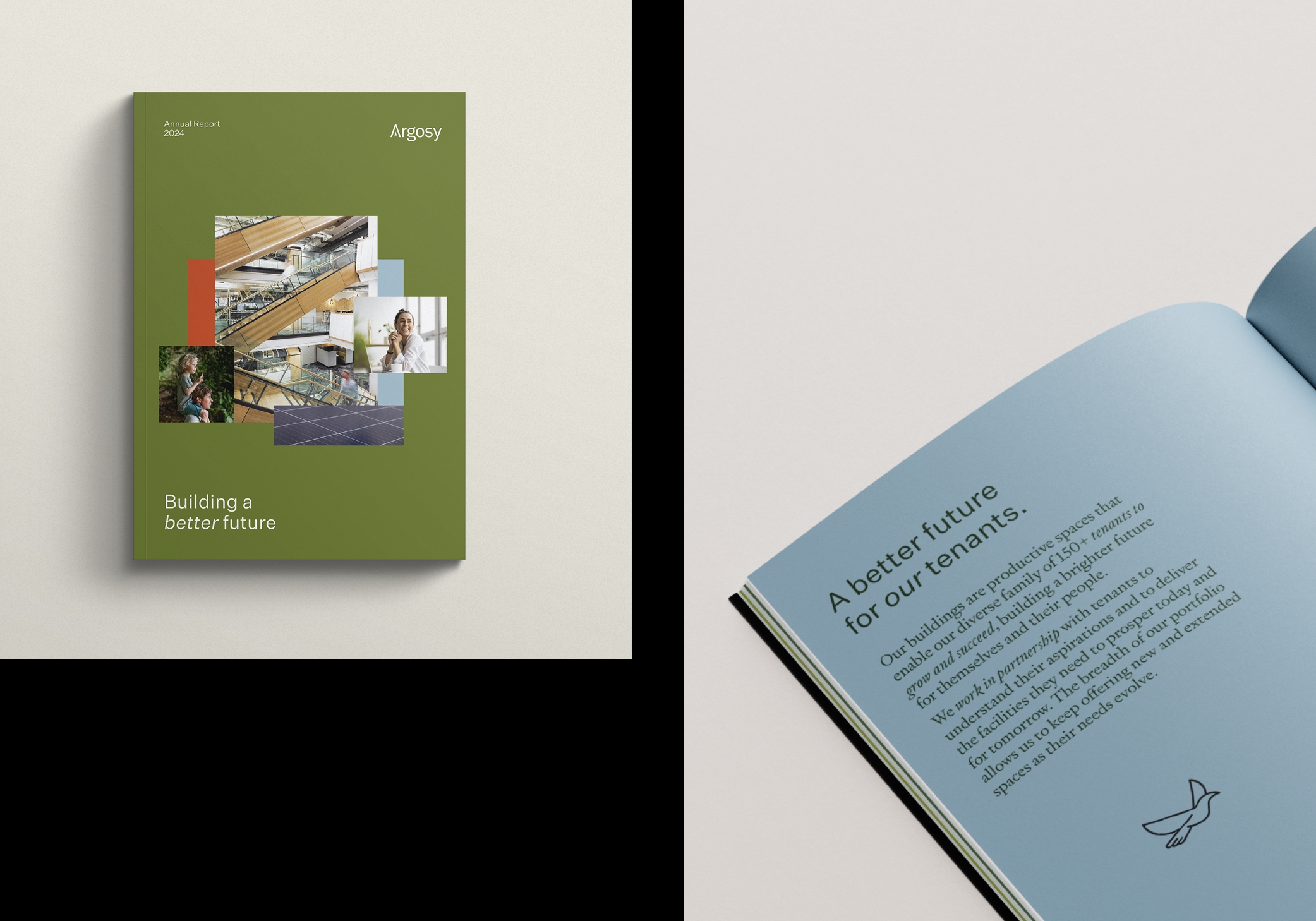


Argosy’s identity needed to evolve with their business. Our positioning ‘Building a Better Future’ unites their activities, creating a reason for audiences to care.
We started with a fresh, dynamic colour palette to capture a green community feel. Photography evolved from buildings to the people & activities in & around them. Icons were made softer & simpler & typography reflects property structure & a human element. The illustrative language offers a modular device to connect their ‘better future’ stories.
A sophisticated design has differentiated them & let them own the green narrative.