IDA 2026 IS NOW OPEN - SUBMIT BY APRIL 15 TO GET A 10% EARLY BIRD DISCOUNT.
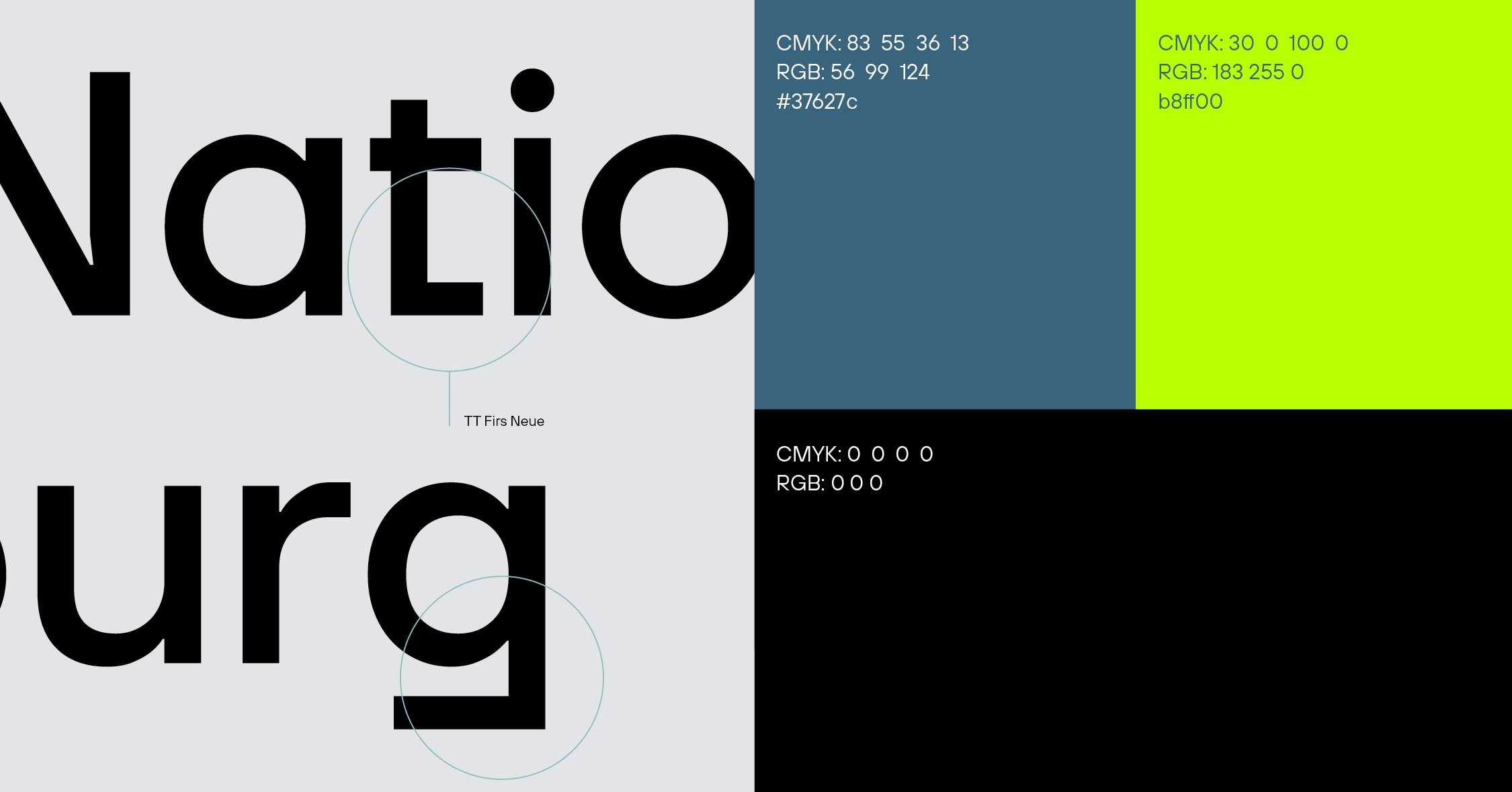
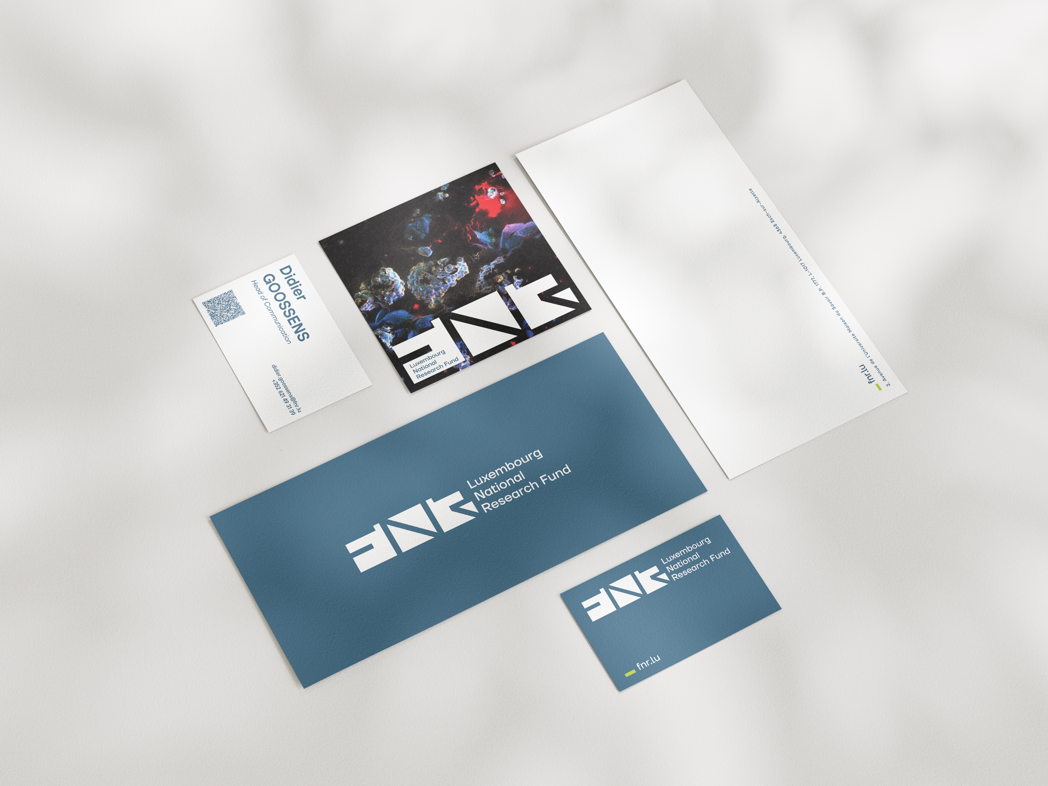
The new visual identity represents their commitment to advancing research in Luxembourg while reflecting the values of excellence, collaboration, and impact.
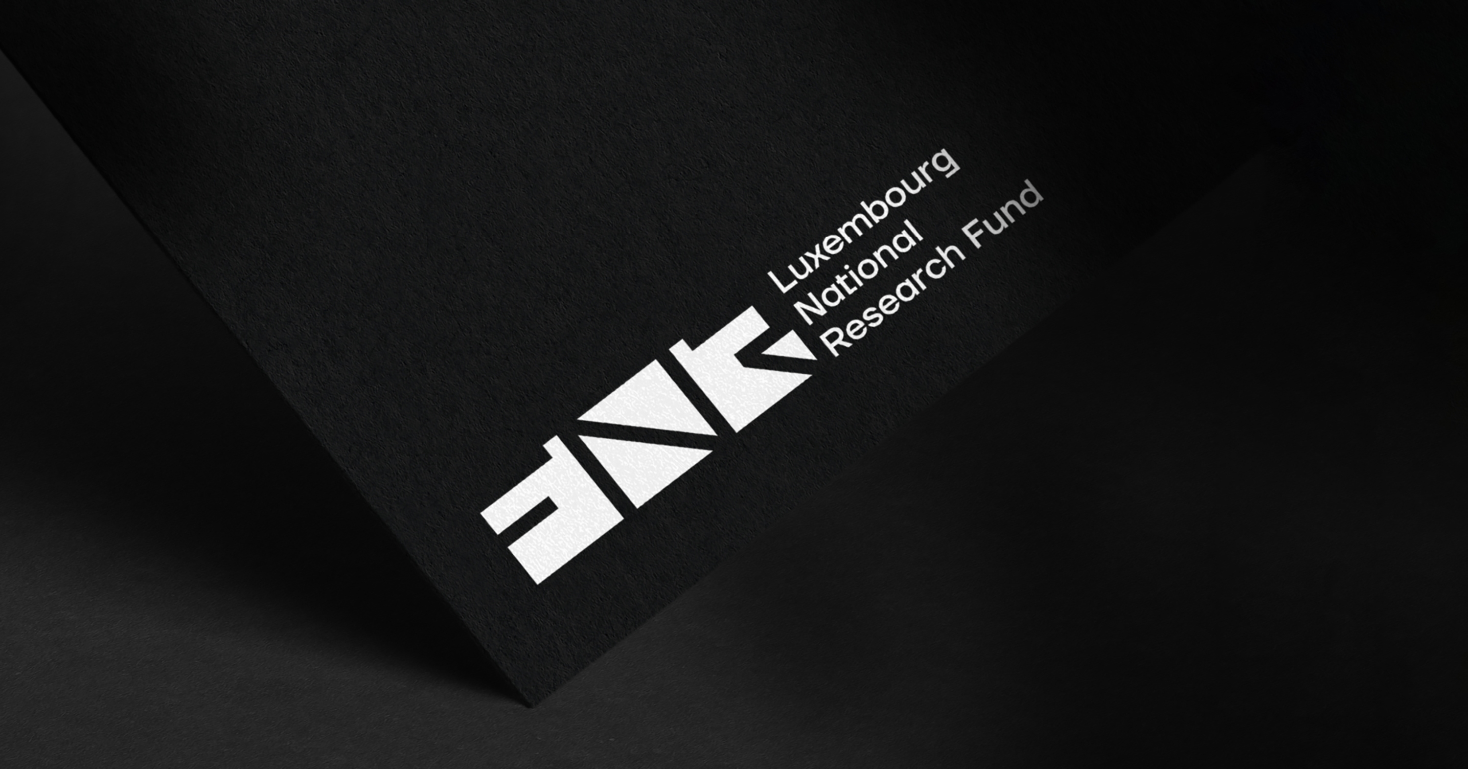
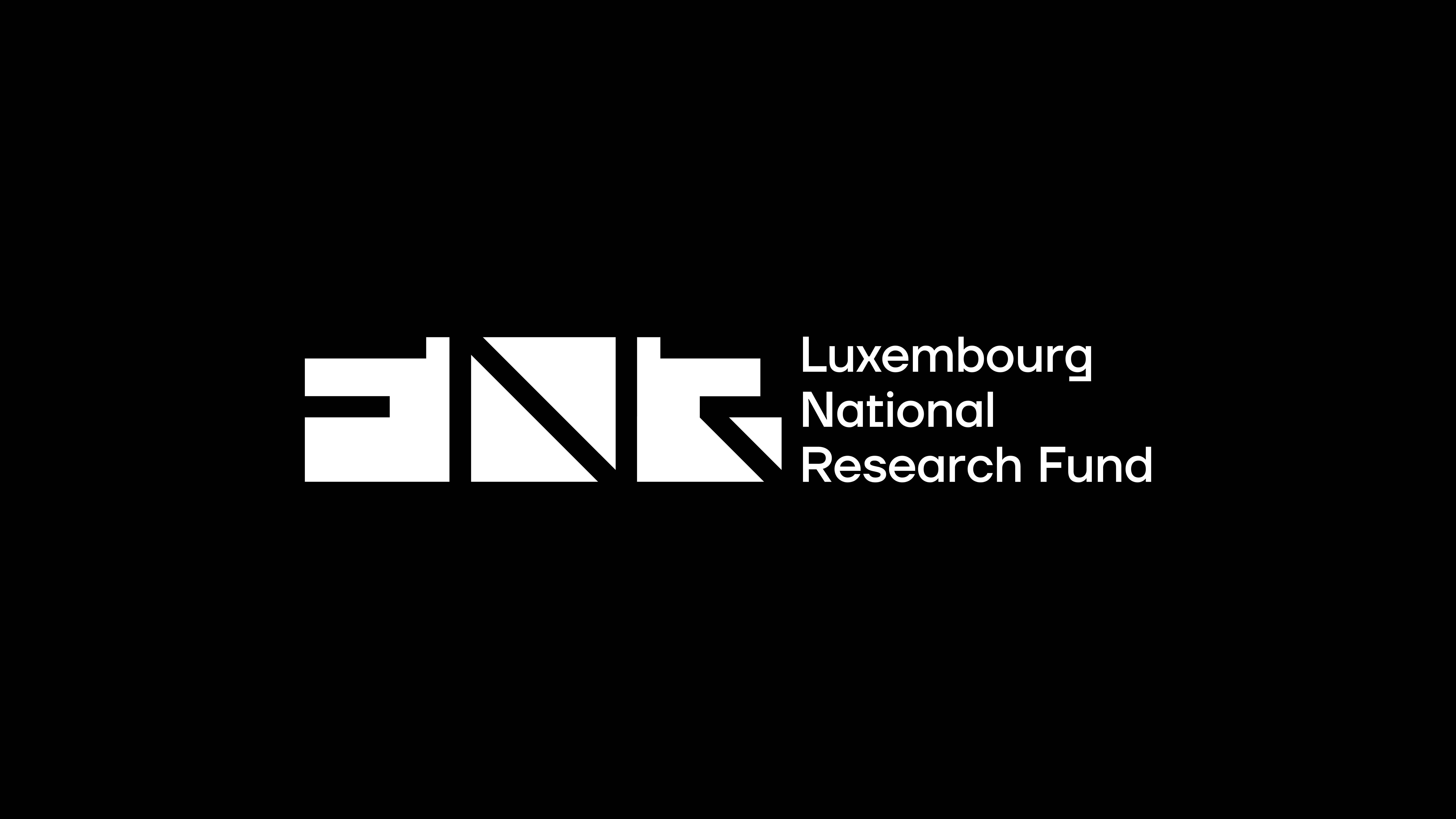
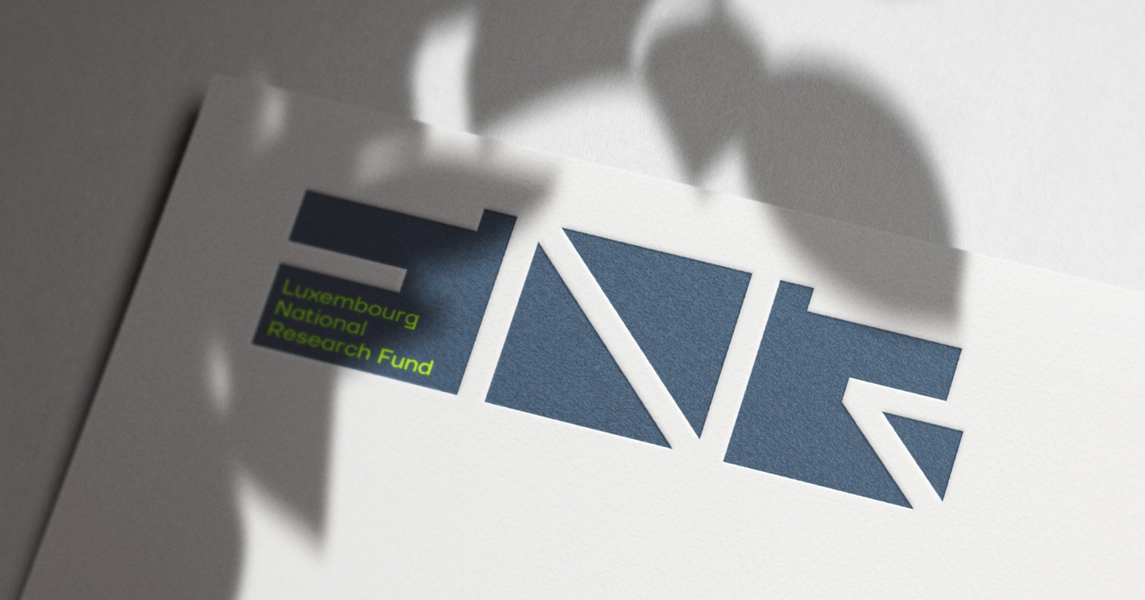
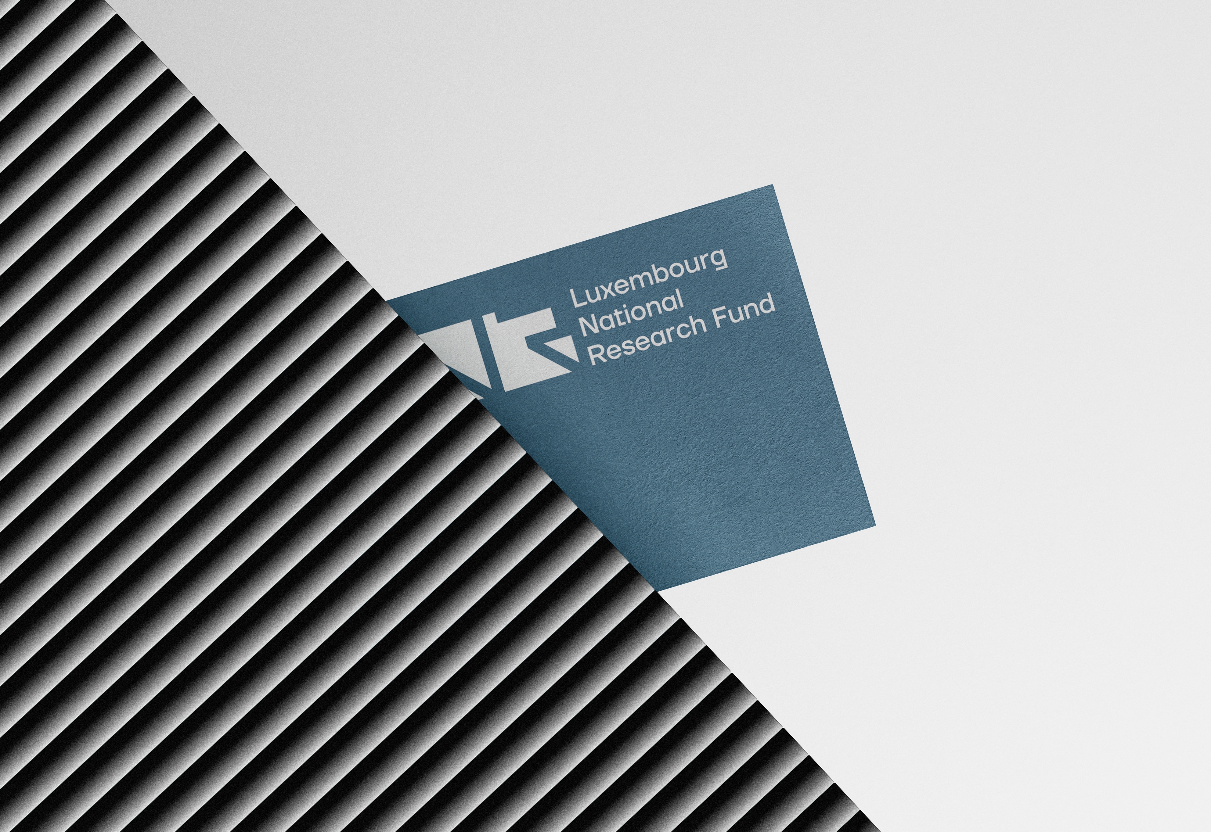
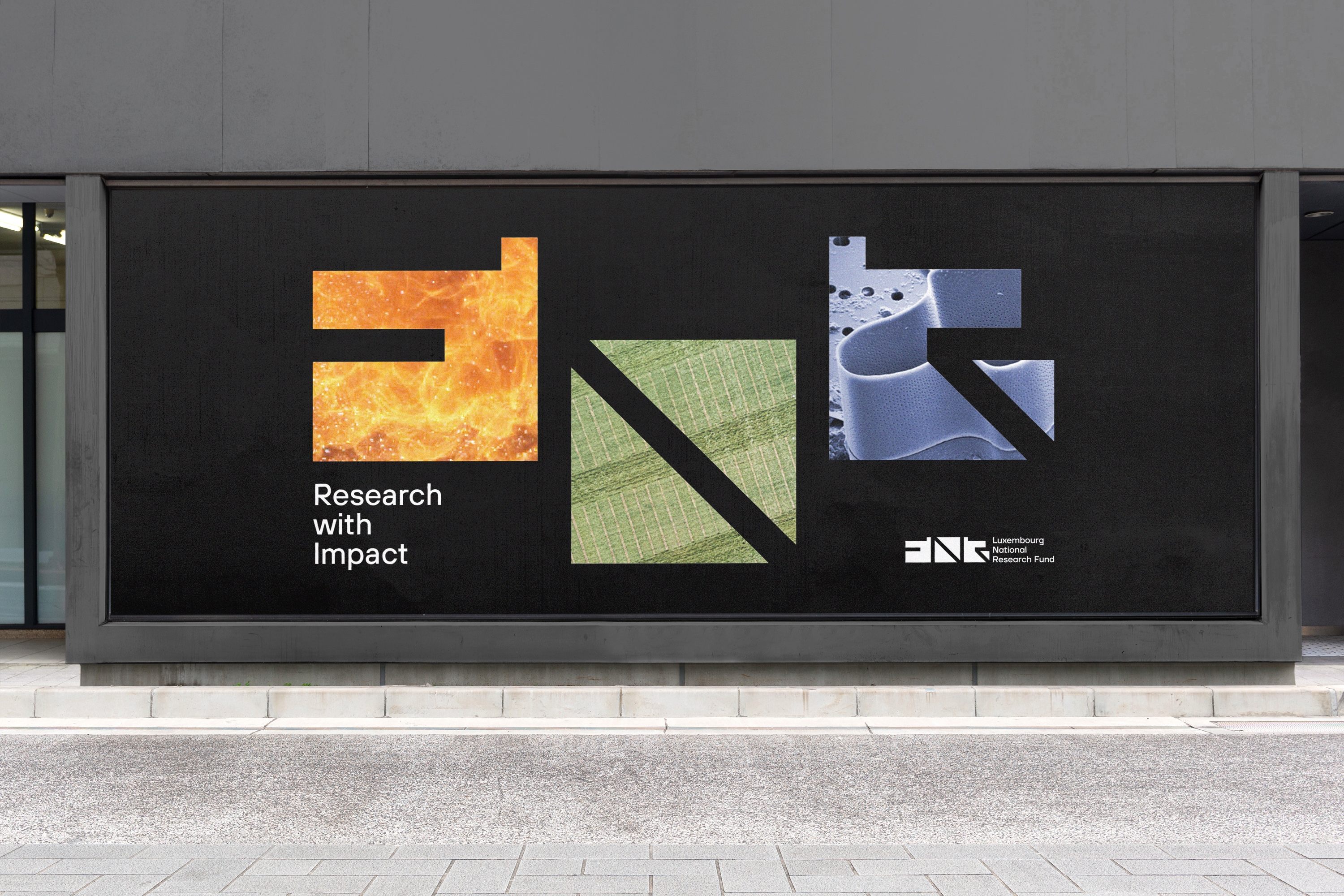
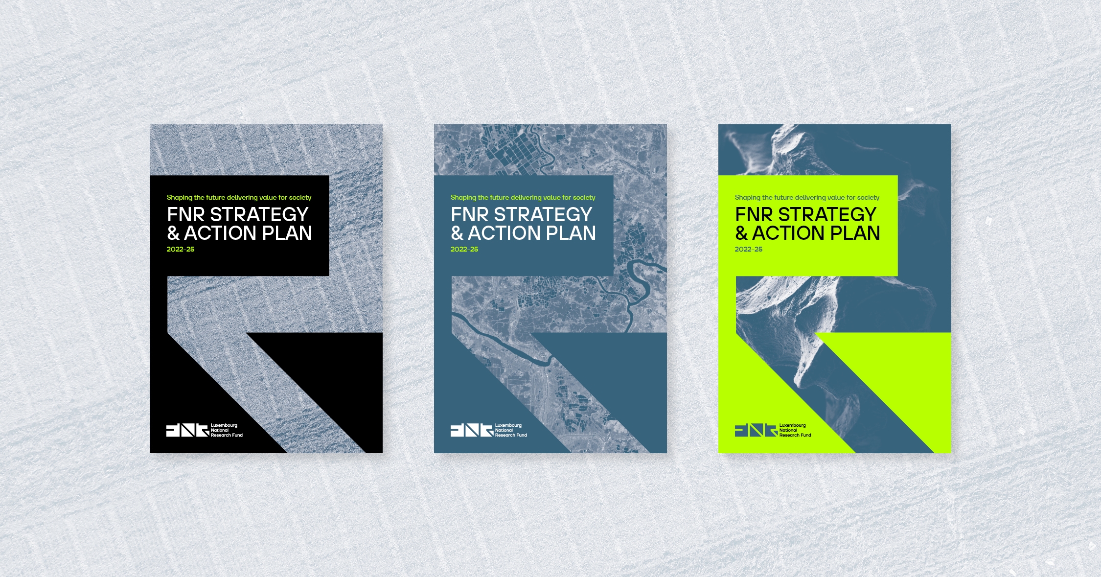
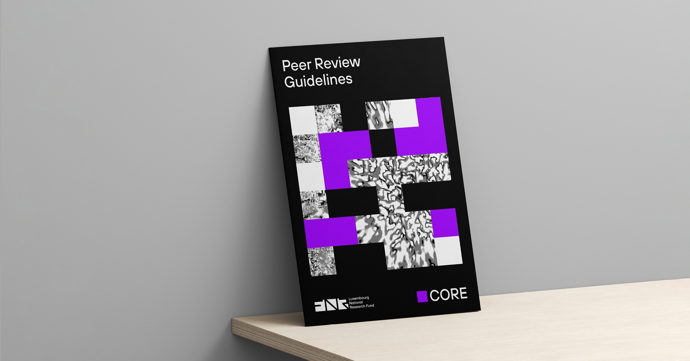
We worked on a complete redesign by choosing a bold and dynamic way, highlighting how the brand is using its acronym.
By ingeniously utilising negative space, we symbolise the openness of science to the outside world. We designed the letters F, N and R in the logo and structured the entire identity around these shapes to create elements that could be infinitely adaptable.
The new visual identity is a powerful reflection of FNR's values
We are a female led creative agency in the heart of Luxembourg-City, founded back in 2013.
We choose our design ingrediences carefully, to create the best outcome. A mix of playful, bold, unusual and colourful concepts are our recipies. Visual identities, editorial design and innovative print work are our trademarks. Our design can be loud, shy, sophisticated or simple. It just needs to follow one rule. Driving emotions.
Working in a small team leads to many fruitful collaborations. We believe in pushing ideas further, in collaborations and unusual approaches.
German Design Award 2024 WINNER : Editorial Design
German Design Award 2022 SPECIAL : Editorial Design