IDA 2026 IS NOW OPEN - SUBMIT BY APRIL 15 TO GET A 10% EARLY BIRD DISCOUNT.
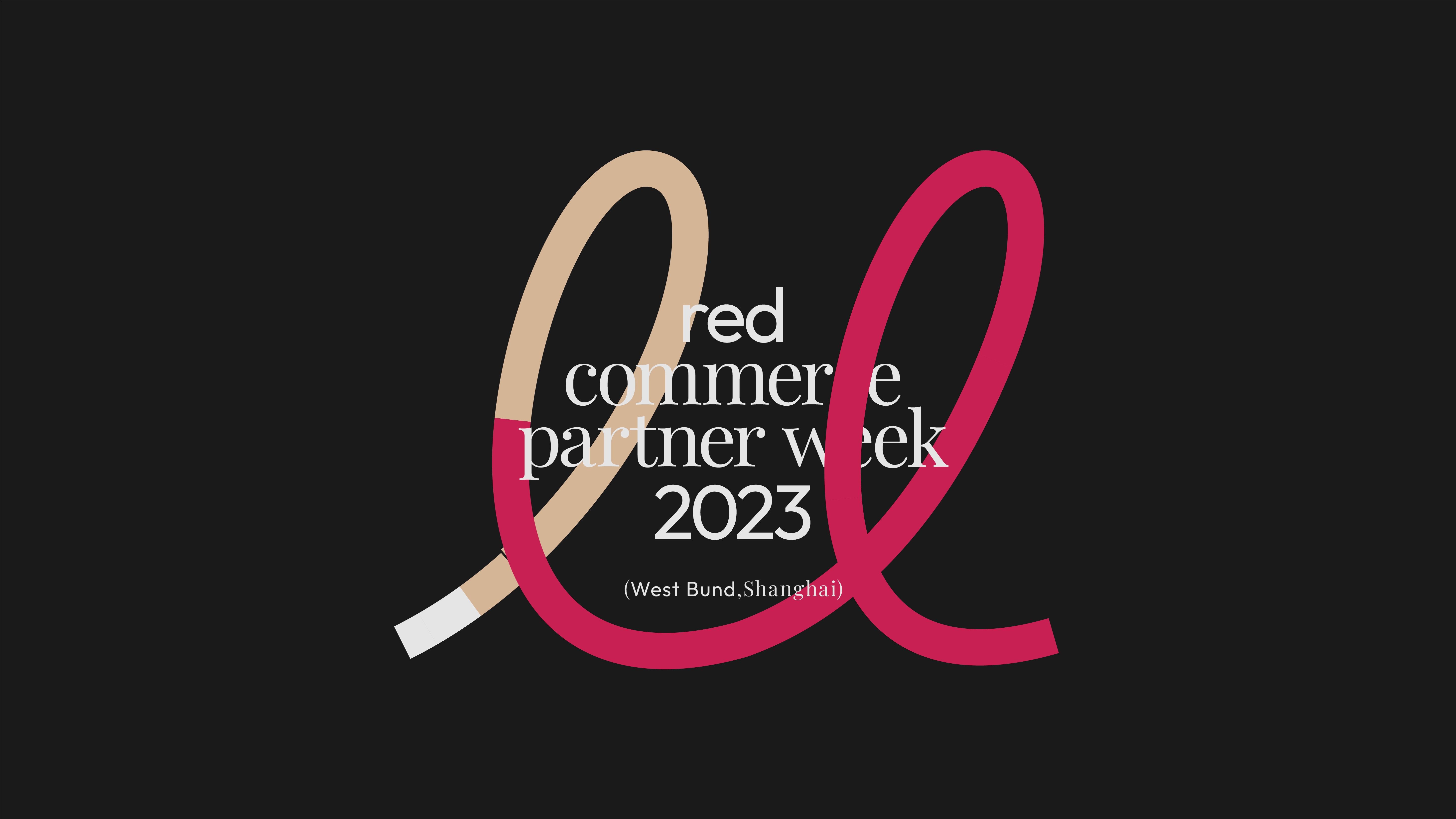
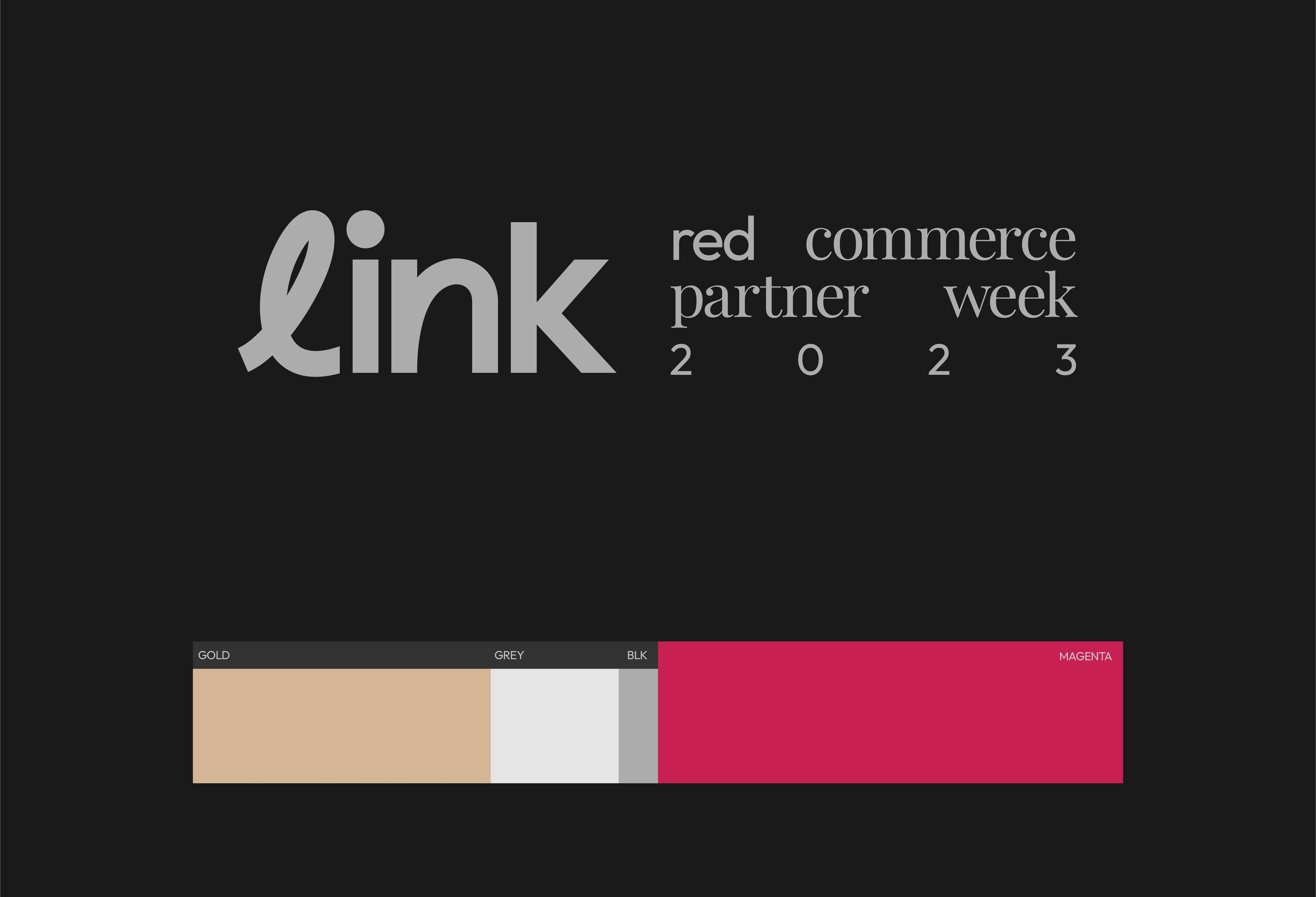
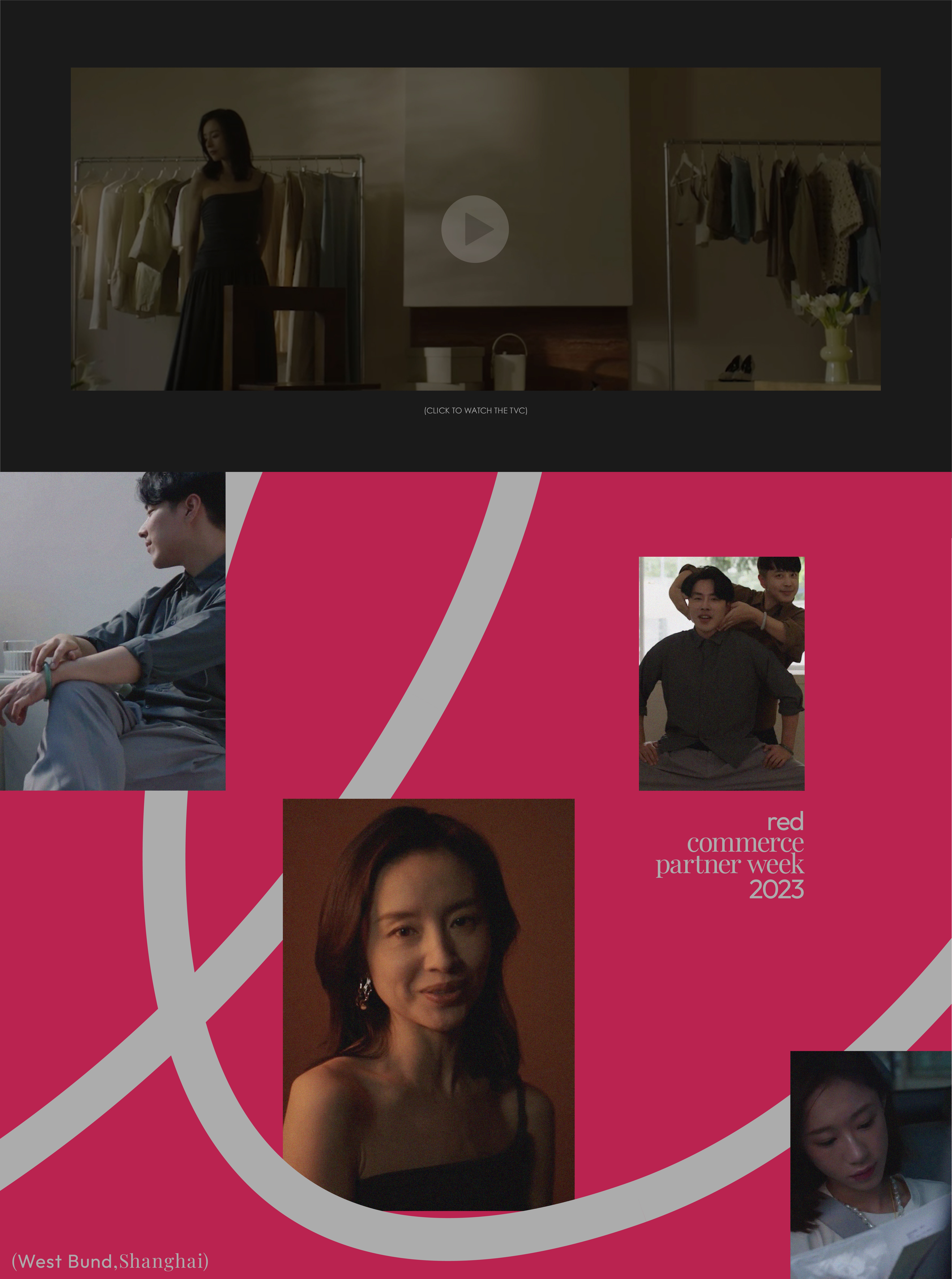
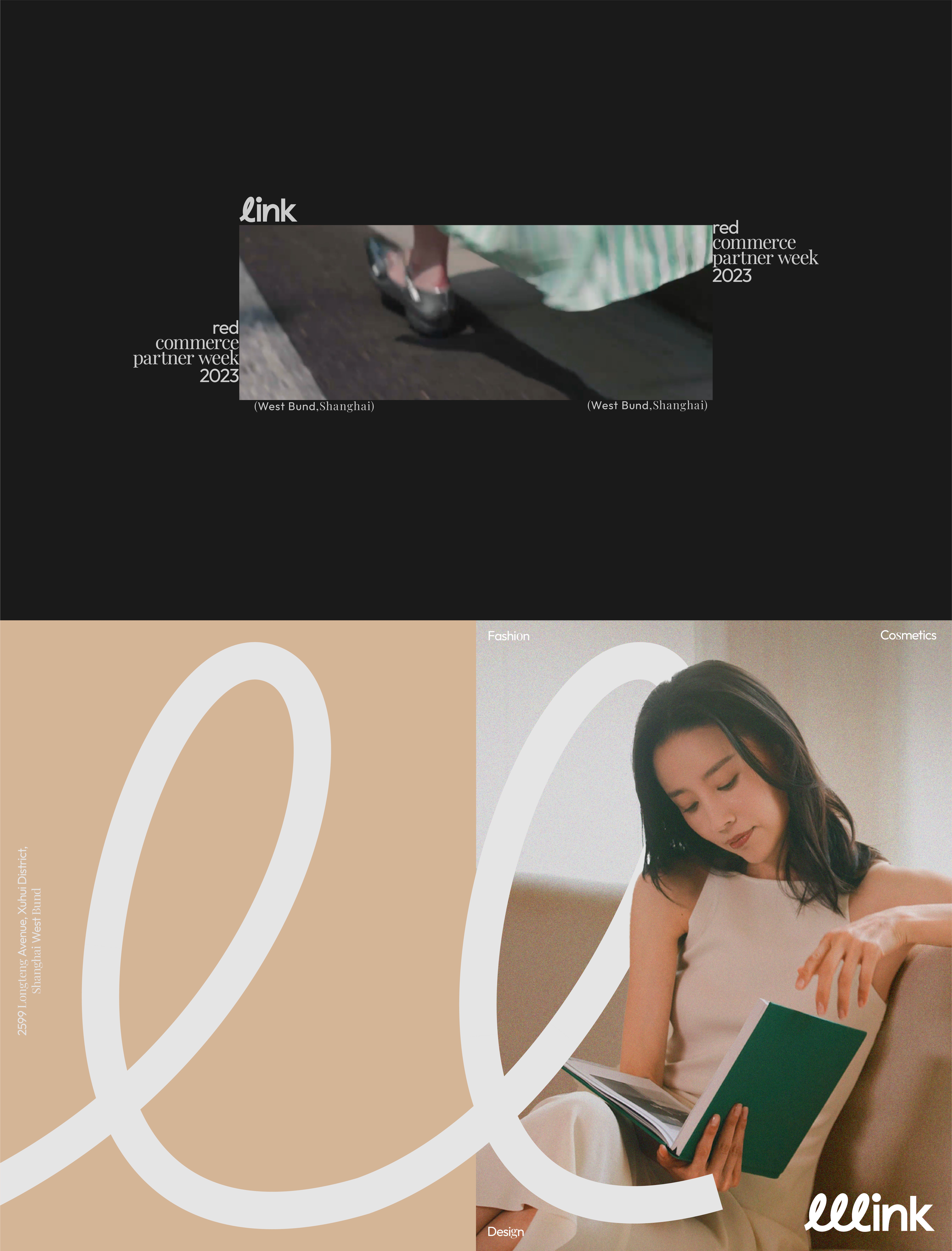
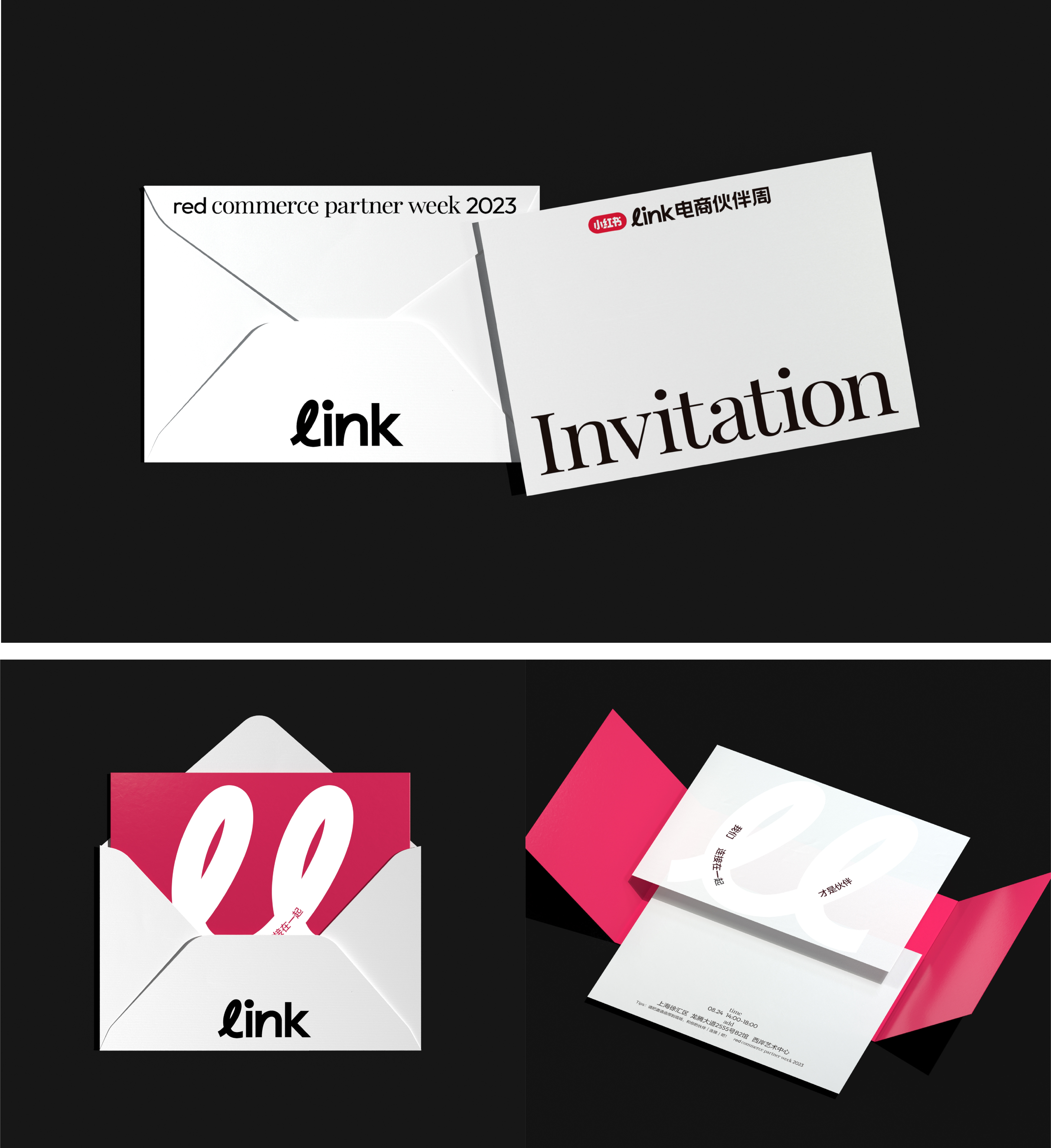
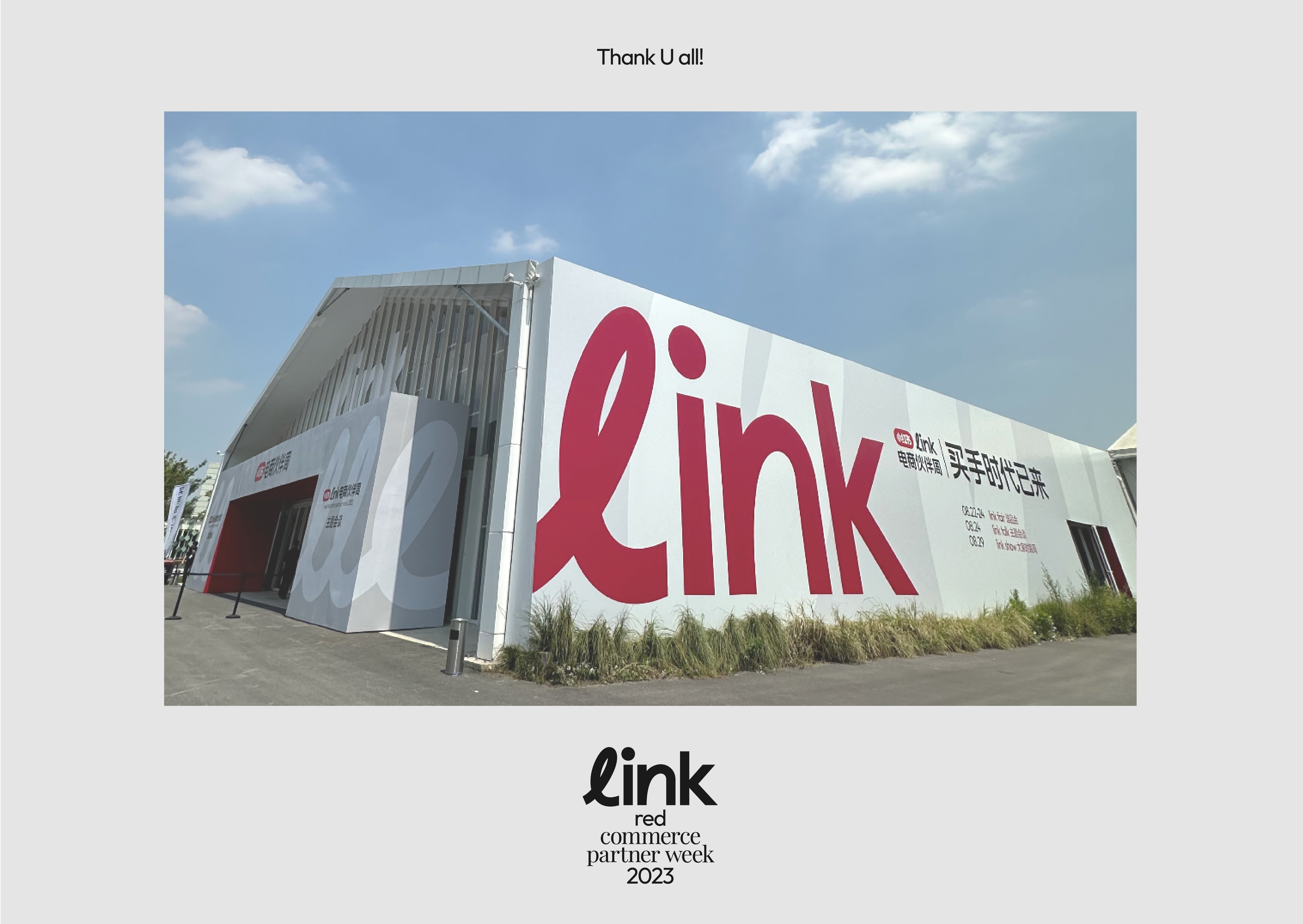
Xiaohongshu's Link E-commerce Partner Week introduces a fresh visual identity for its e-commerce, focusing on communication and connection. Clean lines replace traditional formalities, reflecting Xiaohongshu's user-centric approach. The theme of "linkage" is central, with line graphics surrounding "link" text, symbolizing connection. Across media, these lines merge with real people and products, maximizing impact. Consistent emphasis on this visual symbol enhances brand recognition and leaves a lasting impression, reinforcing project identity.