EXPLORE THE IDA 2025 WINNERS - GET INSPIRED BY OUTSTANDING DESIGN!
Share on Social Media
Rebranding for Child Development Institute (CDI), Shikatani Lacroix Design | International Design Awards Winners

Rebranding for Child Development Institute (CDI)

CompanyShikatani Lacroix Design
Lead DesignersKim Yokota
Design TeamSheryl Keller Ziesmann
ClientChild Development Institute (CDI)
Prize(s)Bronze in Print / Stationery
Entry Description

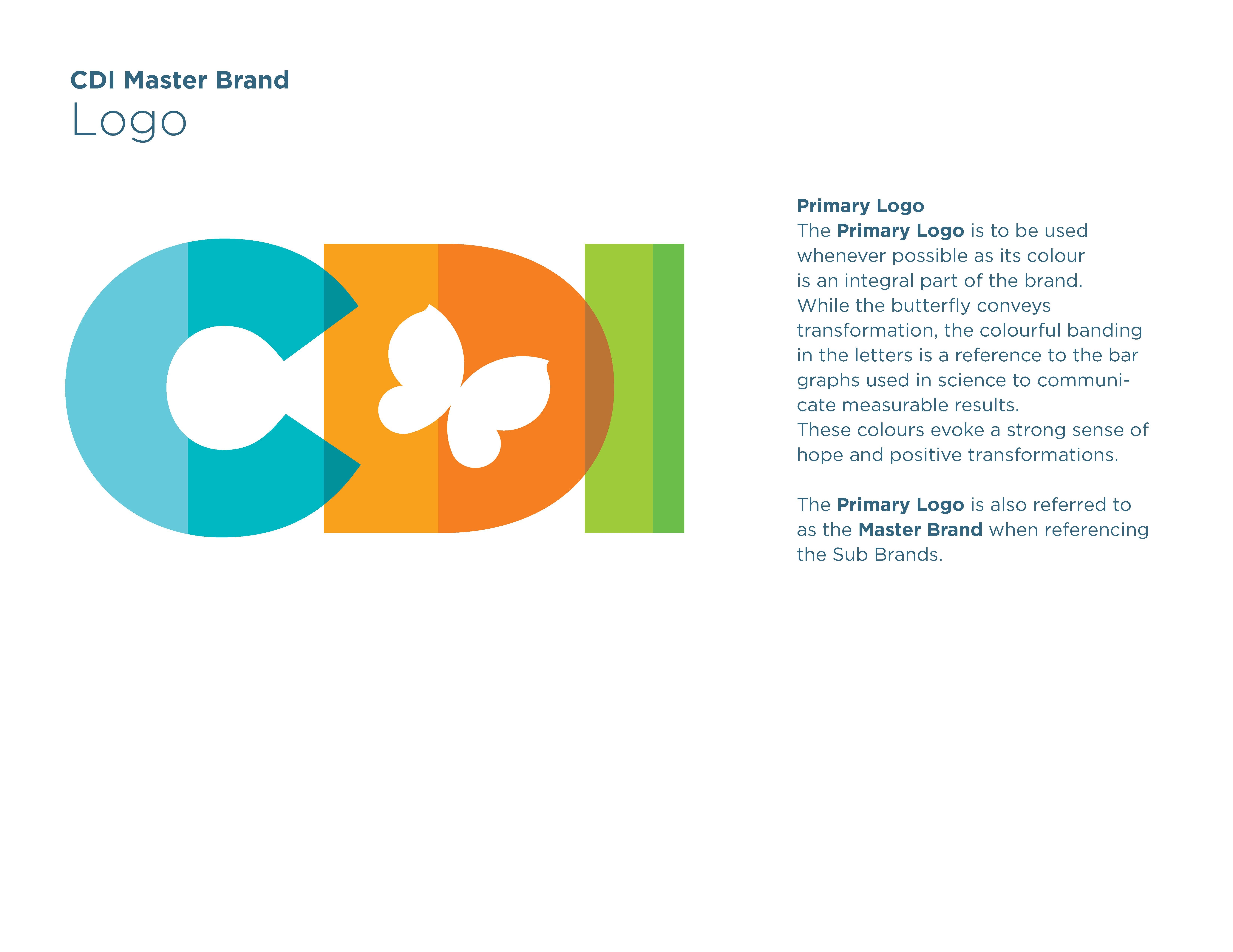
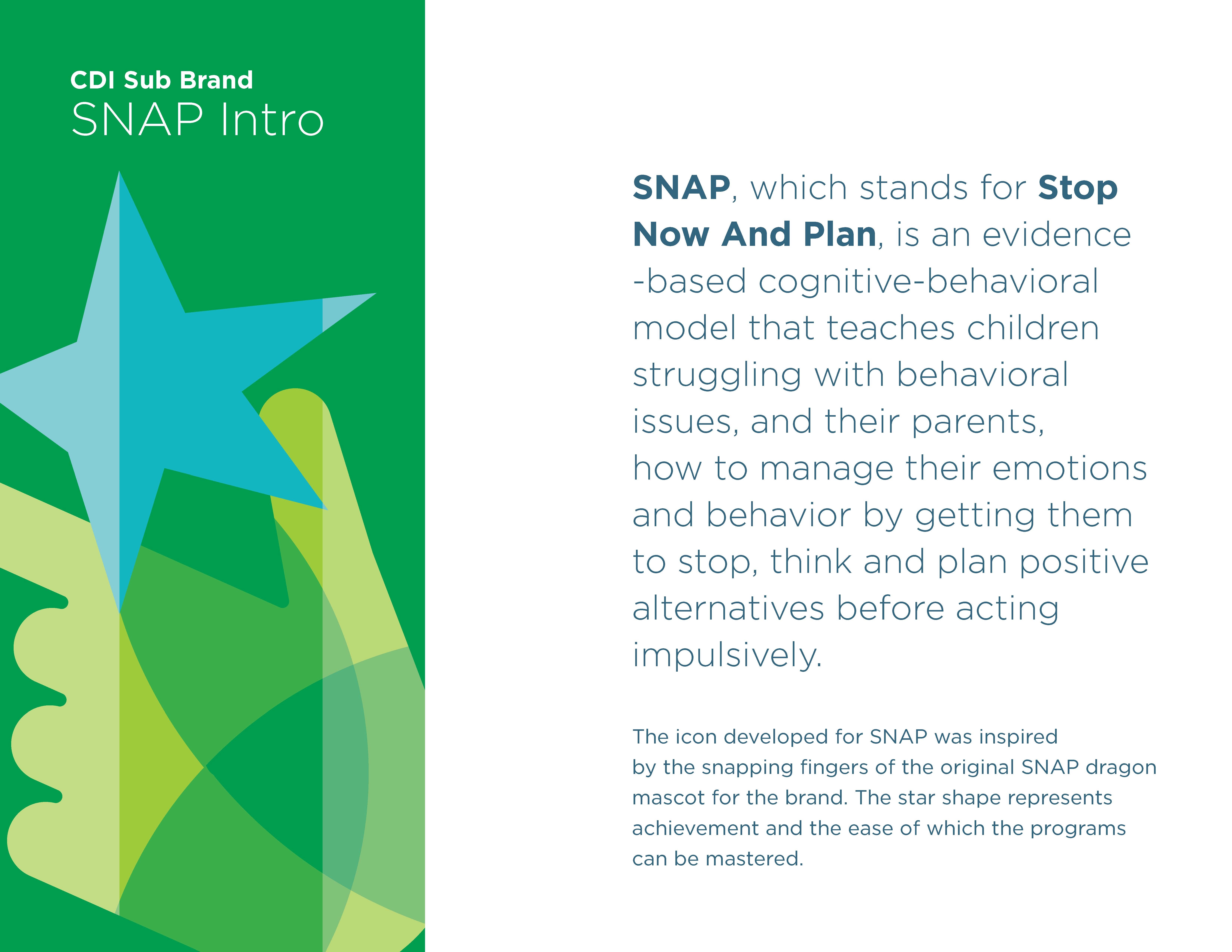
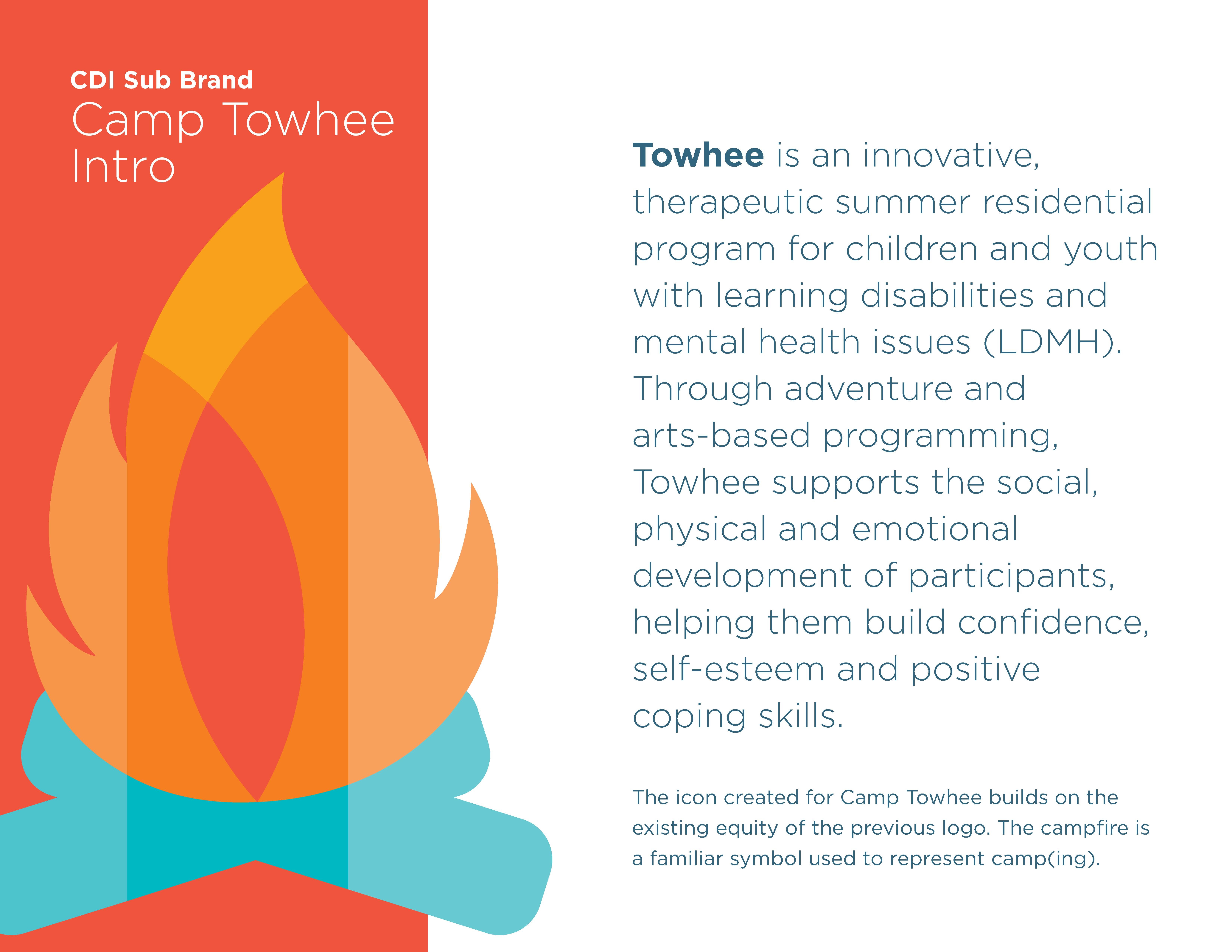
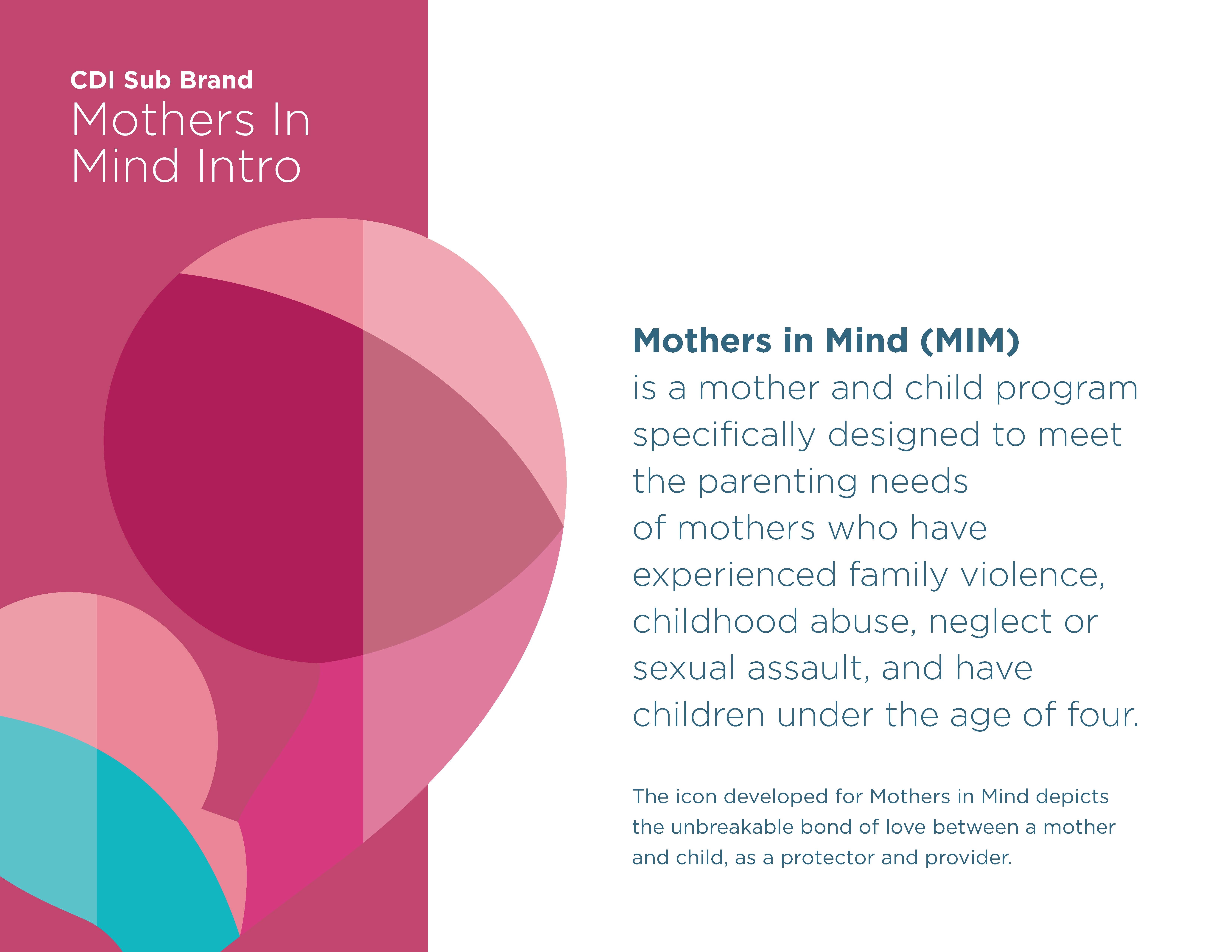
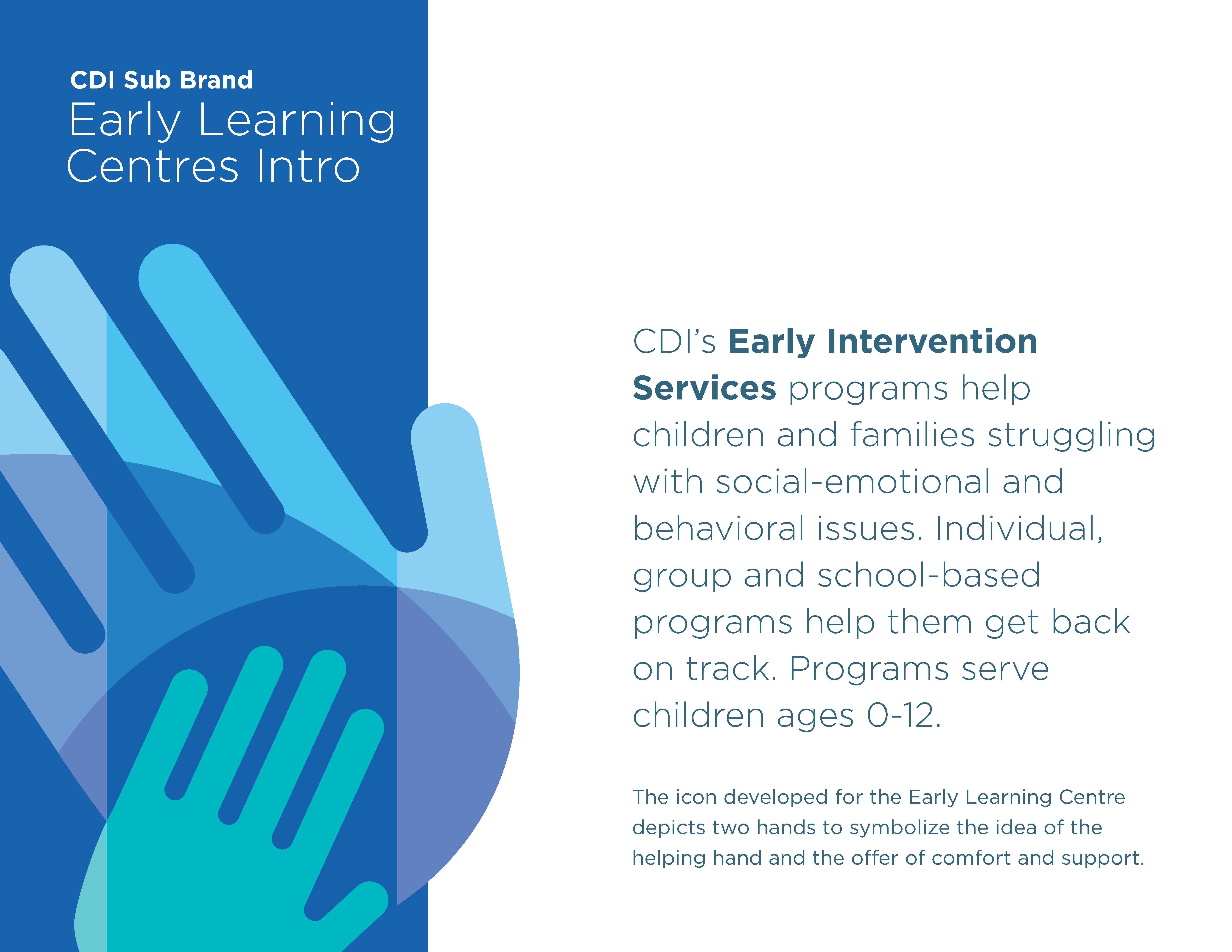
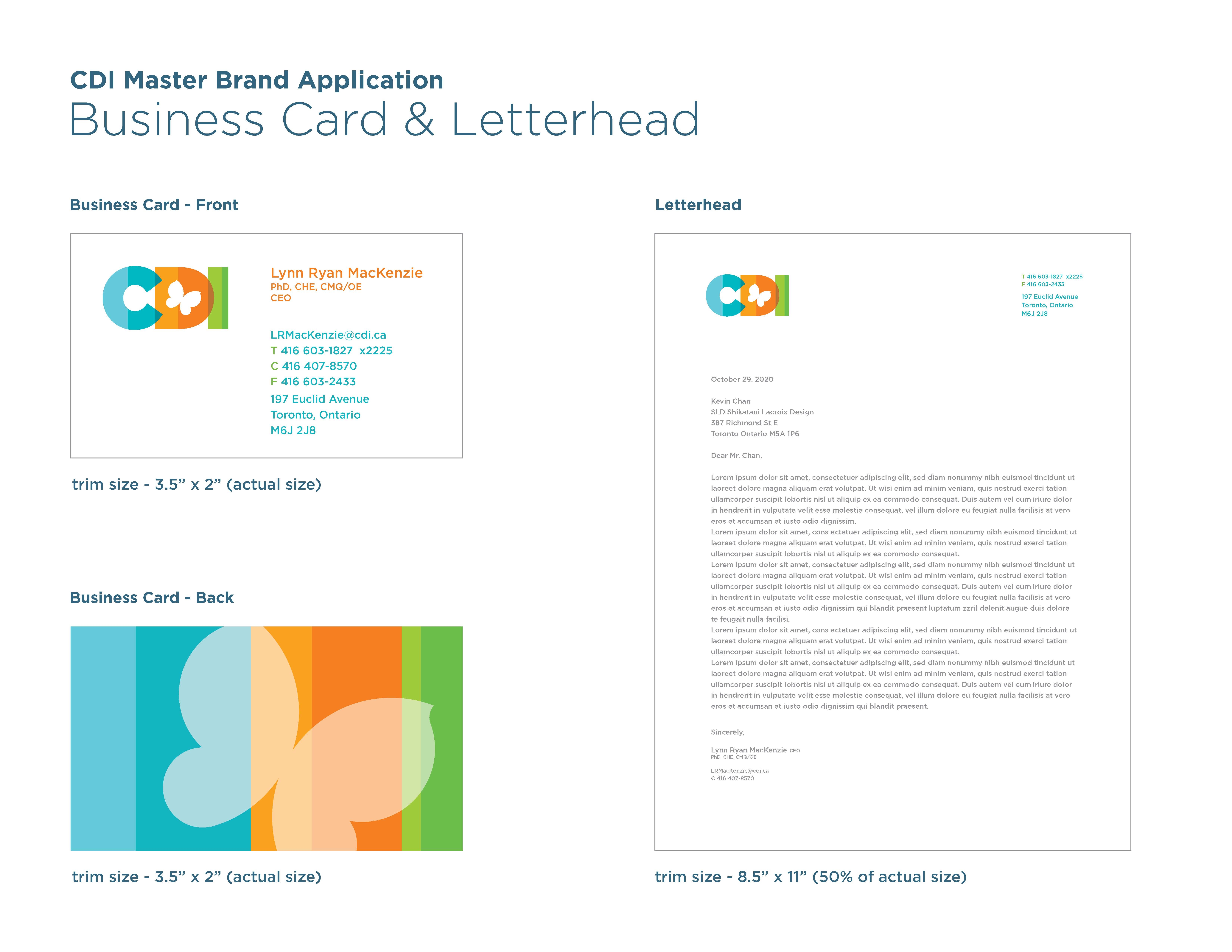
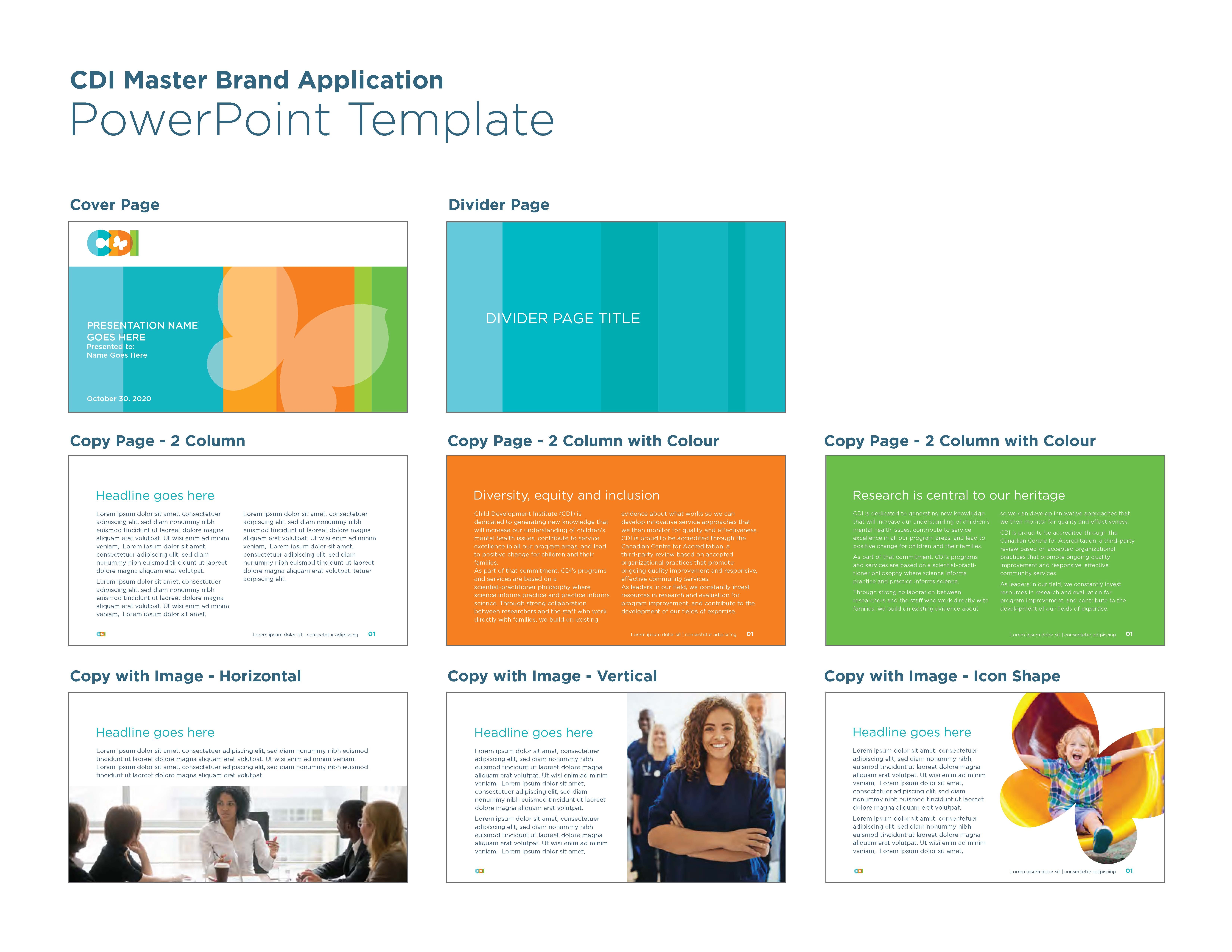
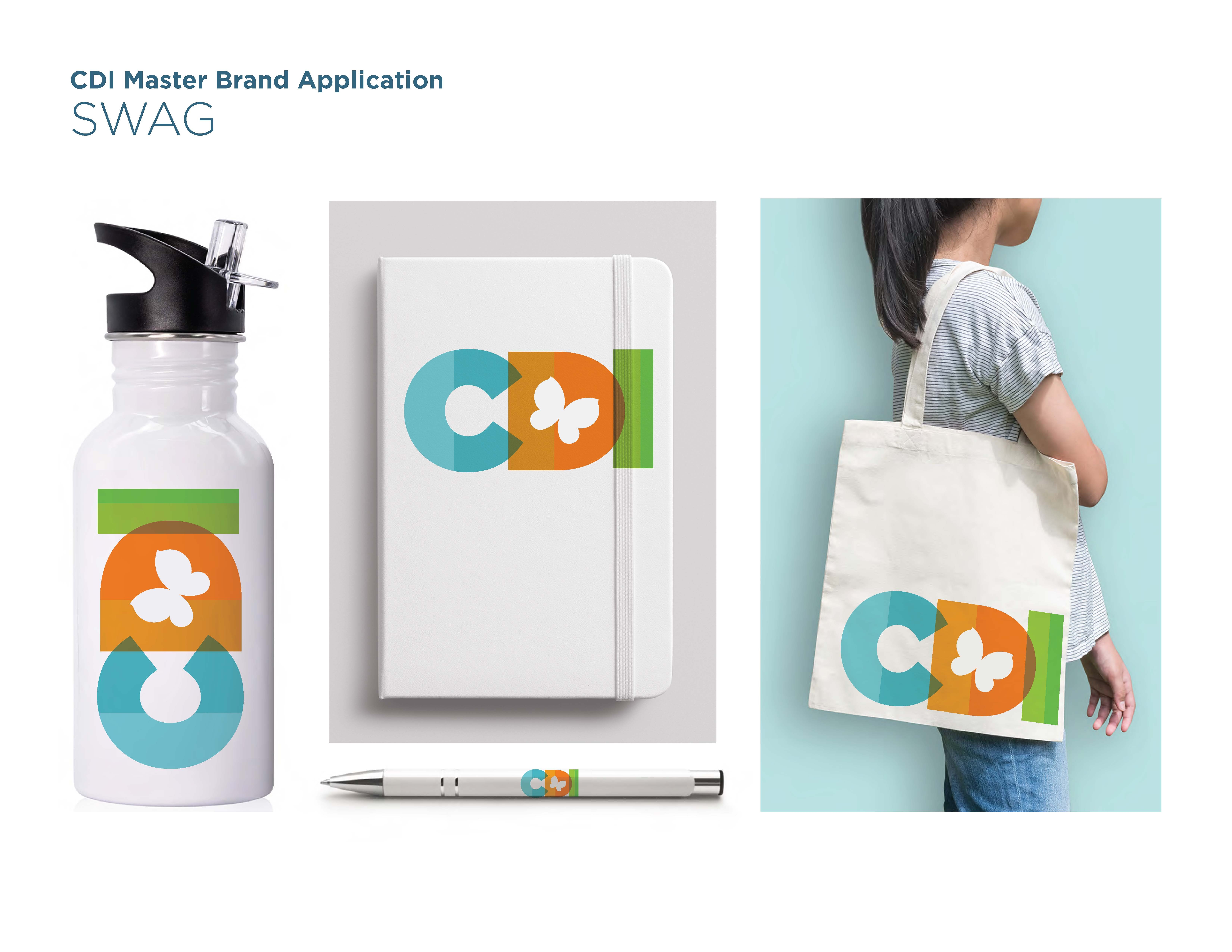
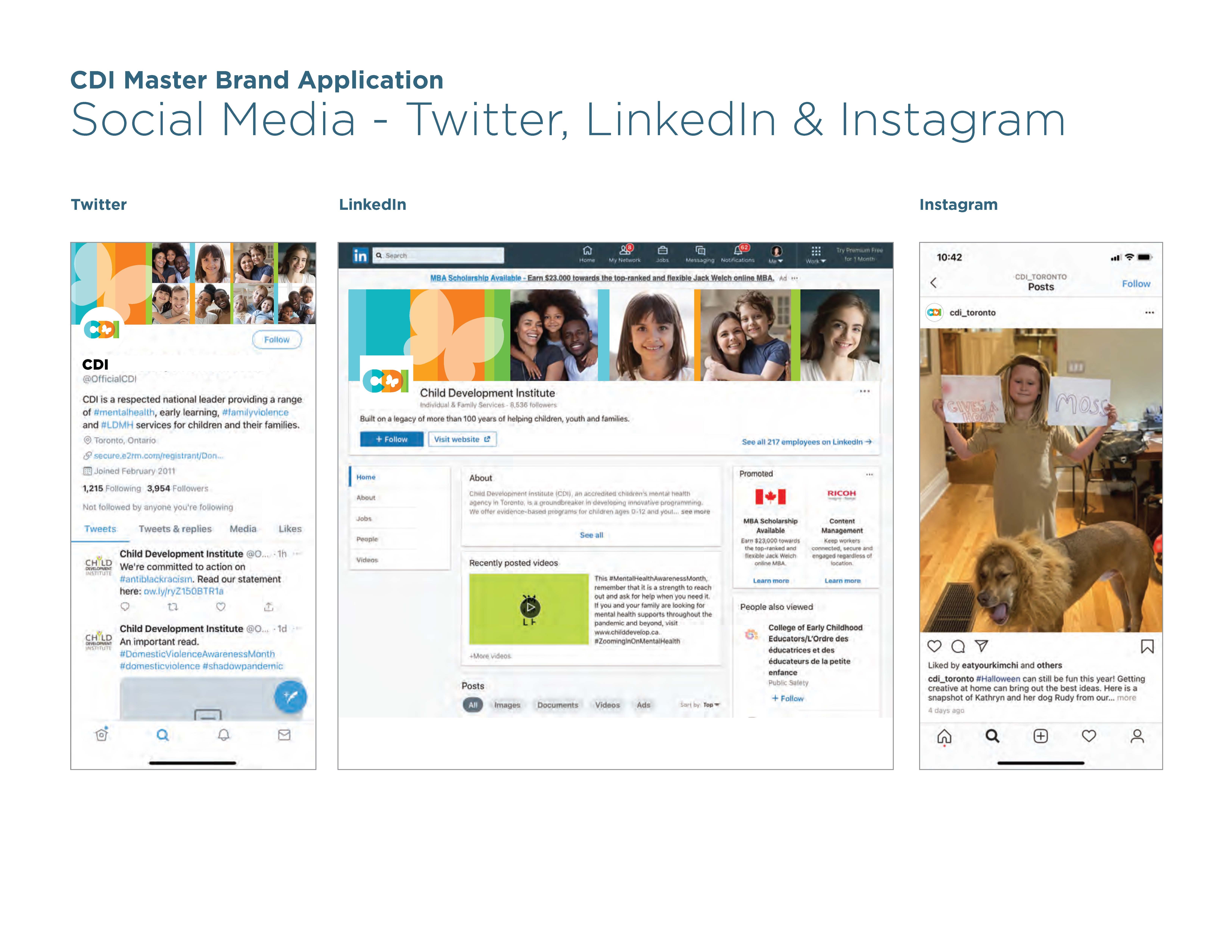
CDI, a children’s mental health agency in Toronto, underwent transformation with SLD to unify its brand and 4 sub-brands, symbolizing innovation, compassion and community. The brand architecture seamlessly connected all sub-brands to the main one. The butterfly in the logo represents transformation, hope and life, mirroring the positive changes CDI brings. Sub-brand logos, created under a harmonious umbrella, incorporate the main brand’s colors while maintaining uniqueness. Color separation of all logos resembles a bar graph, emphasizing its dedication to being evidence-based and data-driven.