IDA 2026 IS NOW OPEN - SUBMIT BY APRIL 15 TO GET A 10% EARLY BIRD DISCOUNT.
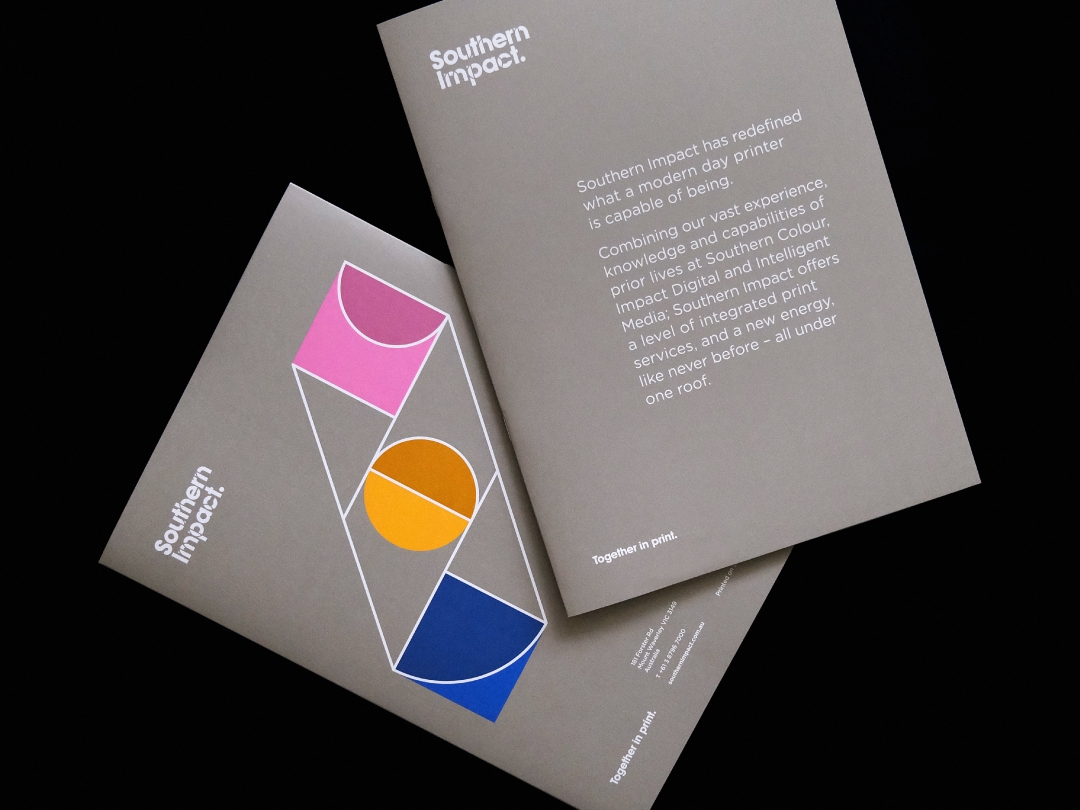
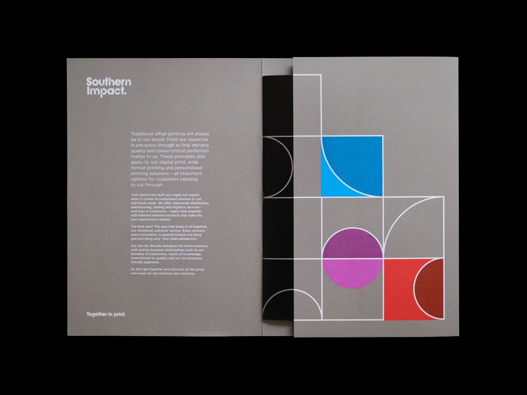
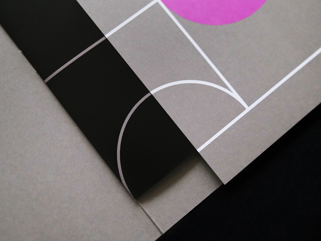
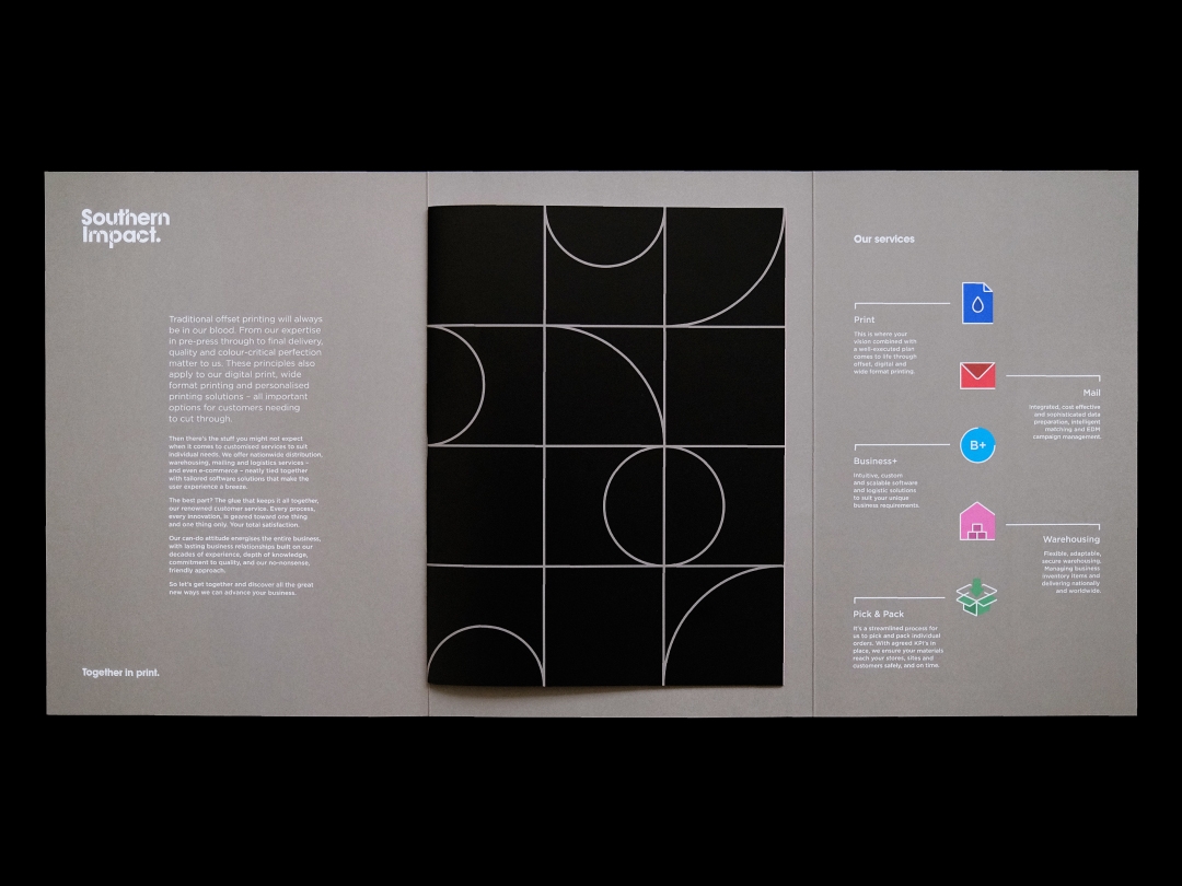
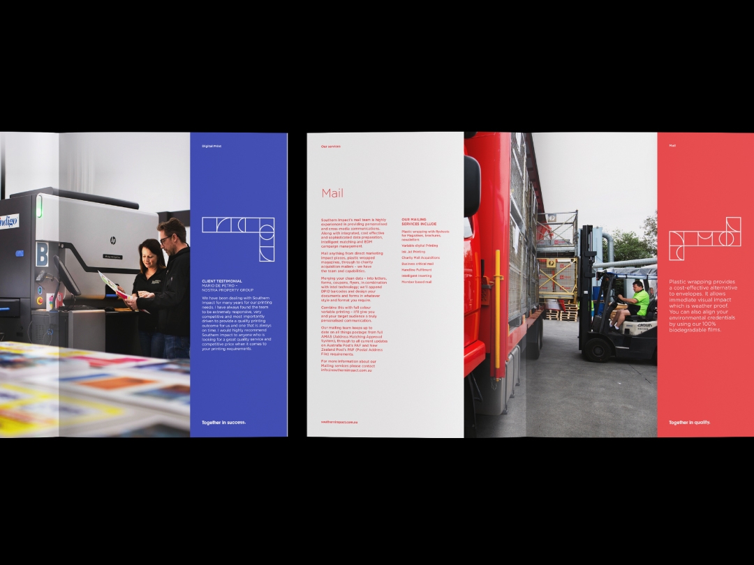
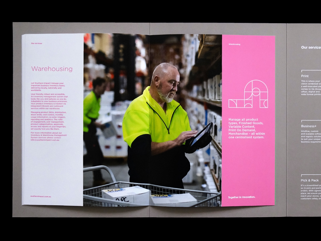
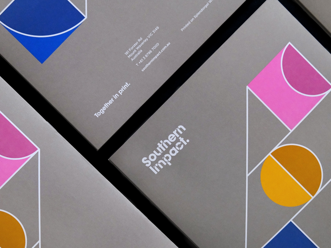
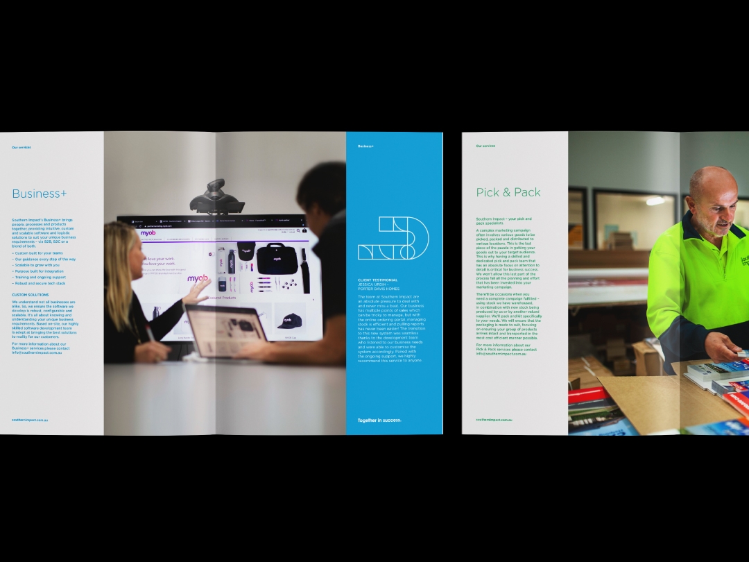
Southern Colour consolidated three businesses as one under the name Southern Impact. In turn, we created a fusion of varied geometric shapes merging together forming the new brandmark. Combined with a broad & diverse colour palette the identity reflected the company’s multi faceted offer of print, digital & logistical services.
An overview brochure was designed to aid sales staff in promoting the diversity of services. The internal pages reflected the colour coded system and language of geometric shapes used on the website, forming a consistent and comprehensive design across all collateral.