IDA 2026 IS NOW OPEN - SUBMIT BY APRIL 15 TO GET A 10% EARLY BIRD DISCOUNT.

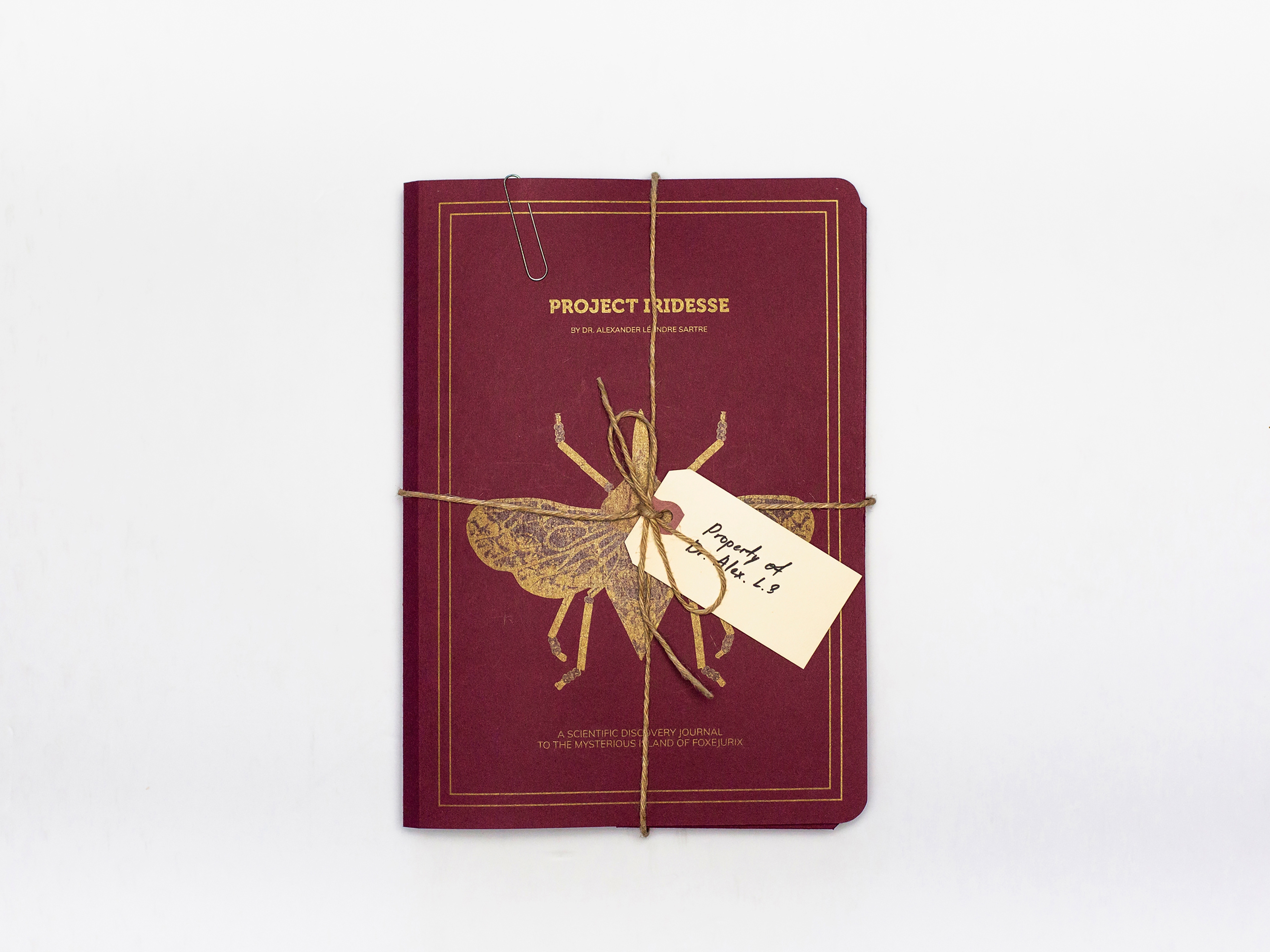
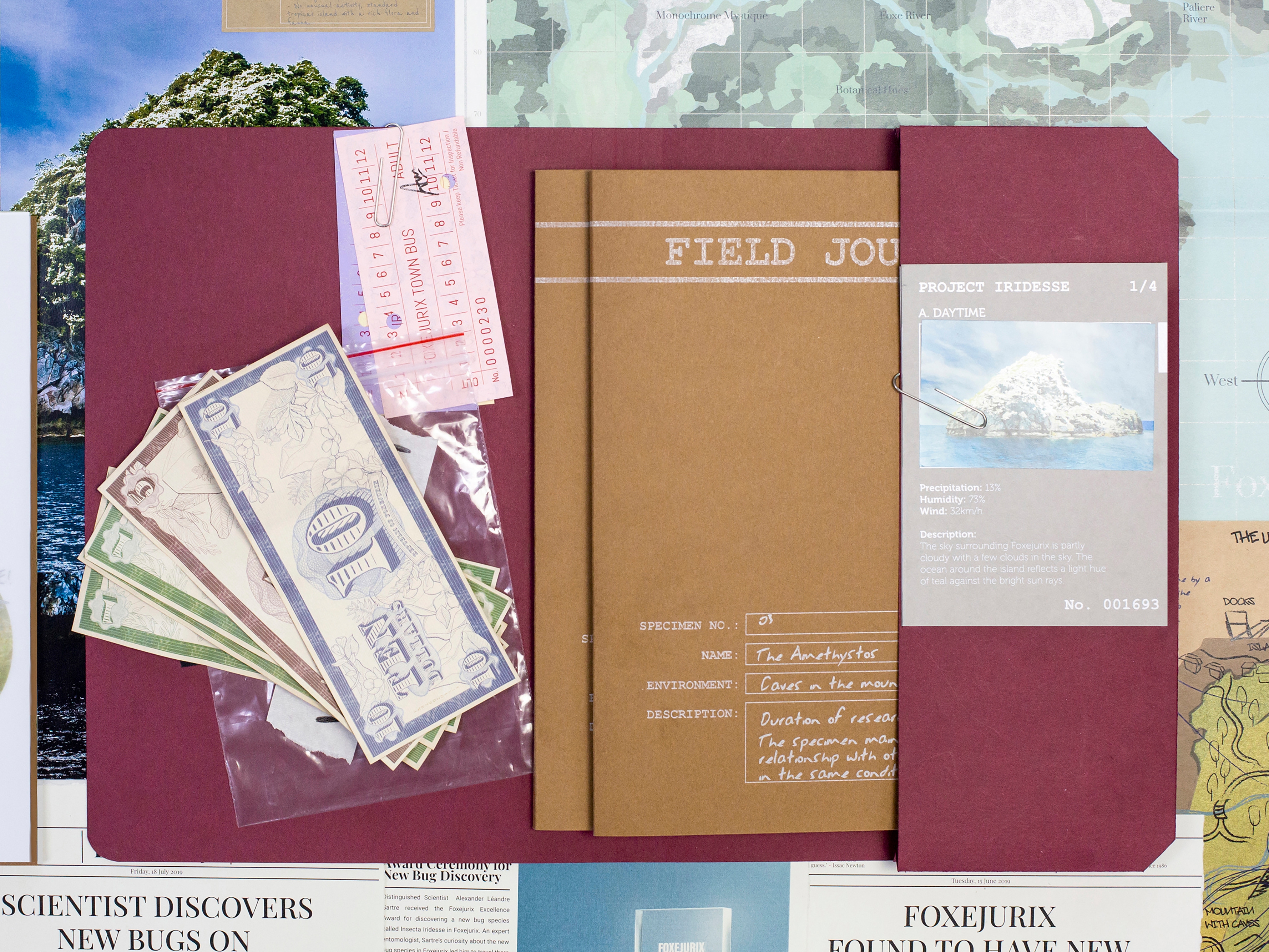
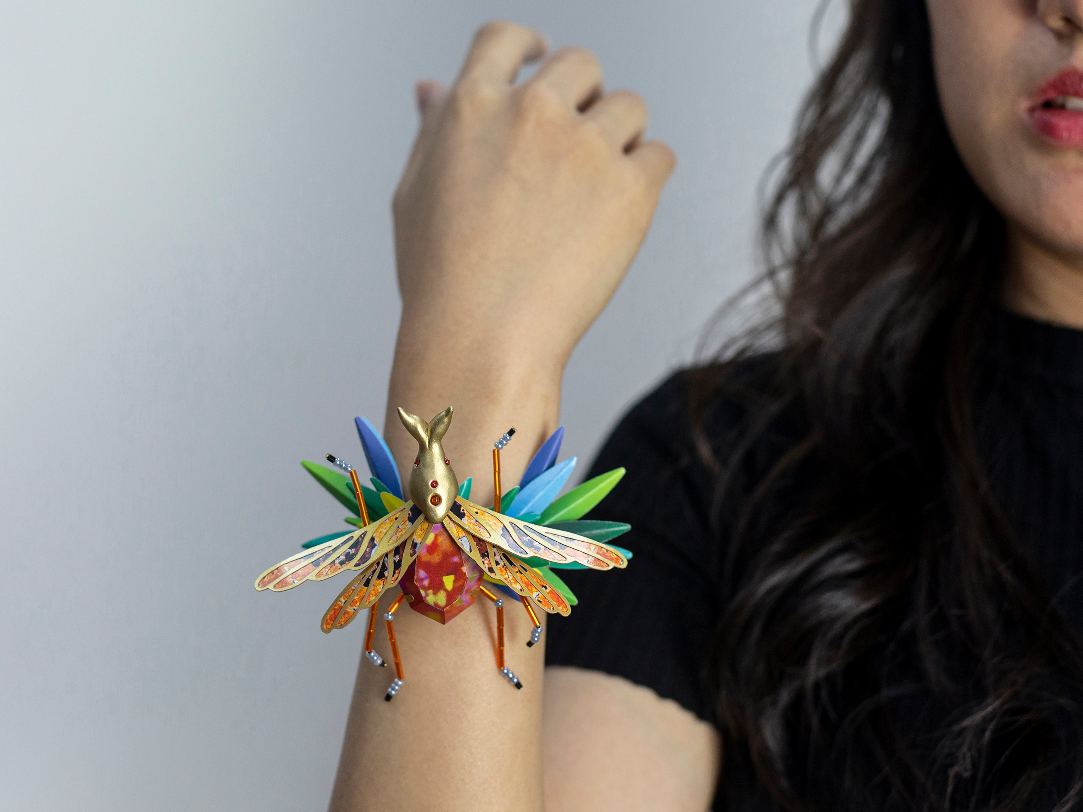
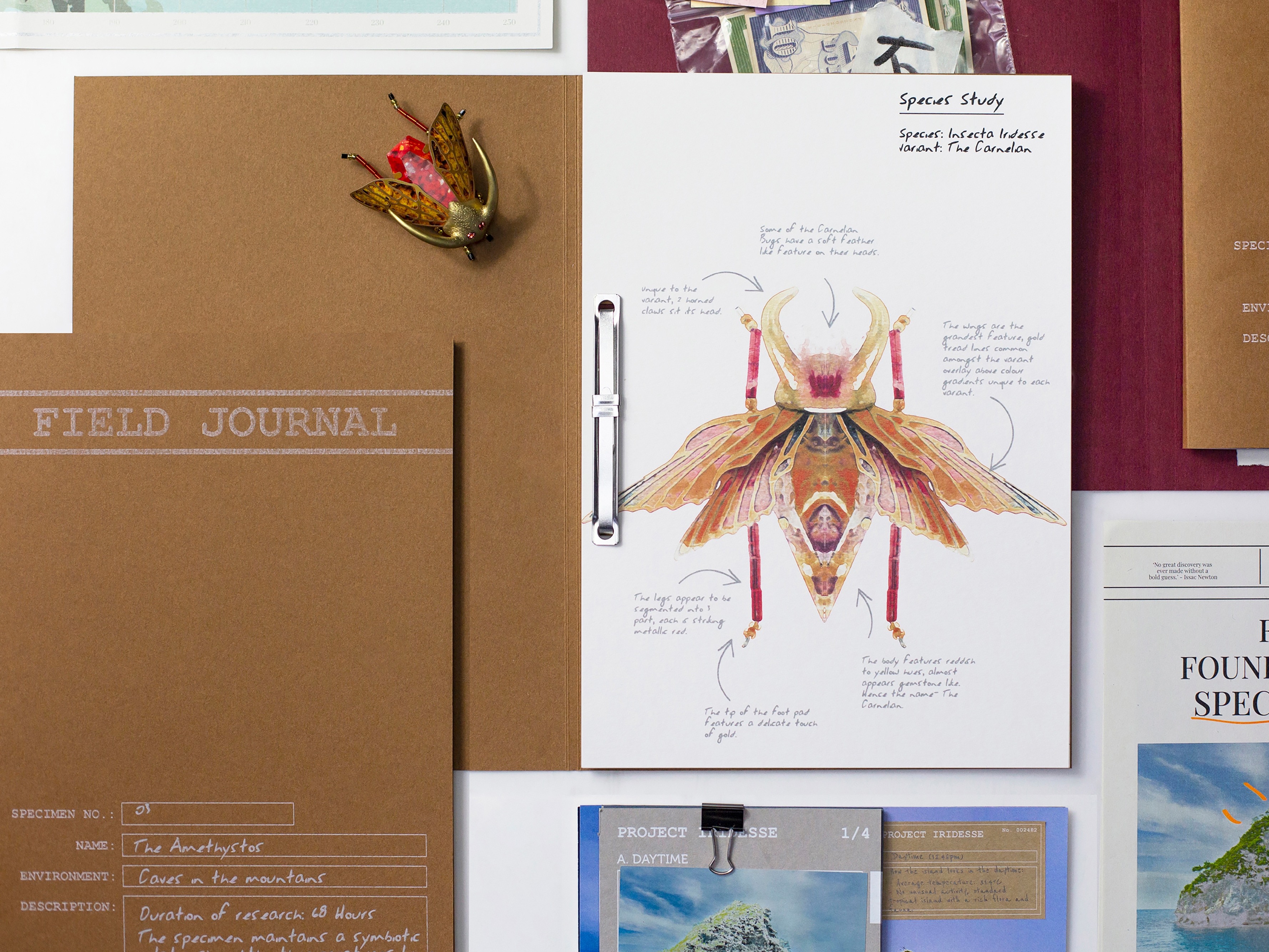
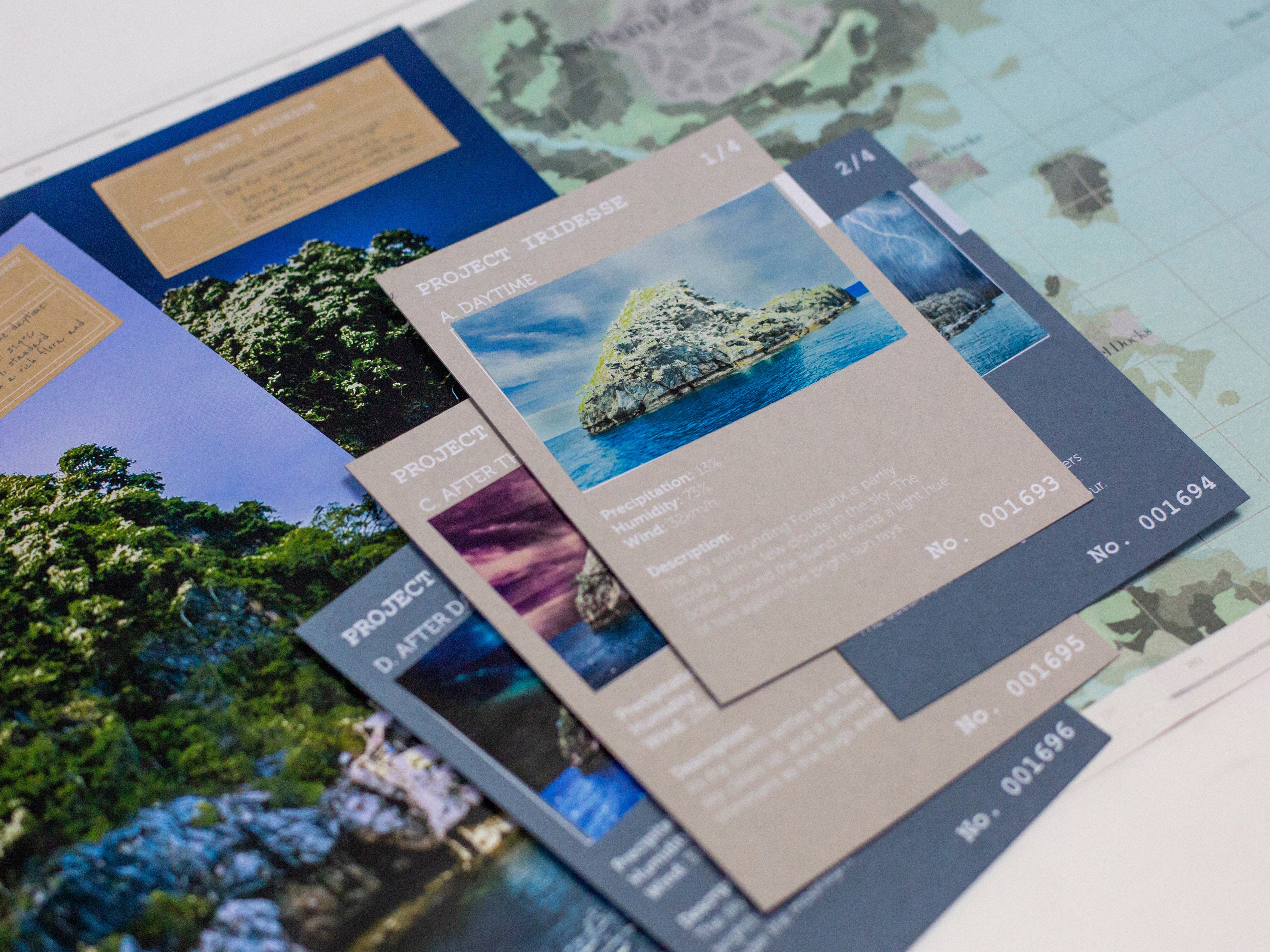
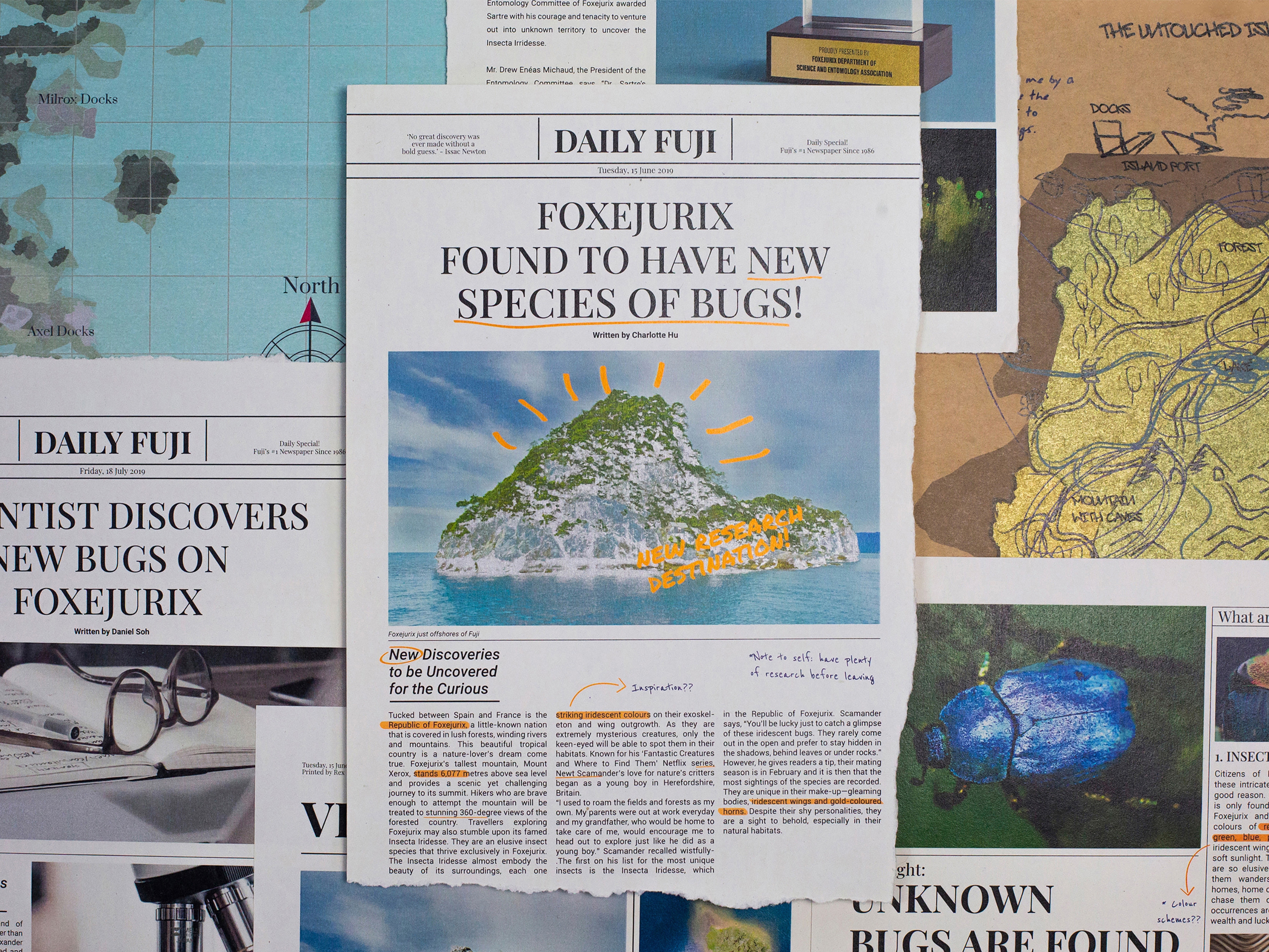
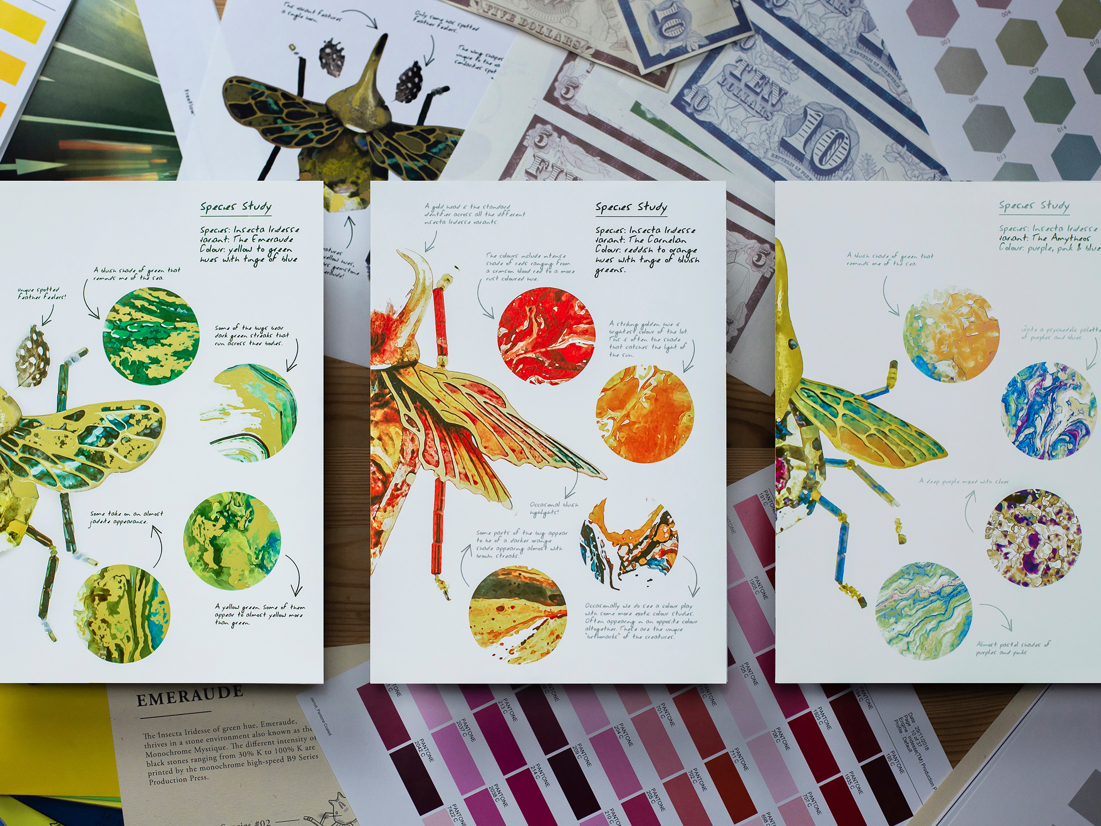
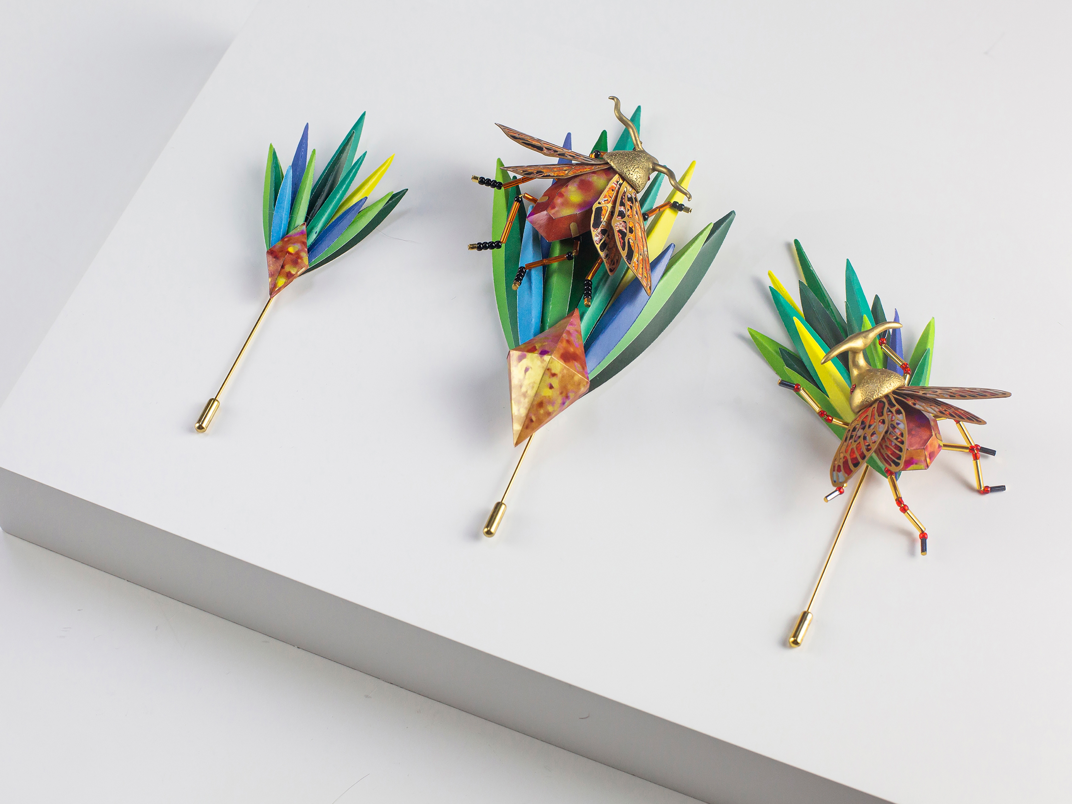
The project disrupted how colours and prints are traditionally presented by the print industry to question its effectiveness in marketing print capabilities. Designed as a 2-part metallic print experience, the colour swatch reimagined into a fictional explorer’s journal documenting the finding of gem-like insects with drawings, maps, news clippings and more that demonstrated specialty metallic print effects on different materials. When new colours are introduced, we can continue to add to this reimagined catalogue, eliminating the need to print yearly catalogue.