IDA 2026 IS NOW OPEN - SUBMIT BY APRIL 15 TO GET A 10% EARLY BIRD DISCOUNT.

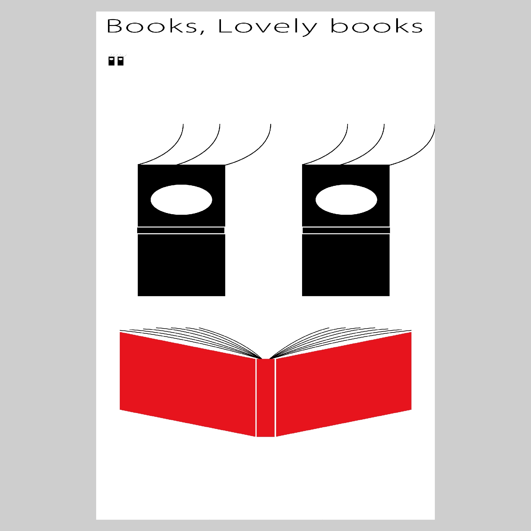
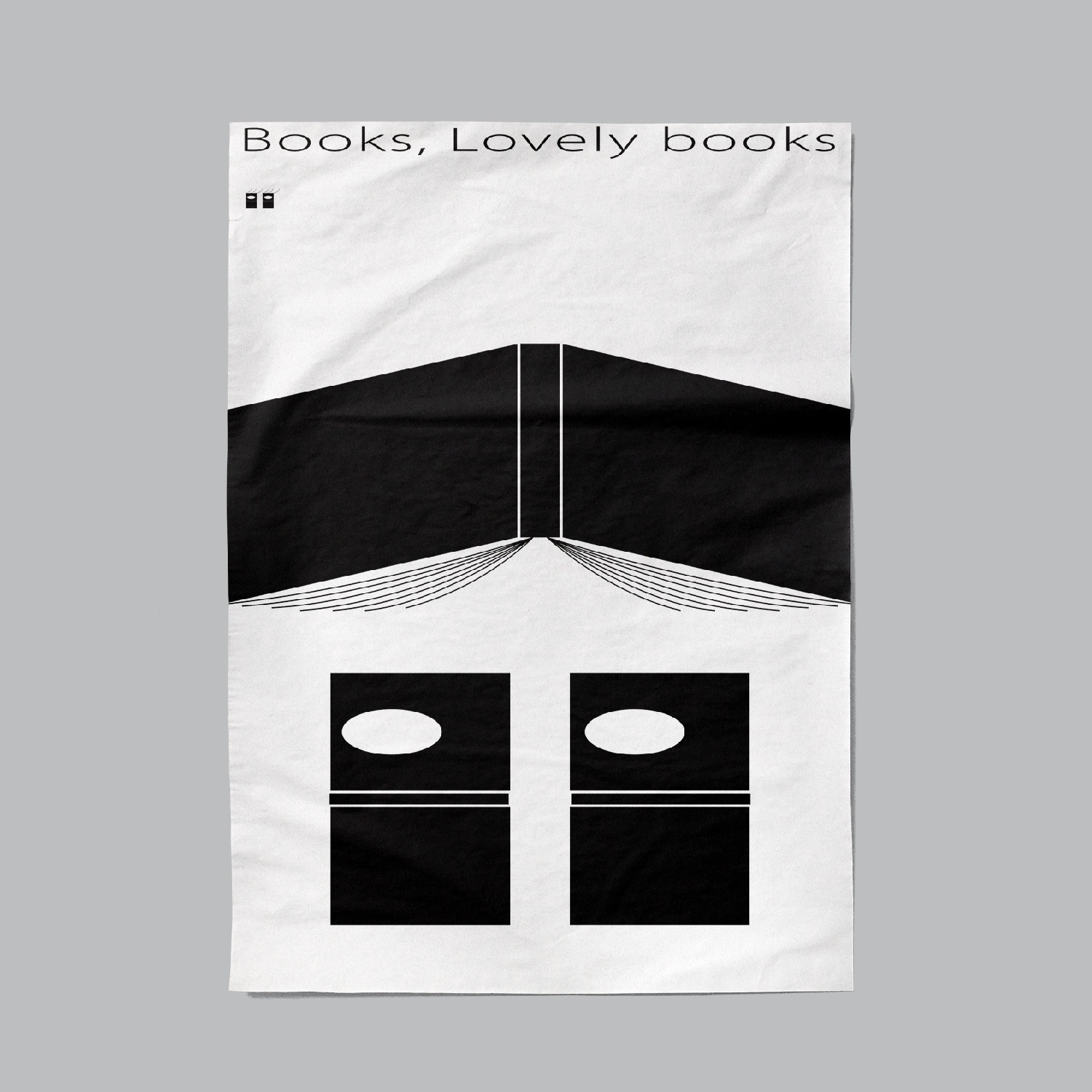
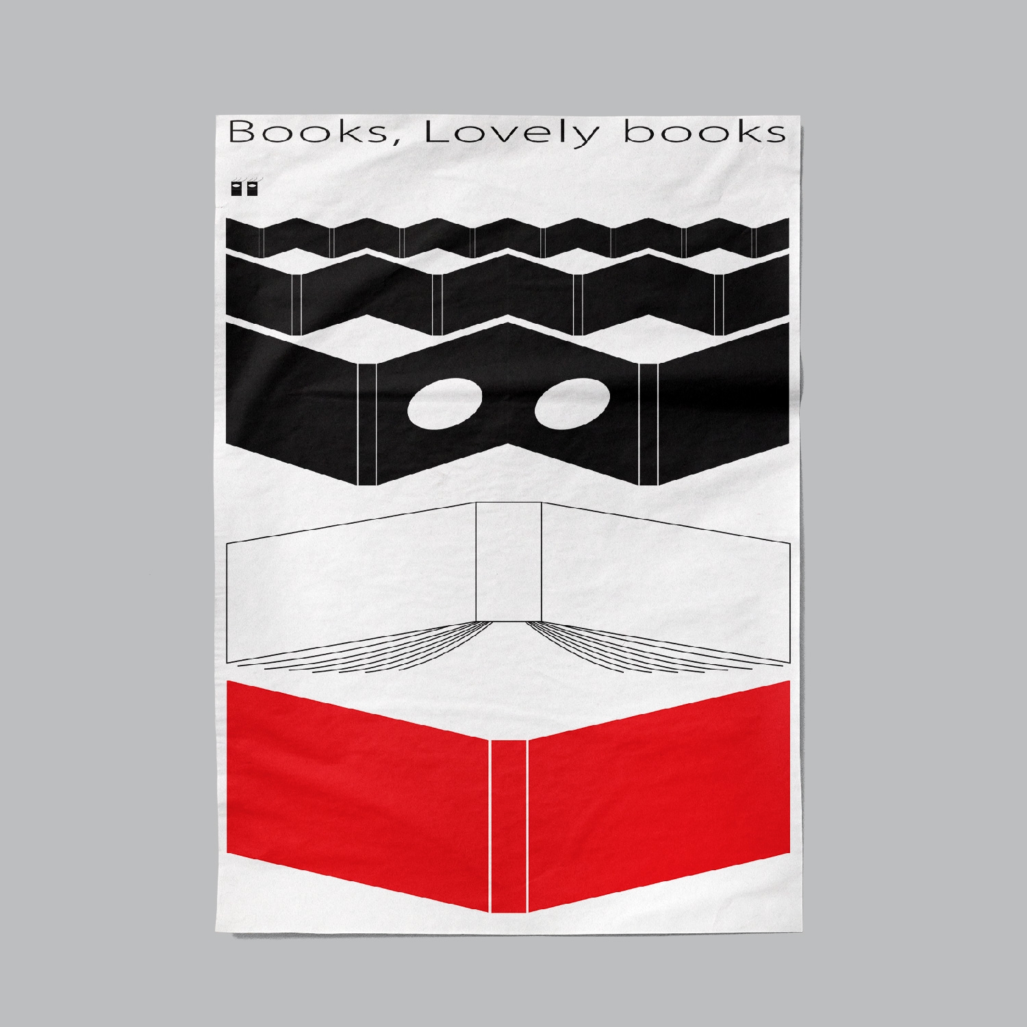
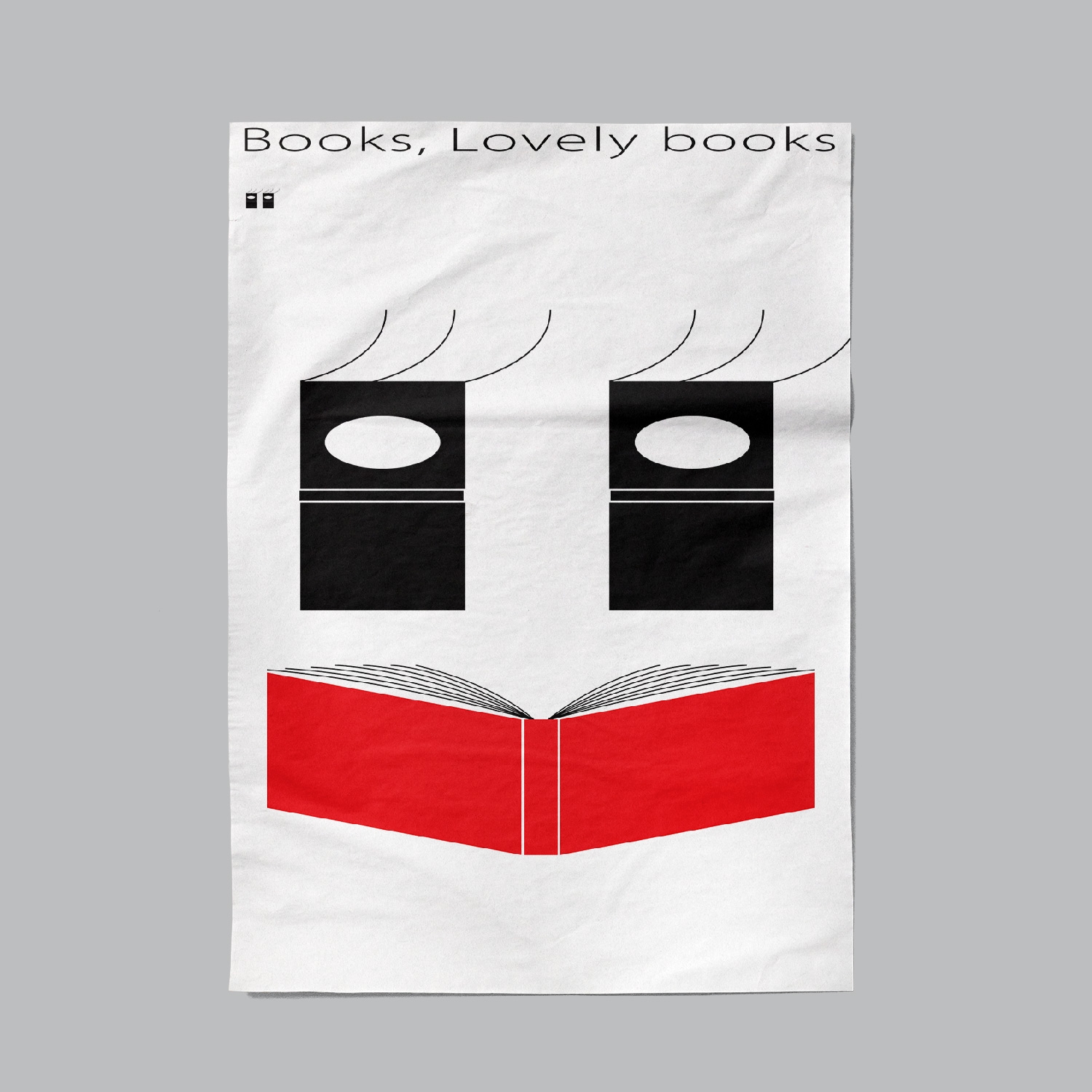
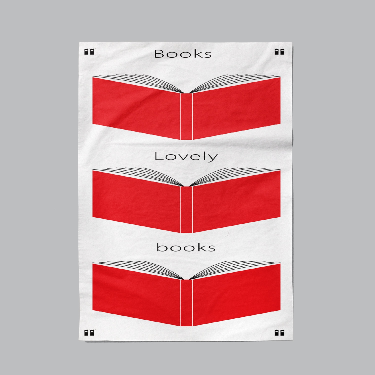

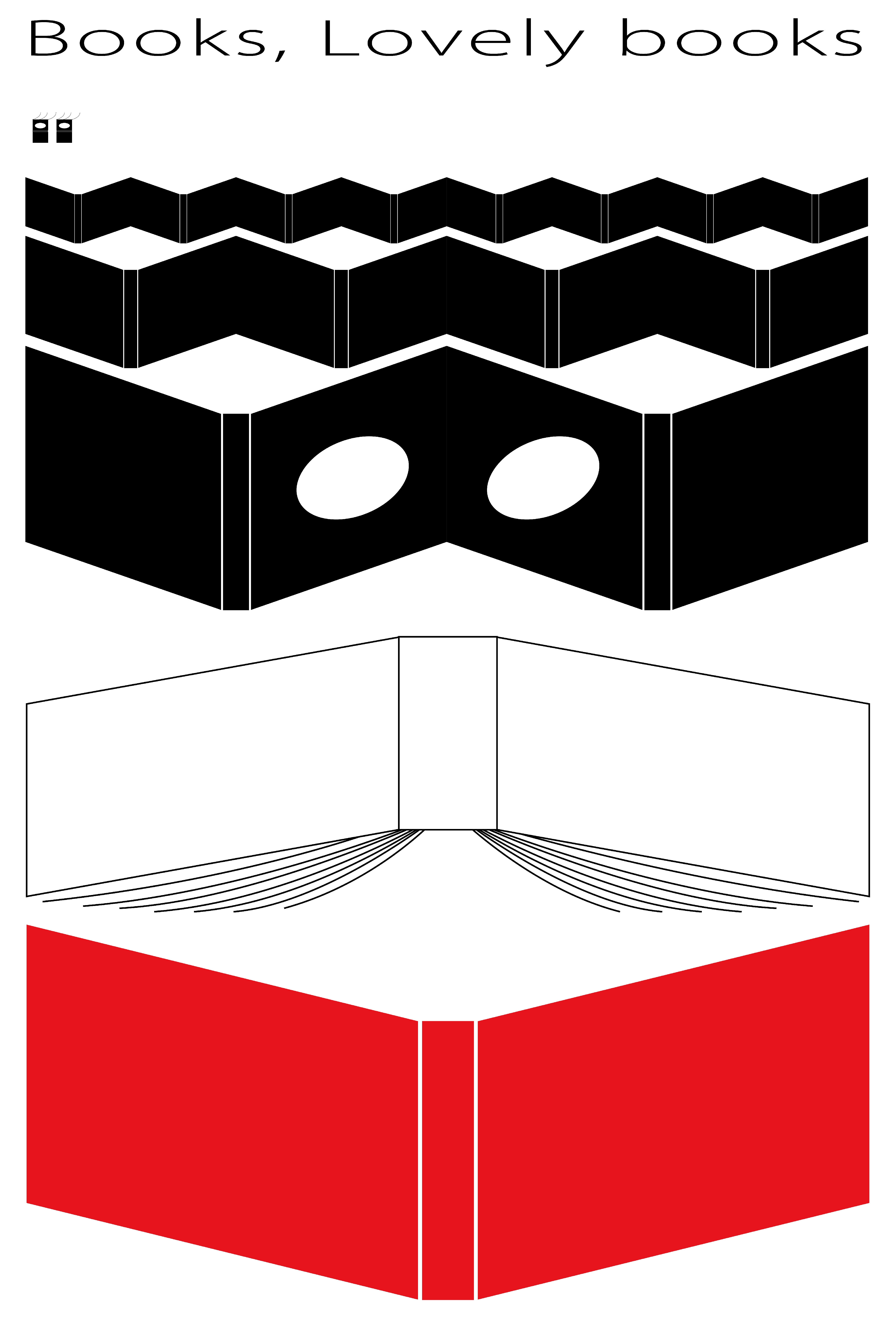
in the past few years, paper books are becoming increasingly sophisticated and ingenious. In another word, books are at risk of being over-designed, which keeps them away from readers. Designer hopes that books can be touched and read more and the distance between books and readers should be shortened. Therefore, he created this design to convey the concept that "books should be lovely". In order to show the cuteness of books, schematic book shapes are used to form a "baby schema",like face that contains big eyes and exaggerated red lips.
Born in 1990 in Shanghai, China. Studied and developed graphic design skills in Osaka, Japan, under the guidance of Prof. Takahashi Yoshimaru. Xin Chen is a member of the Hong Kong Designers Association (HKDA) and the Japan Typography Association (JTA). He is mainly engaged in typography design based on Chinese characters. His design style blends Chinese and Japanese aesthetics, gradually forming a unique visual language dedicated to presenting the beauty of Chinese character design to the world.
2021, Finalist, IPT2021, Toyama/Japan
2021, Nomination Award, C-idea 2021, Adelaide/Australia
2025, Winner, GDA2025, Hongkong/China
2025, Finalist, Poster Stellars 2025, New Jersey/USA
2025, Jury prize, Japan Typography Annual 26, Tokyo/Japan.
2025, Silver prize, IDA Design Awards 2025, Los Angeles/USA
2025, Outstanding award, KTK 2025, Shantou/China