IDA 2026 IS NOW OPEN - REGULAR DEADLINE: AUGUST 15
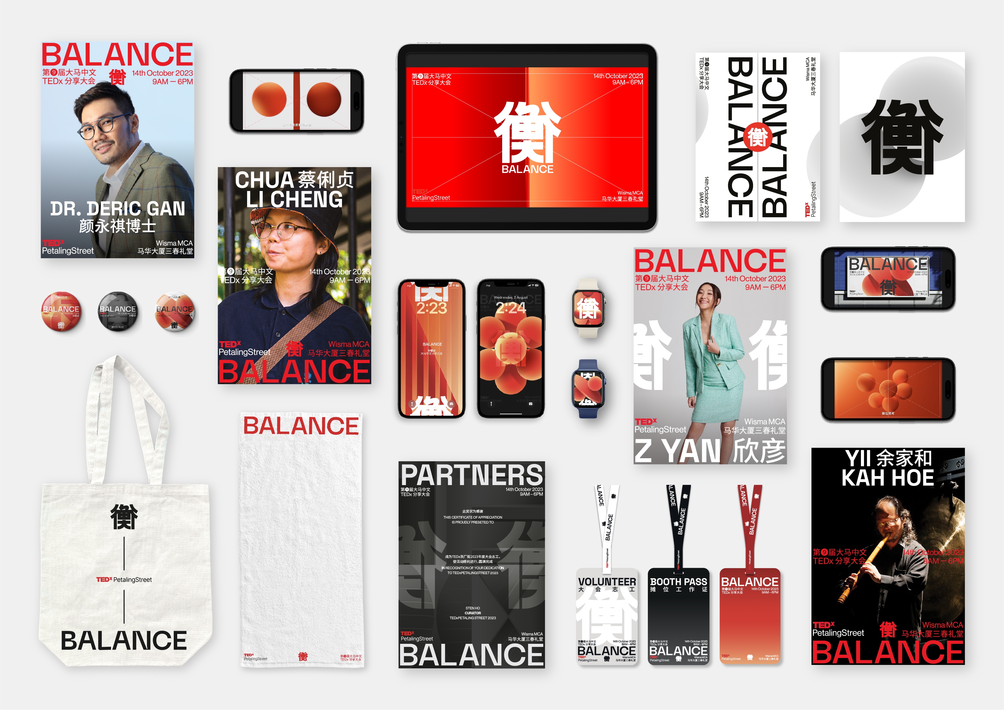
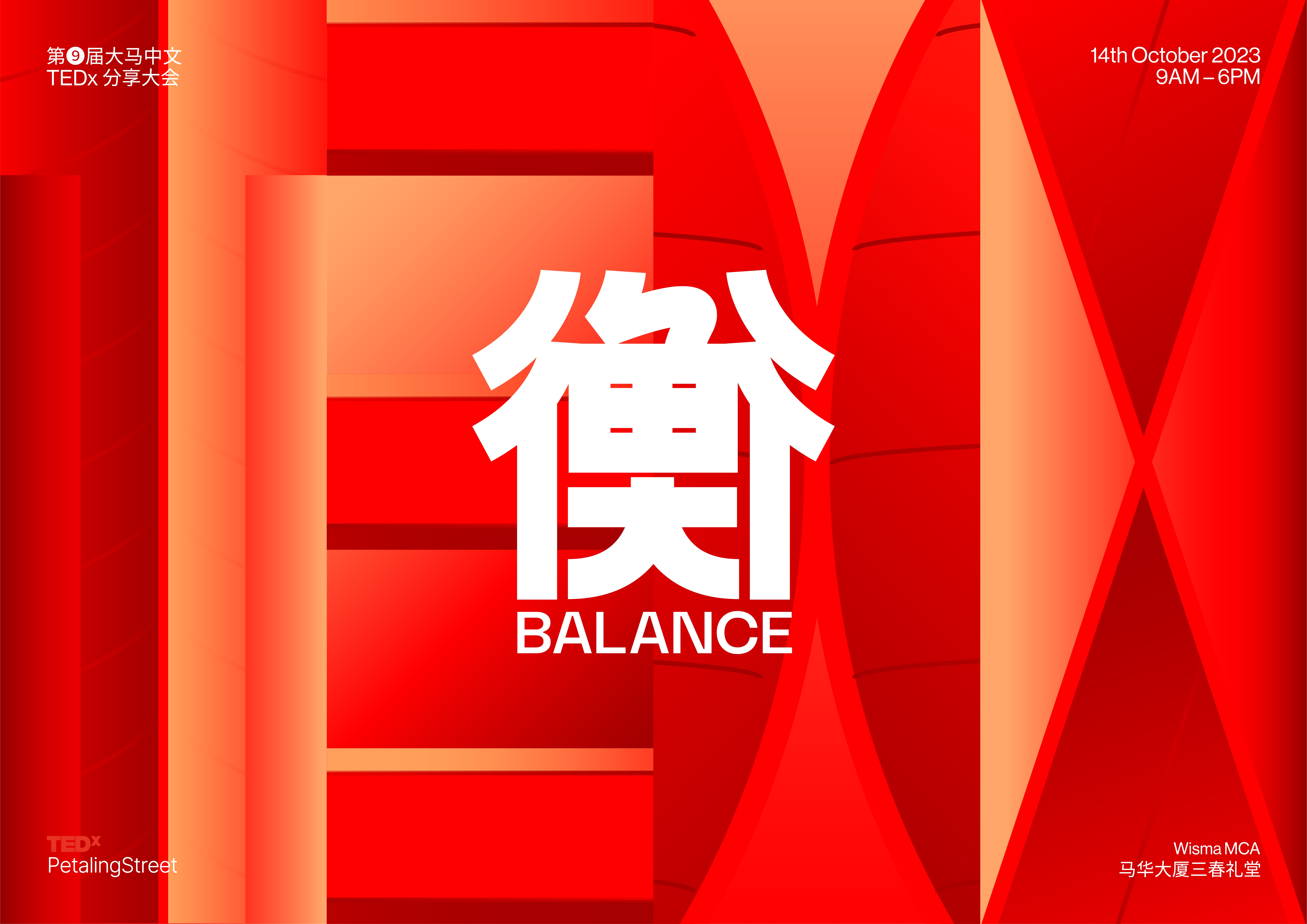
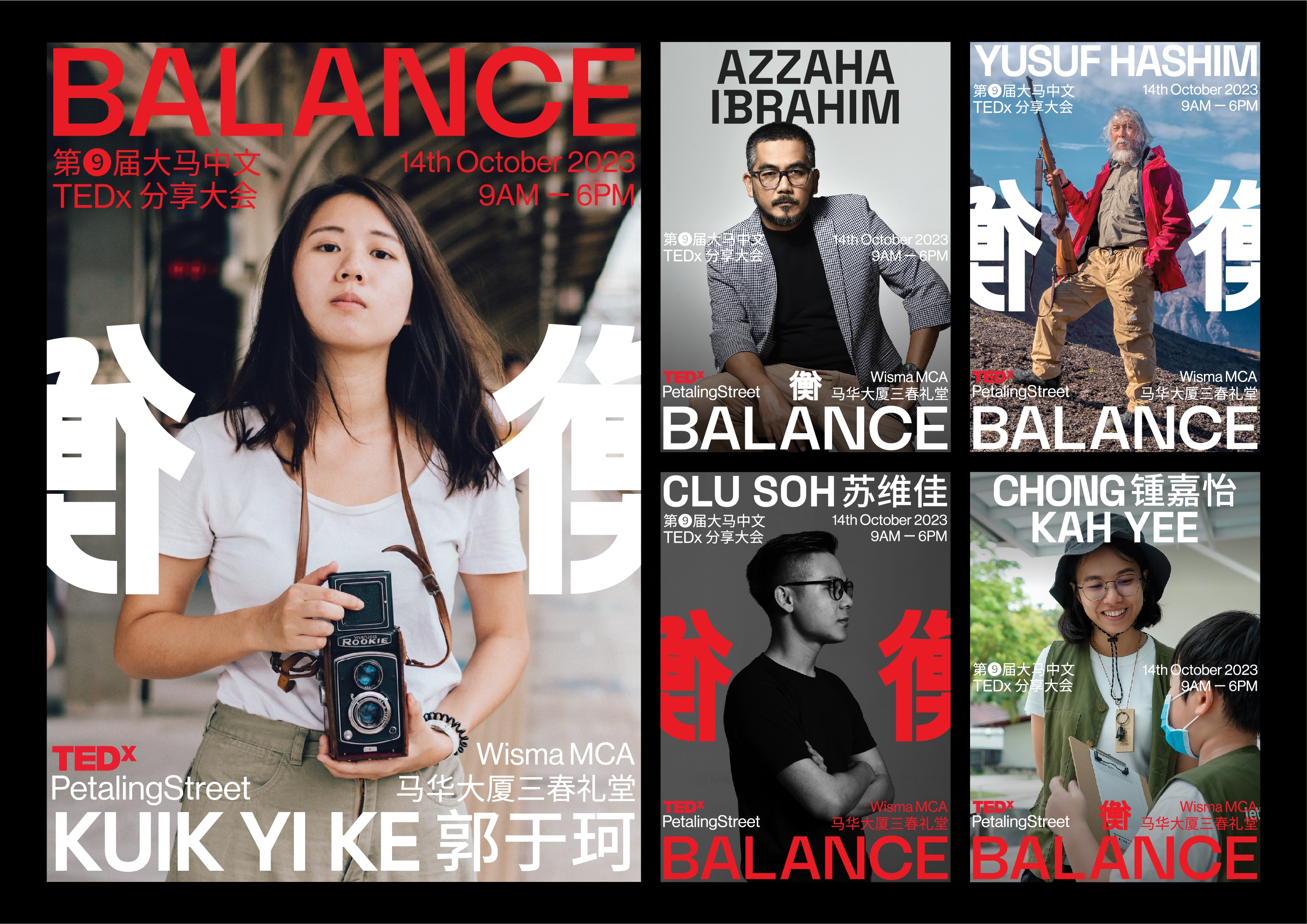
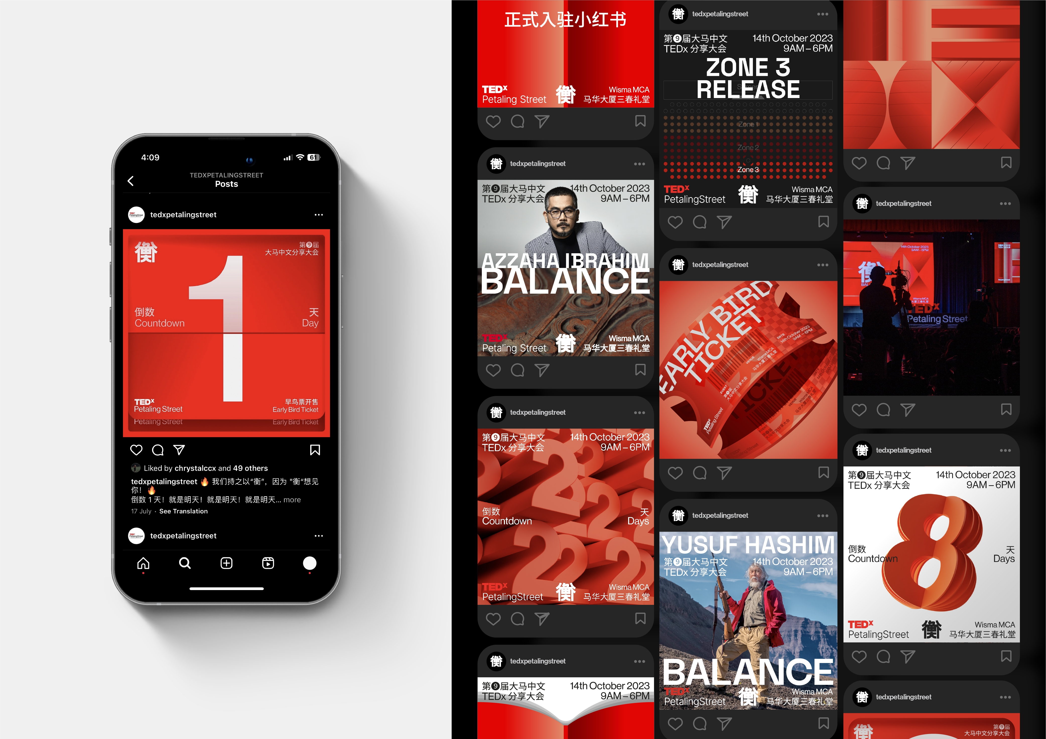
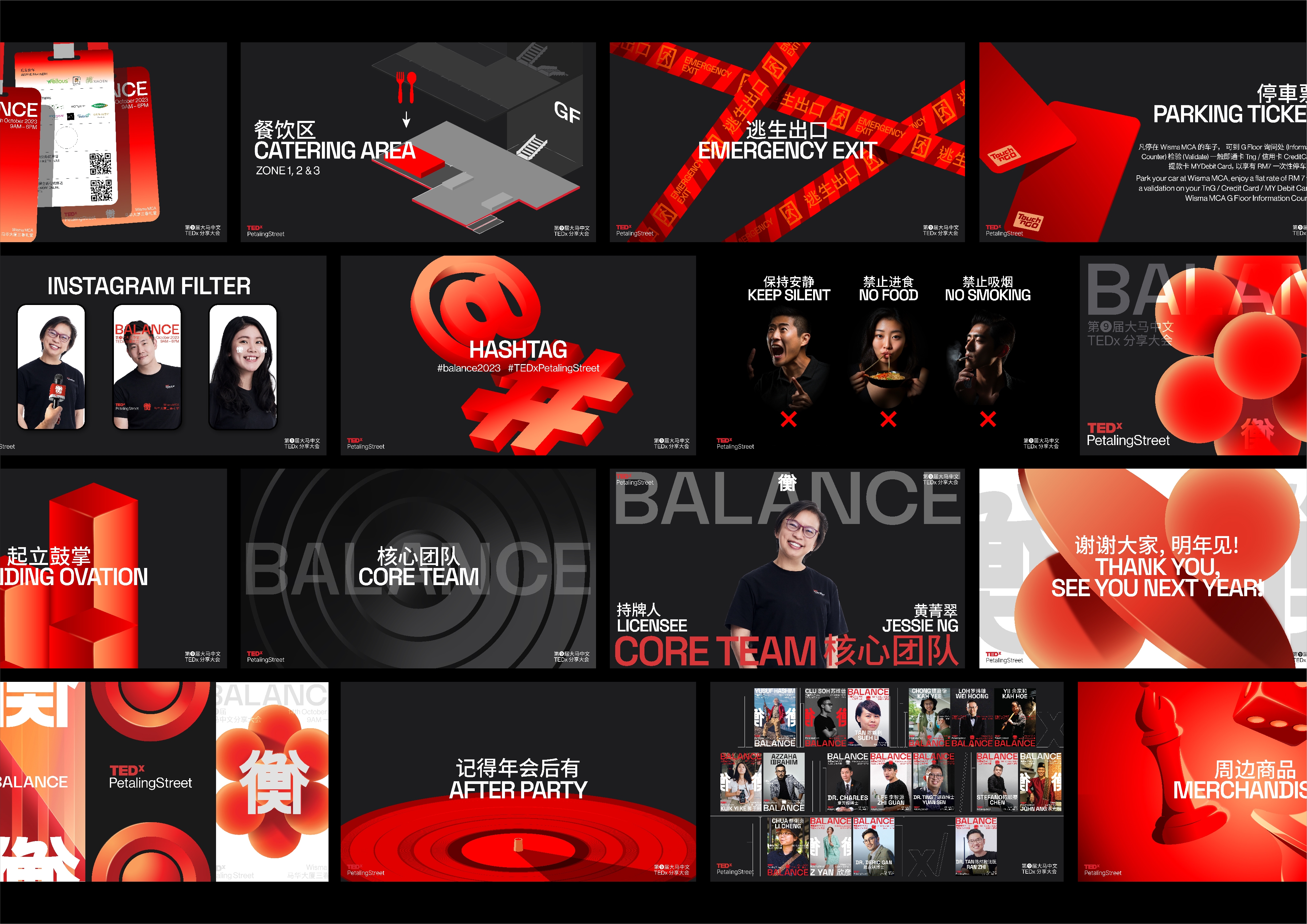
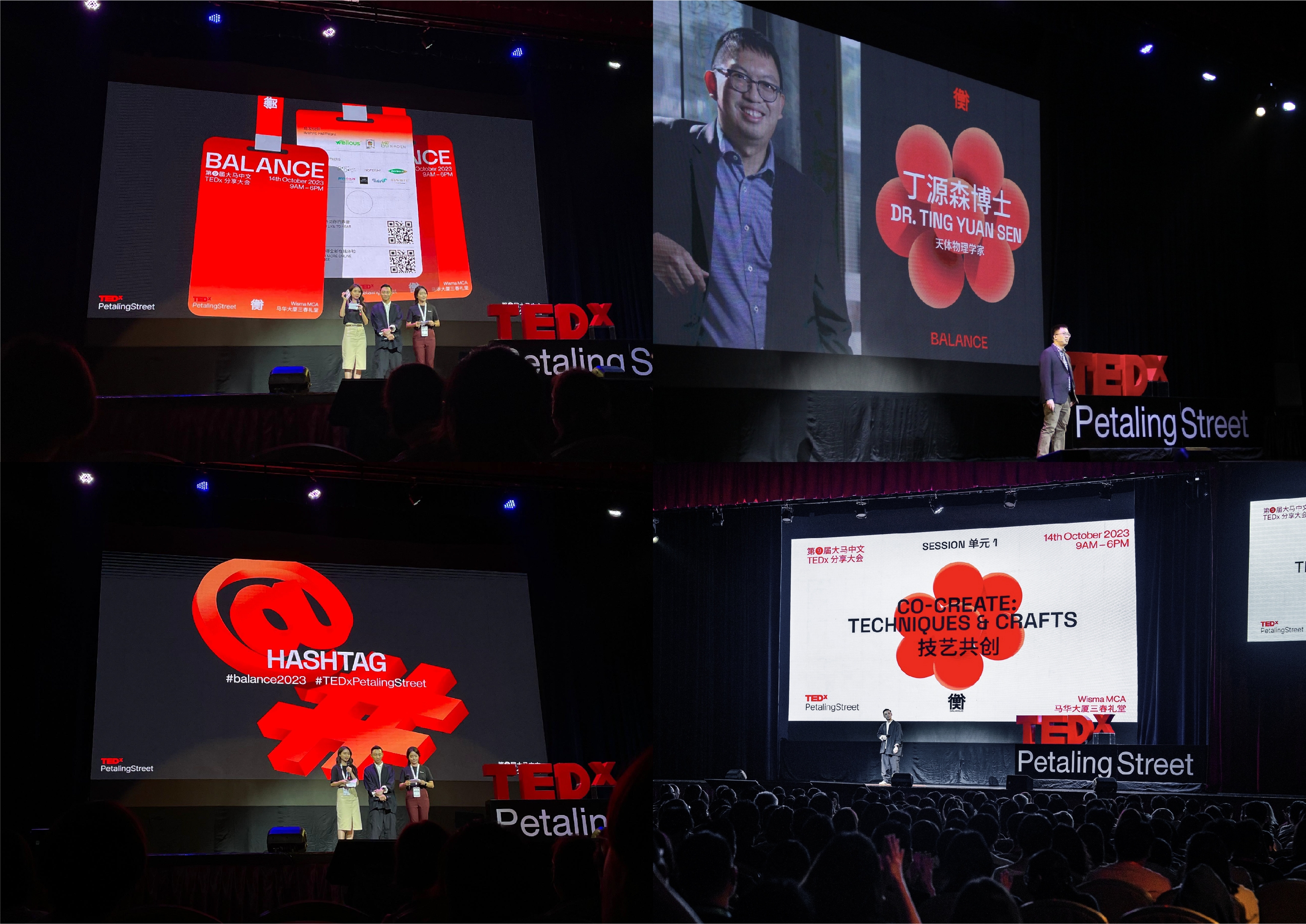
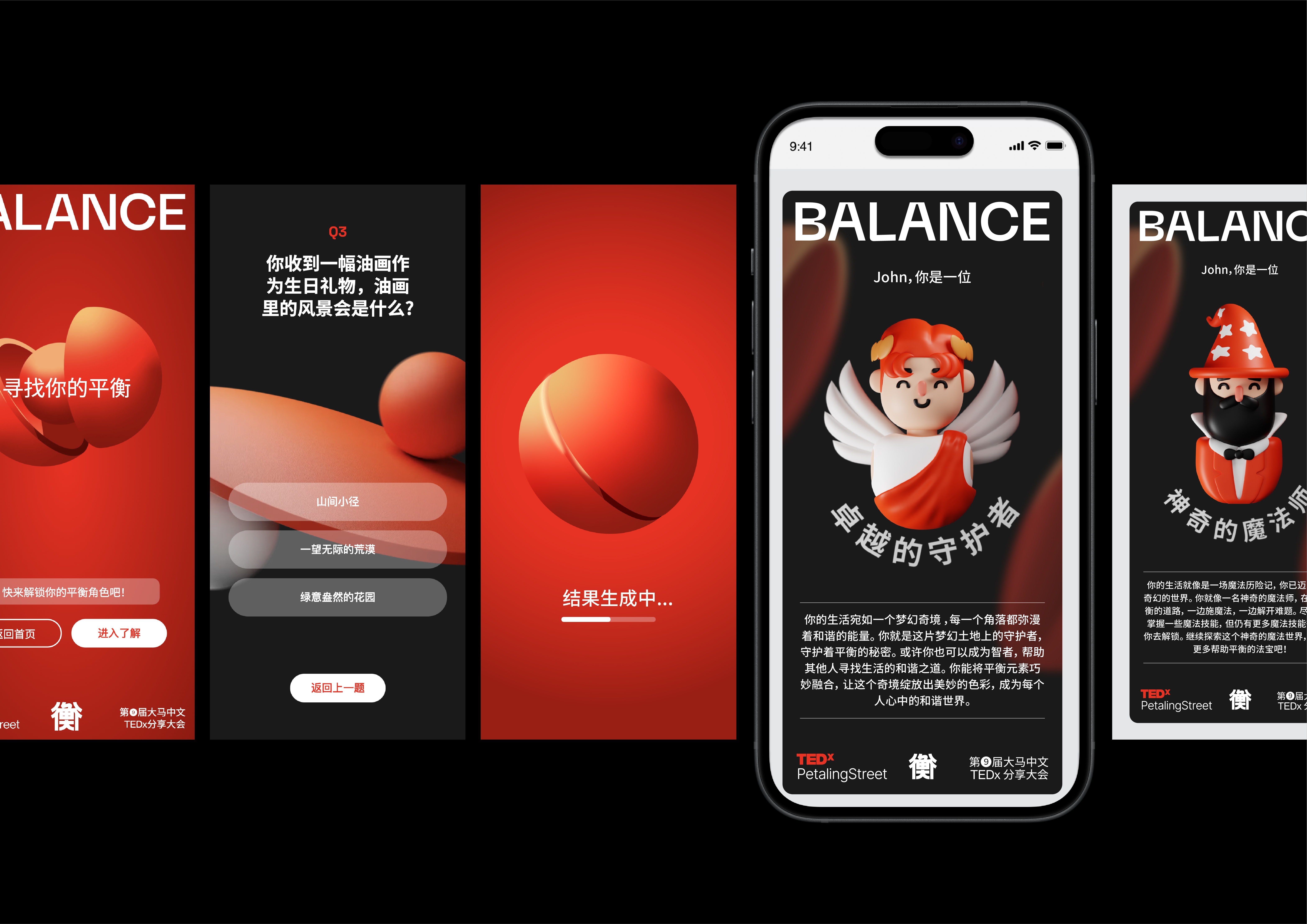
Extending the key visual design with the concept of "Starting Simple, Seeking Balance", we adopted TED's iconic red as the primary color, complemented by black, white, and silver as secondary color. By utilizing the principle of "mirror-reflected", we liken life to a mirror, extending this metaphor to the typography, layout, and overall visual design. This "mirror-reflected" effect encourages self-examination and self-reflection, enabling viewers to explore their own balance within themselves.