IDA 2026 IS NOW OPEN - REGULAR DEADLINE: AUGUST 15
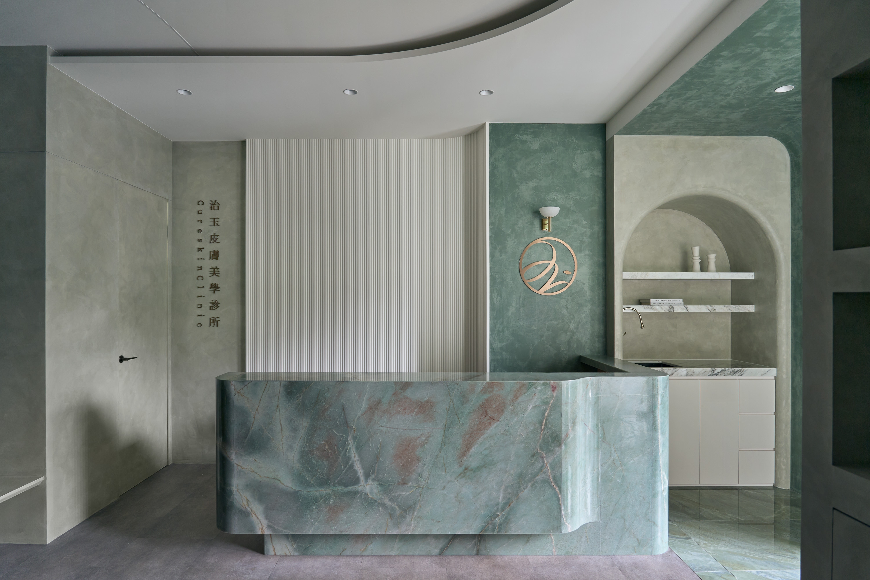
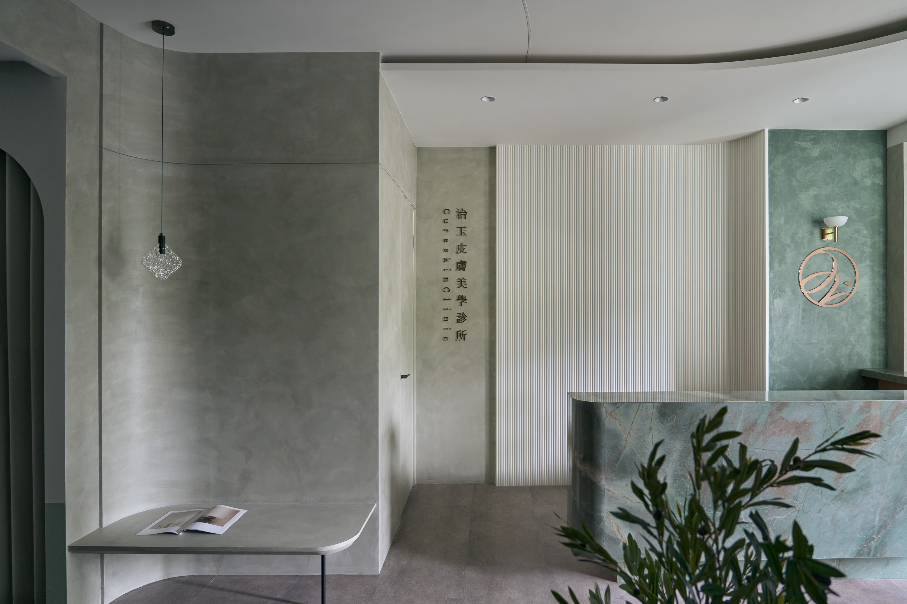
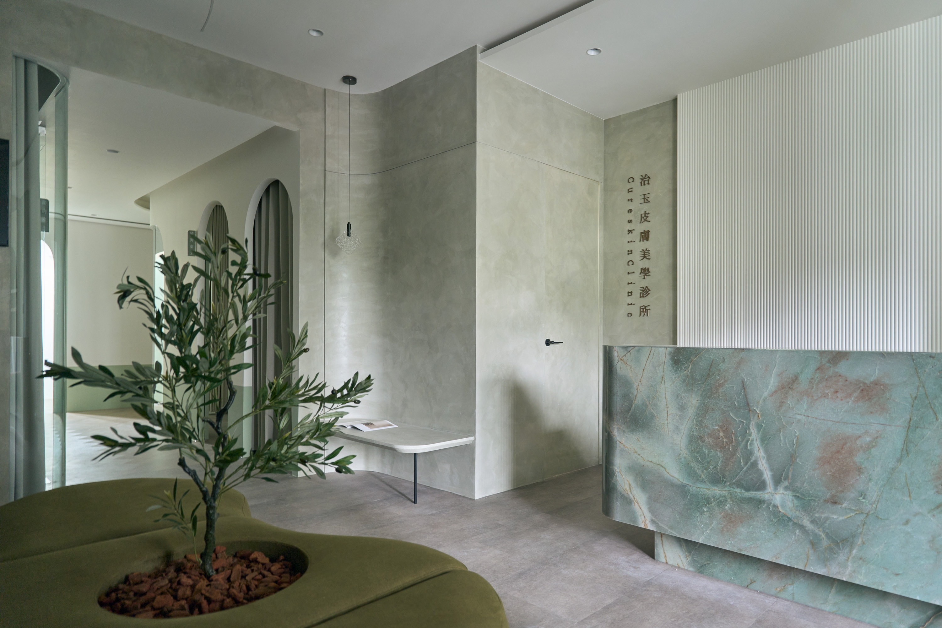
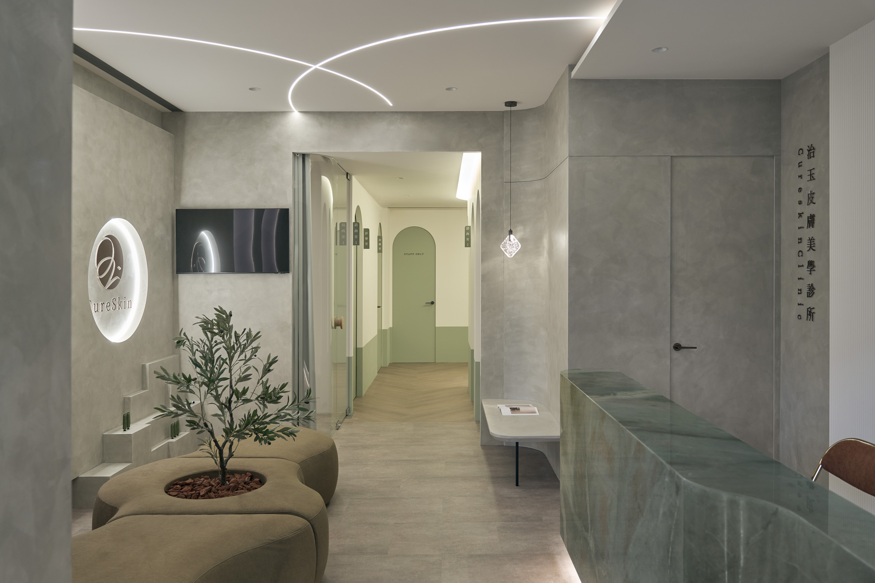
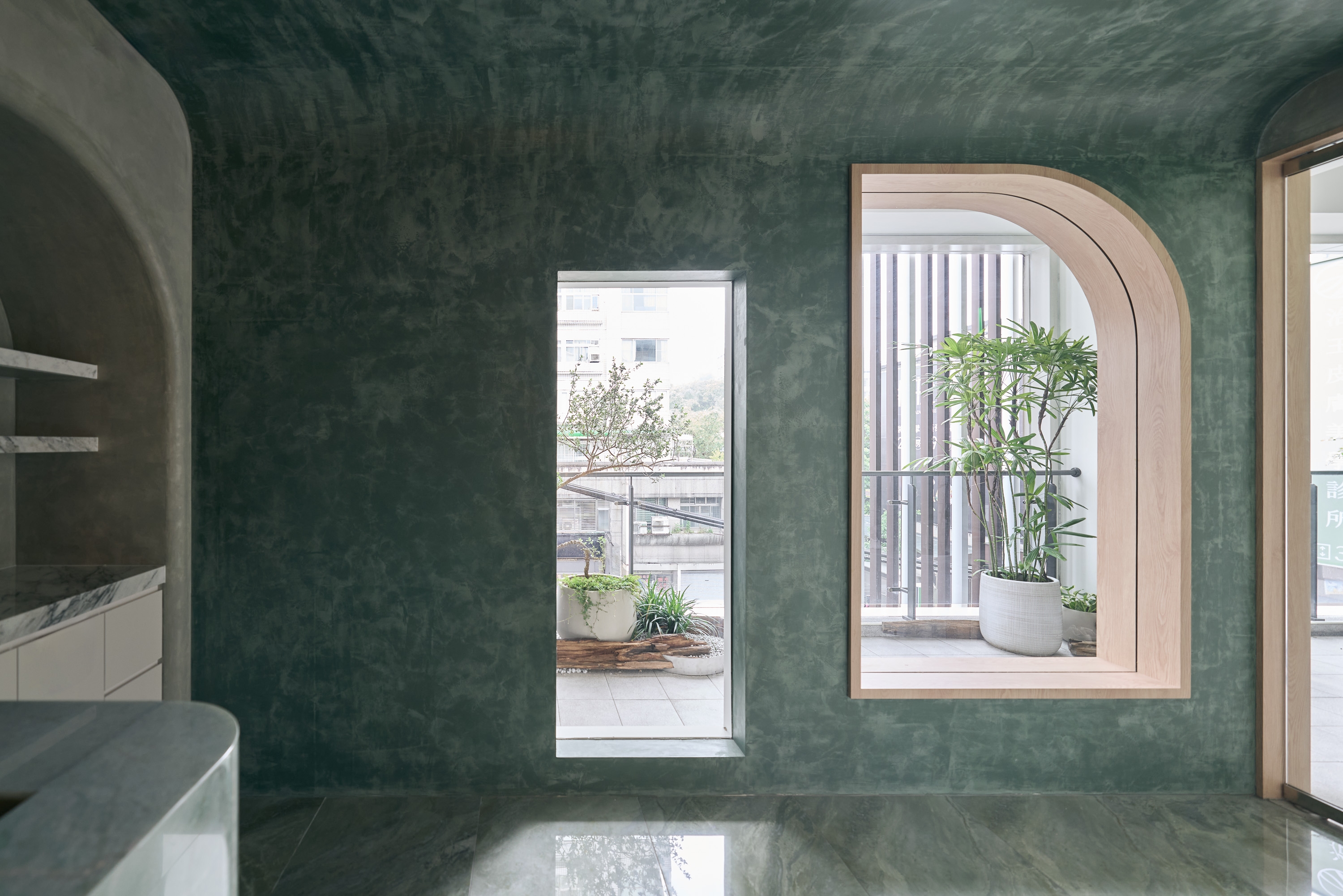
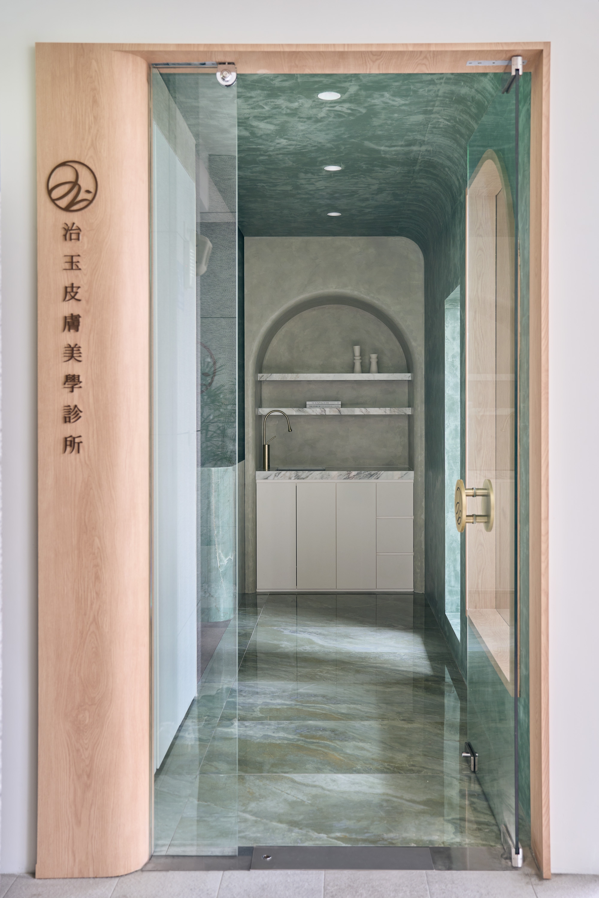
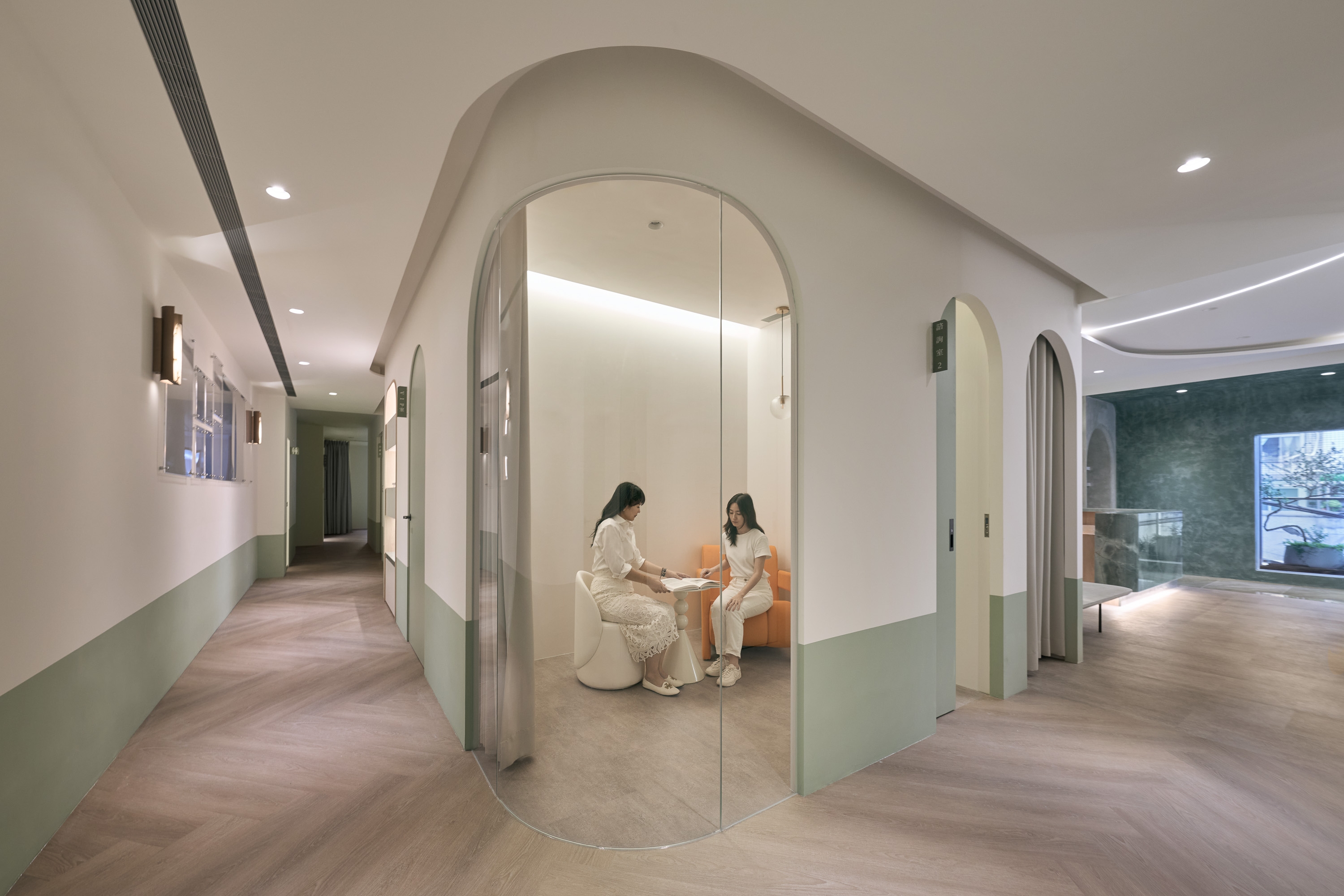
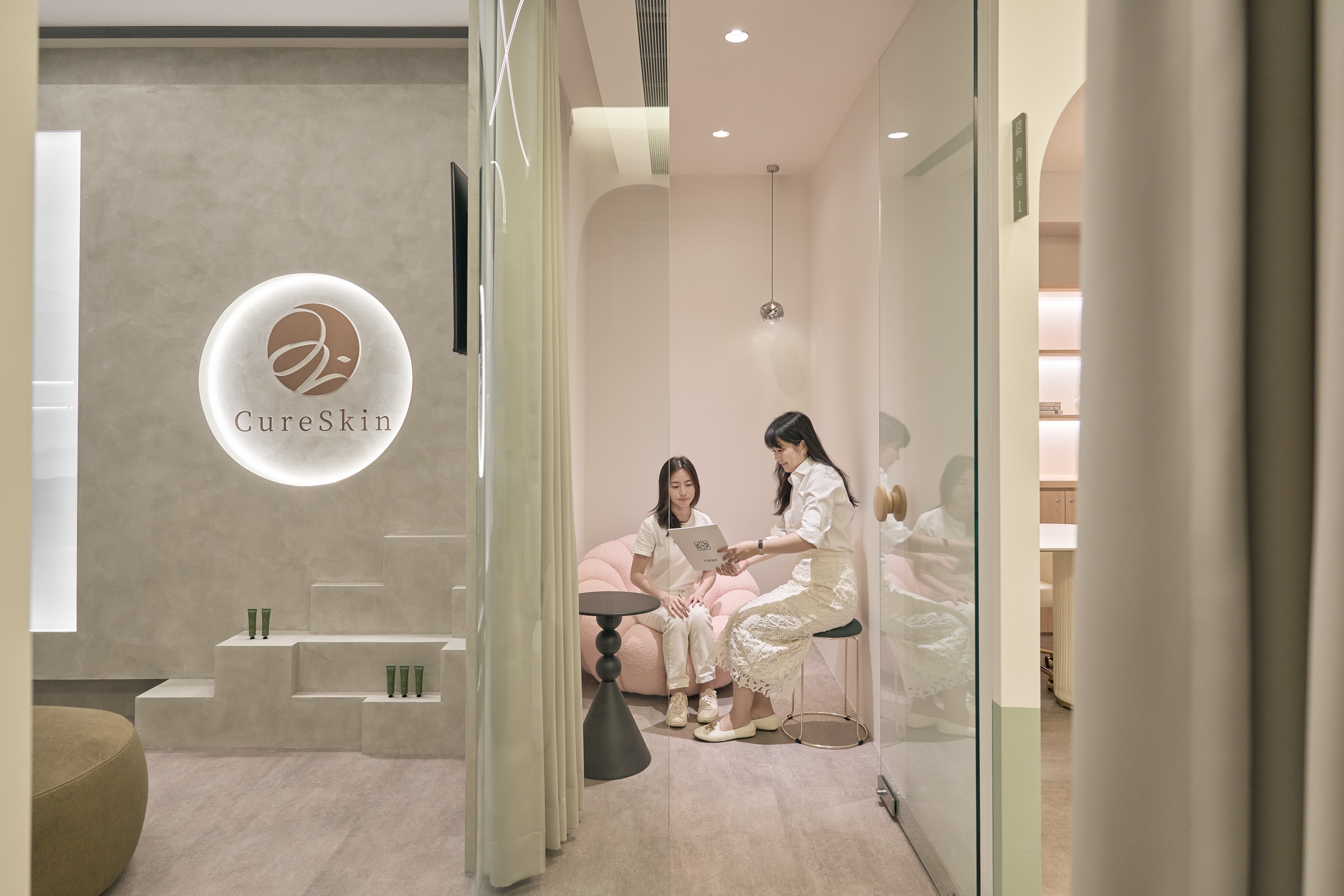
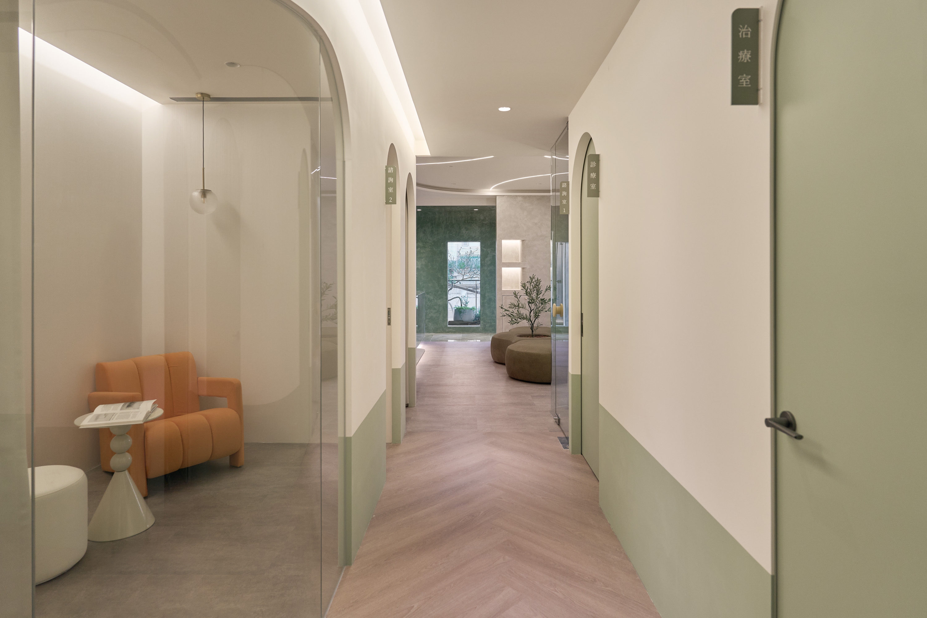
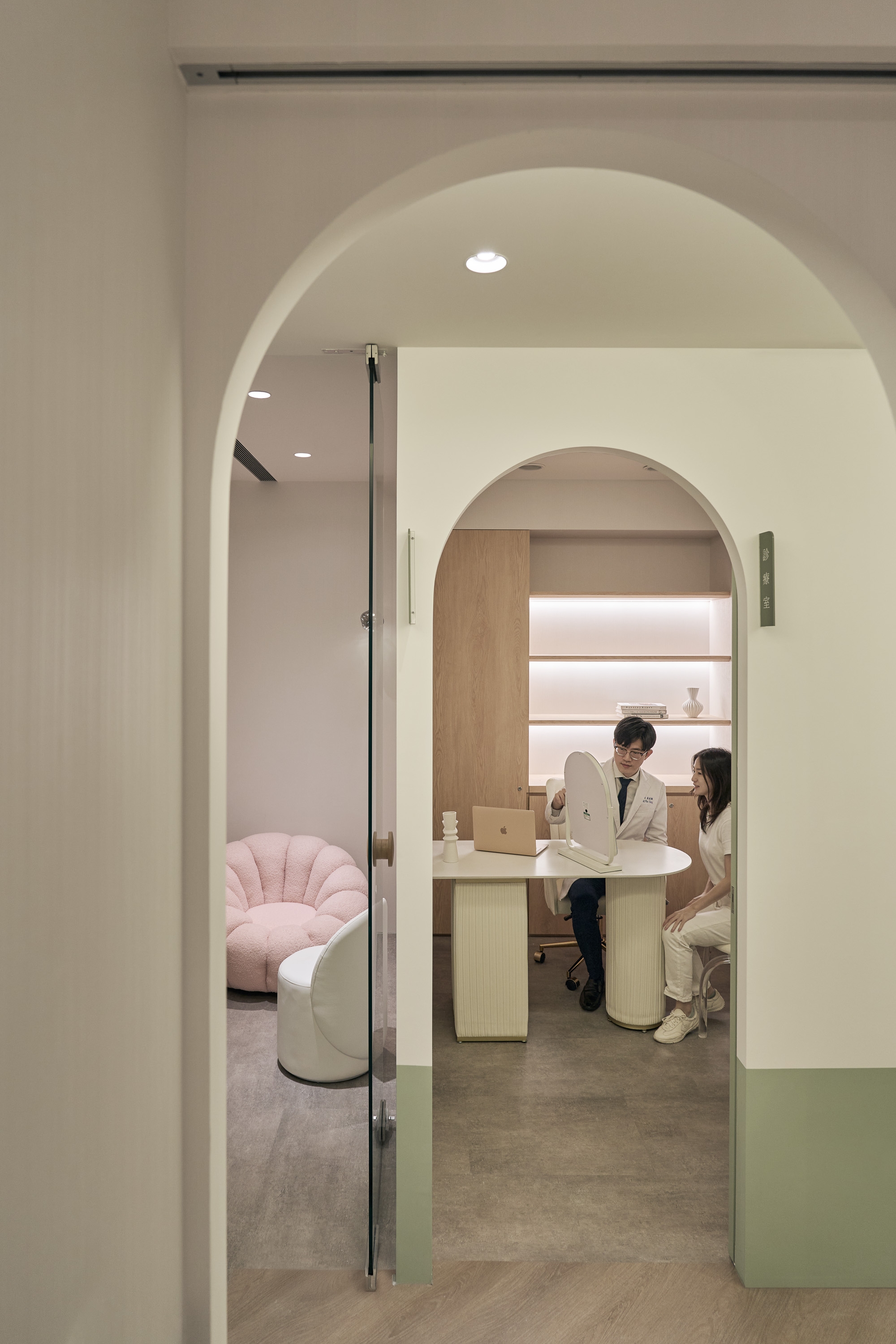
The project repurposed a raw L-shaped unit into a medical aesthetics clinic. The owner coined the brand name by combining characters from their parents’ names, specifically linking it to a jade-like texture and calming green palette. The design team started with the "jade" concept, translating it into the space's colors, materials, and layout. This approach integrated the brand image with a professional, healing atmosphere, delineating the unit into clear waiting and treatment zones.